Contact us pages are a bit undervalued in website design. Some designers save up all their creative energy for the homepage, the shop or the portfolio. While these pages are certainly the priority, the humble contact page is also worthy of attention.
A contact page is the place where you provide information such as your email address, phone number, mailing address and location, created using an online form builder. Using attractive and compelling design ideas, they draw in clients and encourage website visitors to engage with the brand. The following websites boast unique and engaging contact page examples.
As you create a website and potentially start a business of your own, feel free to draw inspiration from these examples when designing your contact us page.

Need inspiration for your website? With Wix, building a standout site is easier than ever. Choose from hundreds of customizable templates and use Wix’s easy drag-and-drop website builder tools to make your vision come to life. Turn your ideas into reality and see just how simple it is to create a unique, professional website.
20 best contact us pages
01. Meria Ogawa
Meria Ogawa’s contact page is not just a web design convenience; it’s also a source of connection between herself and other creatives. To reflect this idea, she uses welcoming, empathetic language. The title, for instance, is “Better Together,” rather than the usual “Contact Us.”
In addition, the bright coral tone of the page comes as a pleasant surprise. This striking pop of color draws in the site visitors with its playfulness and warmth, and encourages people to reach out.
View more minimalist websites and contact pages for inspiration.

02. Million Frames
Million Frames’ contact us page is reachable via a separate Contact button in the website’s header. Similar in function and appearance as a call-to-action button, this button helps the contact us page stand out and compels people to click.
The contact page itself is friendly and inviting, reassuring visitors with text such as “Let’s chat. Tell me about your project” and “Let’s create something together.” In addition to providing an email address, the page makes use of a contact form, enabling customers to connect directly from the site.

03. Juliana Laface
Among the best websites is Juliana Laface’s design service site. Like the rest of her site, her contact us page leaves us no room to doubt her design expertise. The page opens with a trendy light pink image on the first fold, overlaid with a large header reading “Contact.”
Upon scrolling down, visitors are presented with a unique contact form design that asks for just the right amount of detail. By asking for information such as budget and project due date, it’s clear that Juliana intends to hit the ground running. For people who aren’t ready to fill in all the fields, she provides them with an alternative—to book a free 15-minute consultation call to discuss their projects. This way, she’s able to draw in potential customers and gently guide them through her sales funnel.

04. Dija Ouija
The contact us page on Dija Ouija’s website includes an image of her product - in this case, the artist’s work - to catch the eye of site visitors. To the left of an image is a form labeled “Contact Me.” Between the light pink, black and white used on both the image and the form, the artist, Kahdija Murray, has customized the contact page to fit her brand colors.
Interestingly, the contact us page not only includes the standard name, email and message fields, but it also includes several social media buttons. Clicking on these buttons takes the user directly to Kahdija’s social media pages, providing yet another option for viewing her work and getting in touch.

05. Sophie Westfall
Sophie Westfall gives her graphic design website a dreamy feel by adding animated butterflies to her contact us page. She replaces the usual “Contact Us” heading with a friendly “Hello!” Before asking people to get in touch, she gives them a reason to contact her by explaining a bit about her background and experience.
To make things convenient for her site visitors, Sophie provides them with multiple options for reaching out. Her email address, LinkedIn profile and Instagram page are linked to directly from the contact page. Below these links is a form that lets people send her a message directly through the website.

06. Lumo
Lumo’s contact us page is clear and minimalistic, using text and white space rather than images. The background is a soothing dark green, helping it pop even without the use of visuals.
The contact page begins with the header “Let’s Talk,” followed by a short paragraph encouraging people to get in touch. It also includes their email address and a link to their Instagram and Facebook pages. To the right of this is a contact form where visitors can submit their own name, email address and message.

As a whole, Lydia Hill’s artist website makes it easy to get in touch with her from any page. She includes a unique set of social share buttons in the header, helping potential clients find her on Facebook, Instagram, Dribble and more. These social buttons are supplemented by a “Let’s Work Together” tab in the navigation bar that takes users to her contact us page.
The website’s contact us page is straightforward and to the point, providing Lydia’s email address as well as a form that users can fill in to get in touch. The simplicity of the form is offset by the website’s large, animated header, which adds a sense of cheerfulness and a burst of color to each of the site’s pages.

08. Teacup Bee
Artist Melissa Pagluica’s website uses a contact us page that enables people to connect while simultaneously highlighting her design skills. The entire background of the page is made up of Melissa’s own illustrations, offering an enticing glimpse of her talent that makes us want even more.
Overlaying the illustration is a contact form, which is slightly translucent so as not to detract our attention from the drawings in the background. The fields are simple and straightforward, helping visitors get in touch while keeping their attention focused on the illustration rather than the contact process.

09. Rachel Lev
Artist Rachel Lev’s contact us page includes several important elements. First, there’s a photograph of Rachel herself, which instantly makes the communication process feel more personal. In addition to including email, name, subject and message fields, she has also integrated Google maps with her site. This allows her to prominently display the location of her studio and invite visitors to drop in.
As a whole, the contact us page is simple and to the point, with all the important information above the fold. The header of the website displays her logo and one of her illustrations, adding a joyful touch to her contact page that can be seen across her entire site as well as the other website pages.

10. AR Designs
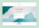
It’s clear that AR Designs is a gallery from the moment we arrive on their website. A large-scale abstract painting, with soothing hues of teal and grey, fills the background of the contact page. Overlaying the painting is a text box that reads “Contact Me,” as well as a phone number and contact form where visitors can fill in their details and send a message.
For visitors seeking alternative methods of communication, more details are provided at the bottom of the page. These include the owner, Ashleigh’s, email address, as well as social media buttons linking to her Facebook, Instagram and Houzz accounts.

Bodyrock Bootcamp is a fitness training program with a website that effectively reflects its brand. Its contact us page uses strong shapes and bold text, and balances the seriousness of a black-and-white design with the subtle addition of energetic colors.
On the first fold of the page is a contact form that asks for all the standard details - name, email, phone number and message. Below that, they provide their own phone number and email address, coupled with an enticing offer for a free one-on-one session. This offer, which seems too good to pass up, encourages people to get in touch, try out their services, and become dedicated clients.

Transplant Interface uses a consistent set of brand colors across its website, from a mint green and purple logo to the matching navigation bar. Their contact us page is no exception; they’ve customized it with a green and purple gradient strip to ensure that every part of their website stays on-brand.
The page includes all the essentials: a contact form beckoning visitors to leave their details and submit a message, their email address, and their mailing address. At the bottom of the page is a prominent, information-rich footer, making it easy for visitors to navigate their site and explore other pages.

13. MIGIZI
MIGIZI is a youth education program that clearly displays its work and mission on every part of their site—including their contact us page. This page is essentially split into two parts, with their contact information on the left side and a large photo of their program on the right. The image not only makes the contact us page visually attractive, but it also emphasizes the program’s merits to interested partners and participants.
The contact page includes three unique elements: an interactive Google Maps image displaying their location, a donation button, and an email signup button. This helps cater to each type of visitor - from people who want to donate to those who want to subscribe to their newsletter.

Evolve Clothing Gallery’s contact us page isn’t just practical; it’s also highly visual. Front and center on the page is an attractive image of their shop, which builds interest and excitement about their products.
Their contact page uses a welcoming tone of voice, giving readers a preview of the friendly service associated with their brand. Since they have both a physical and online store, they make sure to include opening hours and a map of their location alongside an email address and phone number.

15. Somni
With a mission to provide healthy meal plans for night shift workers, Somni’s website has a dark aesthetic that reflects late nighttime hours. The contact us page is not only on-brand, but it’s also trendy with a youthful sense of humor. The heading “Talk to me baby!” is a creative diversion from the standard “Contact Us” heading, and instantly makes the brand feel approachable and relatable.
The contact page includes all the necessities without overwhelming site visitors: a contact form people can use to send a message, as well as social media buttons that link to the brand’s Instagram and Facebook accounts.

Mane Ethical Hairdressing’s website boasts a user-friendly, easy-to-navigate contact us page with a stunning layout. As a service business, she puts the most critical element at the top of the page: a “Book an Appointment Online” button that lets clients schedule an appointment directly through the site.
Below the booking button is a phone number, email address, and physical address, as well as the business’s opening hours and a box for people to send a personal message. To the right of this information is a large photograph showing an unclaimed cup of coffee and a cookie - beckoning clients in for an afternoon drink.

17. IsaTales
Isabelle de Burgh’s website IsaTales uses a contact us page that balances minimalism with an on-brand aesthetic. The page is clean and white, with a selection of delicate illustrations and a touch of handwritten-style lettering.
The page’s simplicity leaves no room for confusion, making it easy for visitors to get in touch. Isabelle explains where she is based, provides her professional email address, and includes a contact form that people can use to write their own message.

Love Local Collective has a visually attractive contact us page that communicates their brand’s overall image. Similar to their logo, the contact page uses a sunny splash of bright yellow to communicate cheerfulness and warmth. Not only is this eye-catching, but it also helps welcome businesses interested in joining the community.
To the right of the contact form is their email address, as well as social media links that enable visitors to connect with the organization on Facebook and Instagram. They also provide a quick summary of their business and mission statement to further entice people to get involved.

19. Makeoverguy
Makeoverguy Appearance Studios gives their contact us page, along with the rest of their vintage website, a sense of retro glamor. At the top of the page is an image of an old school phone, while the footer depicts rows of seats at a theater. This is a look that oozes confidence and class, and one that builds enthusiasm about the brand.
Because this is a service business that works with individual clients in-person, the contact page provides directions for getting to the salon. They also include their location via an interactive Google Maps integration. Beneath that, Makeoverguy gives prospective clients the opportunity to leave their details and subscribe - holding onto clients who may not need a makeover just yet, but who may be interested in the future.

20. Ice Mobility
From looking at Ice Mobility’s website, it’s clear that they gave due attention to their contact us page. The page has strong visual appeal, with a behind-the-scenes photo of their company directly beneath the header. They also preface their contact page with a pun - “Let’s break the Ice” - eliciting a chuckle and making the brand feel approachable and relatable.
It’s clear that Ice Mobility would “love to hear from you,” and they promise high-quality customer service and quick response times. This helps encourage people who otherwise may not be motivated to reach out, while giving visitors a sense of their strong brand values.

Learn more about how to make a website with our guide.