- Yoon Jeong Cho

- Nov 20
- 14 min read

First impressions matter, especially when you create your own website. Your About Us page is where potential customers learn who you are, what you do, and why you do it. In fact, 52% of website visitors say the first page they look for is the About Us page. The best About Us page examples show how a simple page can turn visitors into loyal customers.
The best About Us page examples are informative, stylish and help you stand out from the crowd (especially for corporate websites). Share your business's story—how it started, its mission and your unique approach. Make sure it reflects your brand's style, tone and web design.
Crafting your brand story on one page might feel challenging, but it’s worth the effort. We’ve rounded up the 15 best About Us page examples from Wix users to inspire you when you’re figuring out how to make your website. Use these ideas to build an About Us page that connects with your audience—and start creating with a one page website builder today.

Need inspiration for your website? With Wix, building a standout site is easier than ever. Choose from hundreds of customizable templates and use Wix’s easy drag-and-drop website builder tools to make your vision come to life. Turn your ideas into reality and see just how simple it is to create a unique, professional website.
TL;DR: About Us page examples
We’ve rounded up the best About Us page examples that go beyond just telling a story — they make you feel like you know the brand. A great About page builds trust, shows personality and gives visitors a reason to stick around (or better yet, get in touch). These examples highlight how design, tone and storytelling come together to make that first impression really count.
Your About page is your chance to connect on a human level. From heartfelt brand stories to playful bios and mission statements that actually resonate, each example brings something different to the table and offers ideas you can use to build or refresh your own.
Here’s what we looked for when choosing the examples:
Clear and authentic storytelling that builds connection
Design that reflects the brand’s personality
Copy that feels human, not like a corporate press release
Visual elements like team photos, behind-the-scenes shots or custom illustrations
Calls to action that encourage people to explore or reach out
What each example brings to the table:
Strong brand voice that makes the business feel approachable and real
Layouts that balance text with visuals for easy reading
Personal touches like team bios, timelines or founding stories
Strategic CTAs to guide visitors to contact, explore or take the next step
What makes a great About page
Feature | Why it matters |
Clear brand story | Helps visitors understand your mission and what drives you |
Authentic voice | Makes your brand feel real and relatable |
Thoughtful visuals | Adds personality through team photos or behind-the-scenes shots |
Simple layout | Makes the page easy to read and keeps visitors engaged |
Team bios | Helps put faces to the brand and builds trust |
Mission or values | Shows what your brand stands for beyond just products or services |
Timeline or backstory | Gives context and shows how far you’ve come |
Call to action | Encourages visitors to connect or keep exploring your site |
Mobile-friendly design | Makes sure the page looks great and functions on all devices |
"Each combination of design elements has the potential to evoke specific emotions, convey subtle messages and leave a lasting impression on viewers. From the choice of font to the selection of colors and the incorporation of graphic elements, every detail plays a crucial role in shaping the overall identity of a brand." - Yaya Aaronsohn, head of Brand Maker at Wix
15 best About Us page examples
Want to see what makes these About page examples stand out? Explore the full list for ideas you can borrow — or make your own — as you craft a story that helps your audience connect, trust and remember your brand.
01. Heroines: Nonprofit organization

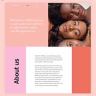
Heroines is a platform which benefits diverse groups of women by hosting supportive events. The About Us page successfully captures the spirit of the organization, beginning with a heartwarming text about its mission and photographs of empowered women who represent their community.
The website color scheme is gentle, combining purples and pinks that channel positive female vibes. Parallax scrolling helps to engage visitors even more, allowing the areas of color and photographs to shift throughout the page as they browse.
By confidently placing calls-to-action on the About Us page—a sweet “Donate” button on the right-hand side, and a slider at the bottom of the page—visitors are invited to become members of the organization.
Like what you see? Create your own About Us page using the same template:
Template name: Social welfare organization (serene) website template
02. Bodyrock Bootcamp: Personal training

Bodyrock Bootcamp fits plenty of useful details onto one page, from informative video clips to a “Meet Our Trainers” section. Their About Us page has an upbeat language and eye-popping visual quality that sets the tone for the gym’s personal training philosophy, method and mission.
Since committing to a personal training program is a big step for many people, it’s a savvy business move on Bodyrock Bootcamp’s part to post various special offers throughout their About Us page. Deals like lower prices for new members and a free trial one-on-one session might be the perfect way to get workout sceptics into the gym for the first time (after all, getting off the couch is half of the work!).
Rocking more than just awesome bodies, the team at Bodyrock Bootcamp has an About Us page that is as effective as we expect their personal training program to be.
Like what you see? Create your own About Us page using the same template:
Template name: Fitness studio website template
03. Helena Kruger: Fashion illustrator

Helena Kruger is a fashion illustrator and designer from Stockholm whose About page, in line with her personal branding, is smart and refined. The page’s clean black and white aesthetic allows us to focus on the text, which communicates who Helena is and what inspires her artistically.
An image of Helena painting in her studio gives visitors a glimpse into her professional process. Although this About page is made in a pretty minimalistic style, there is a lot of important information posted here: a link to Helena’s blog, a list of clients, a link to her online store and a relevant Contact Us page. You can create your own blog with our blog maker.
Like what you see? Create your own About Us page using the same template:
Template name: Home goods store website template
View more minimalist websites for inspiration.
04. The Diigitals: Modeling agency

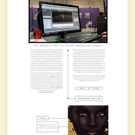
Contemporary, chic and fashionable to a tee—The Diigitals modeling agency’s About Us page really stands out (and not because it's over six feet tall). It includes every element you’d expect a modeling agency to have on its About page, but since it's the first all-digital modeling agency in the world, The Diigitals’ has some voguish technological twists.
Using a font with a futuristic feel to tell the agency’s story coincides well with their unique digital concept. It’s also a nice juxtaposition to the clean sans serif typography used for headings.
The best feature on this page? Visitors can scroll through an attractive timeline that tells the story of The Diigitals’ development. This makes for an engaging experience that breaks up the text in a distinctive way.
Like what you see? Create your own About Us page using the same template:
Template name: Landscape photographer website template
Editor’s note: Don’t worry about the template’s original niche. Wix templates are fully customizable, so choose a design that feels right and adapt it to your brand.
05. Nurturing Nature Cards: Handcrafted greeting cards

Nurturing Nature Cards instils the act of recycling by selling locally made plantable greeting cards. This About page is as endearing as the concept itself.
The brand’s creator Leah adds a short story about how she came up with the concepts, including a thoughtful fact about the amount of waste produced by unused greeting cards in Australia (where Nurturing Nature Cards is based). Made with Wix’s Videobox feature, an accompanying video of a card blooming in a pot of soil captures the essence of the brand, while demonstrating their actual product.
Pro tip: not all About Us pages have to be separated from the homepage. Instead of using a dedicated About page, Nurturing Nature Cards places all the necessary information directly on the homepage of their artist website, using an anchor menu to ensure convenient navigation.
Like what you see? Create your own About Us page using the same template:
Template name: Plant store website template
06. Bon Puf: Cotton candy vendor

Bon Puf is an artisanal cotton candy company whose About Us page greets us in the sweetest way, thanks to the friendly welcome from their owner at the top of the page (“Hi! I’m Cloë!”).
Using pastel colors and soft shapes, Chloe reminds us of the delightful taste of cotton candy. She uses the majority of her About page to write about the unfolding of Bon Puf and her experience as an entrepreneur.
Photographs and links to recent projects along the side of the page create a dynamic experience for the viewer, while embedded YouTube videos give us the opportunity to encounter more of Bon Puf’s charm.
Like what you see? Create your own About Us page using the same template:
Template name: Ice cream shop website template
07. Michaella Twersky: Product designer

While the black and white color scheme adds a dash of simplicity, there’s nothing typical about Michaella Twersky’s About page. Featuring her illustrations throughout the page and using a staggered layout, Michaella’s About page gives us an instant glimpse into the New York based designer’s creative talents.
A balance of communicative imagery and short texts make this page fun to browse through and equally informative. There’s also a multilingual option, which helps visitors from other countries to get to know her (a wise move when working in a culturally diverse city like New York).
All in all, the page captures both sides of Michaella: the professional designer and the original creative. The consistent footer across her UX portfolio also highlights thoughtful website footer design.
Like what you see? Create your own About Us page using the same template:
Template name: Start from scratch website template
08. Bracadale Books: Book binders

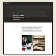
The About Us section for Bracadale Books is undemanding, communicating to its audiences in a straightforward manner. A classic color scheme is a strong choice here, as it accentuates the traditional nature of the bookbinding business. Photographs of the owner working on the conservation of a book are a really nice addition.
Here we can see once again how useful a footer can be on an About page. Bracadale Books manages to fit a lot of information into theirs, including a newsletter sign up, links to the rest of their website’s menu, contact information and the location of their store.
Like what you see? Create your own About Us page using the same template:
Template name: Financial consulting company website template
09. Toks Visoks: Bag designer

The star of Toks Visoks’ About page is the passionate story of founder and designer Akvilina. Her “True Story” relates her zest for design with the creation of an accessory line of her own.
Some of the best About Us pages feature business owners who are in love with what they do, and Akvilina’s smiling portrait is just that. Toks Visoks’ About Us page also makes use of the live chat box feature, so visitors who want more information can easily reach out and receive an immediate response. This type of instant messaging can help the brand build a more personal relationship with their customers.
Like what you see? Create your own About Us page using the same template:
Template name: Poster store website template
10. Rose van der Ende: Graphic design and branding

One of the best website designs can be seen in this elegant site where Rose van der Ende lays out her design and branding services in a way that’s consistent with her style. The flawless organization of her About page reassures visitors that they can trust her professional services.
Opting for a variety of text box sizes and colors, Rose is able to distinguish two important pieces of information in her About section: professional services offered and her bio. Another nice feature is the way she’s embedded her Instagram page to add some nice visuals that go along with the text.
Like what you see? Create your own About Us page using the same template:
Template name: Illustrator website template
Learn more: What is web design?
11. Digigem: Marketing agency

Digigem is a full-service marketing agency helping small businesses and startups grow through creative strategies and data-driven campaigns. The website uses a vibrant professional color palette that reflects the agency’s energetic and innovative approach.
Crafting a trustworthy feel is one of the most important About Us page tips and Digigem nails it. The About section features a “Meet the team” display with a photo of the owner and a bio highlighting the expertise and specialties. A clear “Schedule a consult” button encourages visitors to take the next step and connect with the agency.
Like what you see? Create your own About Us page using the same template:
Template name: Marketing consultant (strategic) website template
12. Extraweg: Artist

Extraweg is the artistic identity of Oliver Latta, a Berlin-based artist celebrated for his emotionally driven 3D animation and visually striking work. Oliver’s projects combine creativity, technology and storytelling to create experiences that are as impactful as they are visually stunning.
The About Us page uses a bright warm pink tone paired with an animated background, creating a playful yet sophisticated atmosphere that perfectly reflects Oliver’s distinctive style. This dynamic combination of color and motion draws visitors in and sets the tone for exploring Extraweg’s innovative and expressive body of work.
Like what you see? Create your own About Us page using the same template:
Template name: 3D designer website template
13. Ryan Saghian: Interior Design Studio

Ryan Saghian’s About Us page showcases the studio’s expertise and creative vision, giving visitors a clear sense of the quality and sophistication behind each project. It highlights the firm’s accomplishments including awards and industry recognition while presenting Ryan as both the creative force and the approachable face of the studio.
The page also features Ryan’s photo, adding a personal touch that connects the audience to the designer behind the work. By combining professional credibility with an intimate glimpse into Ryan’s passion and philosophy, the About Us page effectively conveys what makes the studio unique and why clients trust it to transform their spaces into something extraordinary.
Like what you see? Create your own About Us page using the same template:
Template name: Designer portfolio responsive template
14. Devasya Sharma: UX researcher portfolio

Devasya Sharma’s About Us page is designed to be fun, engaging and visually dynamic, reflecting the personality of a UX researcher. The page combines professional insights with a playful touch using emojis throughout to create a friendly and approachable tone.
Visitors can explore featured projects showcased directly on the page, giving a glimpse into the research process and outcomes. Photos featuring Devasya working with teams and interacting with people add a human element, emphasizing collaboration and real-world experience. The page also makes it easy to connect, prominently displaying an email address and social media links. Overall, the About Us page balances creativity, professionalism and personal flair, giving a comprehensive and inviting view of Devasya’s work and personality.
Like what you see? Create your own About Us page using the same template:
Template name: Creative CV website template
15. Anissa Hexton: Marketing resume

Anissa Hexton’s marketing resume website is clear, professional and easy to navigate. The homepage design is sleek and well organized, immediately showcasing Anissa’s profile and highlighting her expertise in marketing. Its layout communicates credibility while allowing visitors to quickly understand her skills and professional focus.
The About Us page takes a more personal and playful approach. It offers a glimpse into Anissa’s life beyond work, featuring fun elements that reflect her personality including her roles as a dog mama, aerial artist and traveler. With its balance of professionalism and personal flair, this website is a great example among the best portfolio websites giving visitors a full picture of Anissa both on and off the clock.
Like what you see? Create your own About Us page using the same template:
Template name: Business CV website template
The websites featured here were built with Wix and show what’s possible with real, DIY designs. They represent functional, effective and thoughtfully crafted options that help people run their businesses.
Key components of a successful About Us page

A great About Us page doesn't just tell people who you are, it connects with them. It builds trust, inspires interest and leaves a lasting impression. Here are the key components that make it shine both in terms of its design and content on the page.
Tell your story
Go beyond the facts: Share your origin story, your defining moments and the values that drive you. Make it personal and relatable.
Highlight your passion: What excites you about what you do? Let your enthusiasm shine through and show how it translates into your work.
Connect with your audience: Find common ground with your readers. Explain how your mission or products fit into their lives and address their needs.
Show your mission and values: Clearly communicate your company’s purpose and what drives your work, using simple visuals, icons or short bulleted lists to make your core values easy to grasp.
Introduce your team
Bring personalities to life: Go beyond names and titles. Share snippets about their passions, expertise and what makes them unique.
Showcase diversity: If your team reflects the richness of your audience, celebrate it. It fosters a sense of connection and inclusivity.
Humanize your brand: Let your team be the face of your company, creating a more approachable and relatable image.
Highlight your impact
Demonstrate results: Use testimonials, case studies or real-life examples to show the positive difference your work makes.
Build credibility: Include recognition such as awards, media mentions, certifications or customer endorsements to reinforce trust.
Focus on the human element: Show how your work has affected people's lives, not just statistics.
Inspire action: Conclude with a call to action that encourages visitors to engage with your mission or purchase your products.
Design for engagement
Keep it visually appealing: Use high-quality images, videos and a clean layout that makes the page easy to read and navigate.
Break up the text: Use bullet points, quotes and visuals to keep the reading experience engaging.
Make it mobile-friendly: Ensure your page adapts seamlessly to different screen sizes for optimal browsing on any device.
Explore other website examples:
About Us Page FAQ
What is an About Us page?
An About Us page is a section on a website that tells visitors who you are, what your brand stands for and why your business exists. It often includes your mission, values, story and team information. A strong About Us page helps build trust, humanize your brand and connect with your audience.
Why do I need an About Us page?
An About Us page is crucial for establishing trust and connection with your audience. It provides visitors insight into your brand's story, mission and values, helping to humanize your business. This page can highlight your team, expertise and achievements, fostering a personal connection with potential customers. Transparency and authenticity on your about us page contribute to a positive brand image, making visitors more likely to engage, trust and choose your products or services. It's an opportunity to differentiate your brand and leave a lasting impression, emphasizing the people and principles behind your business.
How do I write an About Us page?
You can write an About Us page by following these simple steps:
Start with a clear headline that introduces your brand.
Share your story and explain why your business exists.
Talk about your mission and core values.
Introduce your team or founder to add a human touch.
Share achievements, testimonials or milestones for credibility.
End with a call to action, such as contacting you or exploring services.
What are common mistakes on an about us page?
Avoid these common about us page mistakes to make sure your page connects with your audience:
Writing too much or too little, which can overwhelm or underinform readers.
Using generic language instead of showing off your brand's unique vibe.
Only focusing on selling instead of sharing your story or mission.
Not showing the human side of your business, like team photos or personal touches.
Forgetting to include clear calls to action, like a link to contact you or learn more.
Not updating your page regularly, leaving old or irrelevant info.
Fixing these things can help you create a great about us page that builds trust and gets your visitors involved.













Comments