- Aug 19, 2025
- 11 min read
Updated: Feb 26

Design, much like beauty, lies in the eye of the beholder. This is especially true when you're learning how to make a website that captures your brand's uniqueness while appealing to a diverse audience. The principles of design can serve as a compass for confident decision-making, ensuring your creation excels both in its aesthetics and functionality.
With the help of Wix’s Design Director Yiftach Koronio, we'll explain what the principles of design are and delve into each of them, exploring why they’re important and how to use them. We’ll also discuss them in the context of web design and use an example of each principle
Looking for your canvas? Start creating with Wix’s website builder today.

Building a website for your business, passion project or side hustle should be easy and exciting. With Wix, you can customize and launch a professional website in minutes, no coding needed. Wix is all about simplifying the process so you can focus on what matters most–bringing your ideas to life. So why wait? Let’s get started on creating the website you’ve always wanted.
What are the principles of design?
The principles of design are the essential building blocks that form the backbone of any creative work. They help creators make decisions about how to arrange, style and structure elements within their work.
The ultimate goal of these principles is to ensure that the result is both visually appealing and effective in its purpose. Whether you’re exploring web design trends, learning how to design a website or seeking website design tips to improve your online presence, creating stunning graphics that tell a story or making your website user-friendly as part of routine website maintenance set the fundamental framework for success.
These principles of design don’t exist in a vacuum. They operate as a cohesive system where each principle is interconnected, enhancing and supporting the others. “All principles of design mesh together,” explains Yiftach. “You can’t have one without the other.” If you're just starting, a web design tutorial can help you apply these concepts to your website.
Explore these website examples and personal website examples for inspiration.

14 principles of design to incorporate in your next project
01. Balance
Thinking back to your playground days, you might remember getting stuck at the top of the seesaw because the person on the other end was much bigger than you. As one of the most important principles of design, balance affects composition similarly: when the elements on one side are much heavier than the other, the artwork feels stuck, lopsided or awkward.
Balance refers to the distribution of visual elements in a composition to create a sense of stability and harmony. It's about how these elements—like color, lines, texture, space and shape—are arranged to produce a feeling of equilibrium.
Your art doesn’t need to be perfectly symmetrical to be balanced. In fact, asymmetrical balance—a strategy in which elements of different visual weights are arranged to create a dynamic yet stable composition without identical sides—is a potent design tool that’s particularly relevant in modern website design. “As web design evolved beyond Adobe Flash [the predominantly used software in the past] to more responsive platforms, we gained the flexibility to explore less rigid, more dynamic layouts,” says Yiftach. This shift gave designers more freedom to experiment with structure.
Take this personal blog website template as an example. Although the photo on the left is much larger than the one on the right, the text and negative space that surround the smaller photo help distribute the visual weight evenly.
Learn more:

02. Variety
Variety is how designers use contrast and diversity to add visual intrigue and complexity to a composition. By implementing variety in your designs, you’ll avoid creating compositions that are boring and monotonous. Variety helps to hold the viewer's attention and is often used alongside other principles of design, like unity and balance, to achieve a harmonious yet dynamic composition.
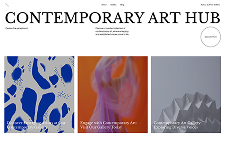
In this design blog website template, the variety of images below the header text draws you in and moves your eye around the page. The images are a palette of varying colors. But it's the recurring shades—such as cobalt blue and red—that stitch the diverse tapestry together, creating unity and guiding the viewer through the visual narrative. Although there’s variety in the number of images on either side of the center line, the asymmetry in the website layout makes the composition dynamic.

03. Contrast
If you’re looking up “what are the principles of design?,” you’re guaranteed to come across contrast. Contrast is defined as the arrangement of opposite elements or effects to create visual interest in a design. Although color is typically the first thing people think of when you talk about contrast, elements like size, texture, shape and typography can also create a sense of contrast.
When used effectively, contrast can make designs more dynamic, improve clarity and convey messages more powerfully. However, it's crucial to strike the right balance. Too much contrast can be jarring, while too little can render a design dull or hard to decipher.
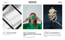
The best websites implement contrast to achieve numerous effects. Take a look at this T-shirt store website template which uses various forms of contrast to direct the visitor’s eye, particularly to the calls-to-action. “The designers created a contrast between the very neutral background of white and a very high-level, edgy, neon green,” says Yiftach. “They use the green to emphasize or highlight what they want.”

04. Alignment
Alignment means the arrangement of elements along an axis. This principle of design helps create order and organization within a composition. You can use it to improve readability and create a path for the eye to follow, making information easily digestible and the overall design more professional and polished.
Our designers use alignment in this branding portfolio website template to create a natural reading flow and to make the minimalist composition more dynamic. The studio name on the left aligns with the body text below it, creating a strong vertical axis that's easy on the eyes and suggests a well-thought-out structure. The right-aligned headline balances out the composition and ties the two halves of the fold together.

05. Movement
Movement is a design’s ability to guide the viewer’s eye around the piece. It's about creating a visual flow that directs attention to different elements in a design, often leading to a focal point.
Movement helps grab attention and make a design more dynamic, Yiftach says. He points to the design below, which his team created for Wix’s Instagram. “We chose handwritten typography lettering to make the image dynamic,” he explains. “You can see that the flow of the elements creates a sense of movement.”
In web templates, movement makes the page feel easy to follow. It guides visitors step by step, showing them what to look at first and what comes next. A strong sense of movement keeps people interested, helps them absorb information without effort and points them toward the most important parts of the page like a call-to-action or sign-up form.
06. Scale
Scale in design is essential for establishing visual relationships and setting the design's overall tone. It adjusts the viewer's perception of space and importance, guiding their gaze to where designers want it most. When scale is manipulated alongside color, texture and shape, it can transform a simple design into a compelling narrative.
This brand book website template uses scale to create visual interest and guide the user’s attention through the hierarchy of information. Key photos span entire folds, standing in stark contrast to the smaller product snapshots. These large images become the central focus, capturing the eye and highlighting their significance. Moreover, the scale of the visuals gives them a lifelike quality, underscoring the brand’s dedication to authenticity—it uses natural ingredients to enhance the user’s innate beauty.

07. Proportion
While scale determines the size of elements in relation to a standard or expected size, proportion refers to the relationship in size between elements within a composition. Properly applied, proportion creates a sense of unity, balance and aesthetic harmony in a design.
In this graphic, our designers have skillfully employed proportion to create a clear message hierarchy while maintaining a balanced and attractive visual arrangement. Making the word “do’s” proportionally larger than the word “don’ts” implies that it’s more important to pay attention to the former than the latter.
Despite "accessible design" being the overarching theme, the phrase "Do’s & Don’ts" is deliberately magnified. This isn't just a matter of aesthetics but a calculated move to capture the viewer's interest; these terms are action-oriented and dynamic, promising practical advice that readers typically find more engaging.
08. Emphasis
Emphasis entails making an element of your composition different from the rest of the composition so that it stands out. You can emphasize elements by making them different sizes, colors or shapes from the rest of the composition, or by giving them less or more white space. Emphasis creates hierarchy and focuses viewers on what you want them to see.
“Emphasis is like when you highlight a line of text,” says Yiftach. “It’s trying to put the attention of the viewer on what you want them to look at.”
While learning about the principles of design, you may encounter The Elements of Graphic Design. This design bible states that a “lack of dominance among a group of equally-weighted elements forces competition among them. Readers must then discover their own entry point, which is a chore.” In other words, emphasizing elements of your compositions makes them easier for viewers to comprehend.
In the graphic below, the designer used a different font and color to emphasize the words “cyber attack.”
09. Hierarchy
Hierarchy in design is all about organizing visual elements to show their order of importance. It's a crucial tool for guiding viewers' attention to what matters most. Without a clear hierarchy, everything in your composition might seem equally important, which can be overwhelming or confusing. Hierarchy helps in laying out the elements in a way that naturally tells the viewer where to look first, second and so on.
In web layouts, you can use hierarchy to create structure and enhance readability. The title, typically in the largest font, grabs attention and sets the context. The subheading, slightly smaller, guides readers into the subject, offering a bridge between the title and the more detailed body text. The body text, typically the smallest font, is where the main content lies. This structure helps make the content more skimmable and provides the reader clarity and context before they dive into the body text.
Size isn’t the only way to establish hierarchy. “When you use Portrait Mode to take a picture on your iPhone, you’re creating a hierarchy by blurring the background elements to focus on the subject,” says Yiftach. “Or, when you’re dealing with copy, you’re going to make the main thing you want people to read bigger or bolder.”
Color and position play key roles in establishing hierarchy, too. Using high-contrast colors for key text or icons can make them stand out. In web design, positioning critical elements 'above the fold' (the part of the web page that’s visible without scrolling) ensures they are seen first. These techniques help in creating a clear and effective hierarchy, making the design not only aesthetically pleasing but also easy to navigate and understand.
In this video, Wix’s designers use size, contrast and motion to establish a hierarchy. “We put the artist’s name in large, capital letters to indicate that it’s the top of the hierarchy, but then we used animation and the black shape to emphasize the URL so it’s the second thing viewers notice,” explains Yiftach. In establishing this hierarchy, the designers first inform viewers of the topic of the video, then direct them to the desired action—visiting the website.
10. Rhythm
In design, rhythm is the visual flow and movement created by the repetition or alternation of elements. It’s a principle of design that helps establish a sense of order, continuity and harmony
You can use rhythm to make intriguing patterns, as seen in this dynamic Instagram post graphic. This design creates rhythm by repeating shapes but alternating their sizes. We see spheres and cubes in both small and large iterations. The size and placement of the central sphere create hierarchy, while the arrangement of the shapes around it guides your eyes around the composition. The undulating colors and fingerprint-like patterns inside the shapes make the elements feel like they’re pulsating to the rhythm of music.
11. Unity
Unity is the cumulative result of how different elements work together. In a unified design, each item holds a deliberate place and purpose, contributing to a comprehensive whole without superfluous or random details. Achieving unity means crafting a design that is cohesive, harmonious and balanced, which can solidify the visual hierarchy and brand identity.
In the realm of website design, unity is key to delivering information in a visually appealing manner. Take, for instance, this wedding website template. It's a masterclass in unity, with each element—from the delicate typography to the pastel-pink color scheme—carefully curated to reflect elegance and romance.

Related reading: Expert tips for picking your website images
12. Space
Space, as a principle of design, refers to the area around, between or within elements in a composition. It plays a vital role in determining a design's effectiveness and aesthetic appeal.
There are two main types of space in design:
Positive space: The area that the main subjects of your composition occupy. For instance, in a portrait, the area that the person inhabits is the positive space. It's the focal point that draws the viewer's attention.
Negative space: The area within a composition that is void of visual elements. Far from being dead air, negative space is an active and integral part of design that increases the effectiveness, clarity and visual appeal of a composition. “Think about it this way,” says Yiftach. “When reading, it's not just the letters that your eyes process, but also the space surrounding them.”
In this accessories store website template, negative space helps viewers focus on the products on display and gives each colorful tote bag breathing room. Though it’s often referred to as “white space,” negative space is any type of website background, whether it’s a pattern, a color or even an image.

13. Repetition
Repetition refers to the repeated use of certain elements—such as shapes, colors, textures, lines or patterns—within a composition. This principle can create unity in a composition, reinforce a brand identity or strengthen the visual narrative of a design. Think of how using the same pattern for tiles in different rooms can create a sense of predictability, making the home more comfortable and consistent.
In this beauty salon website template, the repetition of black diagonal stripes invokes movement and establishes a rhythm. This guides the viewer’s eye across the page and imbues the design with a sense of energy.

14. Proximity
Our final principle of design is proximity, which has to do with how elements are grouped. It involves placing elements that have a connection near each other, creating a visual relationship and improving the organization and clarity of a design. Proximity helps guide the viewer's understanding of the relationships between different parts of a composition. It’s also a foundational principle of Gestalt theory.
Proximity plays an important role in this Instagram post announcing alternative top-level domains (TLDs) on Wix. First, the proximity of the word “pop” to the TLDs shows that the elements are related and should be read together. The proximity of the TLDs to each other presents them as interchangeable options. By placing the TLDs so close together, the graphic conveys a message while keeping the focus on the center of the page for a composition that pops.
Principles of design FAQ
What are all the main principles of design?
The main principles of design are balance, contrast, emphasis, unity, rhythm and proportion. Achieving visual harmony involves distributing elements evenly (balance), creating visual interest through differences (contrast), highlighting focal points (emphasis), ensuring coherence and consistency (unity), establishing a visual flow (rhythm) and maintaining proportionate relationships among elements. Adhering to these principles enhances the aesthetic appeal and effectiveness of design across various mediums including art and website design.
Principles of design: a definition
Principles of design are fundamental guidelines governing the arrangement and organization of visual elements in art, graphic design and other creative disciplines. Following these principles helps artists and designers create aesthetically pleasing and effective compositions, fostering visual harmony and communication.


