- Jenna Romano

- Sep 23
- 19 min read
Updated: 6 days ago
Ready to let your work shine? Build your portfolio →

Many artists turn to social media to share their work, but fixed layouts can limit how it’s experienced. A better option is to make a website or create an online portfolio that reflects your personal style. This way, you control how your art is presented and who sees it—whether that’s curators, galleries or potential collectors. In fact, 48% of freelancers report finding work through their own website or portfolio, showing that a well-crafted portfolio can directly lead to new opportunities and clients.
In the words of pop artist Romero Britto, “art is too important not to share.” Hanging your work in a gallery or sharing it online has always been an essential part of being an artist.
Learn how to make a website from scratch or start using an AI website builder for a quicker setup.

Showcasing your talent should be easy. With Wix’s portfolio builder, you can create a professional, eye-catching portfolio that shows your best work in just a few clicks. Wix’s customizable templates and easy-to-use tools let you present your skills with confidence–leaving a lasting impression on anyone who visits your site.
TL;DR: art portfolio examples
We’ve handpicked these art portfolio website examples for their standout design, smooth navigation and ability to reflect each artist’s unique voice. Each one shows how a polished online portfolio can showcase your work, build credibility and help you connect with clients, collaborators or collectors.
Here’s what we looked for when choosing the examples:
Striking visuals that instantly capture attention.
Easy navigation with clean, intuitive layouts.
Artist personality that highlights the creator’s style and medium.
Portfolio presentation using galleries, project pages or categories to display work.
What each example brings to the table:
Creative, industry-focused design choices tailored to different art disciplines.
Strong personal branding with thoughtfully selected templates and layouts.
Audience-friendly features like contact forms, social links and artist bios.
Online art portfolio tips for every type of artist
Type of art | Portfolio tips |
|---|---|
Painting and drawing | Use high-quality images with natural lighting. Add close-ups so viewers can see textures and details. Group works by series or theme to show growth and consistency. |
Photography | Organize photos into clear projects or categories. Add short captions with context or technical details. Keep the site layout simple so the images are the focus. |
Sculpture and 3D art | Show each piece from multiple angles. Use videos or mockups to give a sense of scale. Explain your choice of materials and techniques to add depth. |
Digital art and design | Display your work in real-world settings like posters, apps or websites. Highlight different styles to show versatility. Share short process notes or sketches to reveal how you work. |
Animation and video | Feature short clips or a highlight reel. Use a strong thumbnail image for each project. Mention your role, the software you used and any collaborators. |
Performing arts (dance, theater, music) | Share performance recordings and behind-the-scenes clips. Add testimonials or reviews when possible. Include a bio that highlights your training and recent work. |
Literary arts (poetry, fiction, scripts) | Present polished excerpts or sample pages. Link to published work or performances. Organize content by genre or project for easy navigation. |
Mixed media and installations | Include both wide shots and detail photos. Use video tours to capture scale and atmosphere. Write a short story or concept note for each piece. |
Folk and traditional arts | Share process photos to highlight craftsmanship. Add cultural or historical background. Show how your work connects to community or tradition. |
14 best art portfolio examples
To inspire you, we’ve hand-picked these outstanding examples to help you create an online art portfolio with Wix. Whether you’re ready to kickstart your artistic career or just want a beautiful online space to share your art with a wider audience, take note of the smart tools and features used in these best websites so you can implement them to your own site.
01. Multidisciplinary artist portfolio: Jessie Maxwell Bearden
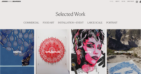
You know how the saying goes: less is more. Well, in the case of Jessie Maxwell Bearden, more is more. Jessie’s art portfolio is full of flair, starting with the animated self portrait on her homepage - an exciting image which reflects her work as a multidisciplinary artist.
With all its charm and cheekiness, Jessie’s site is balanced with good design and consistency. She chose an easy-to-read font, conversational language and a straightforward navigation menu - all elements that will create a friendly user experience.
Pro tip: Connecting an Instagram feed to your site, like Jessie does, is a fantastic way to feature more images of your work, gain followers and make sure that your site is always up-to-date.
Bold, visual-first homepage that instantly highlights signature artwork
Seamless project storytelling through parallax galleries and crisp text overlays
Integrated press features and brand collaborations, reinforcing authority
Minimalist navigation with clear CTAs for inquiries, commissions and portfolio access
Inspired? Here’s the exact Wix template behind this art portfolio:
Template name: Minimal layout website template
02. Personal brand portfolio: Lissa Brandon

Lissa Brandon’s art portfolio starts out with a bold and beautiful splash page that is highly representative of her tangible works. As we enter into the site, an organized gallery of projects is accompanied by a parallax background and micro-animations—the perfect way to engage visitors with her work.
A dark color scheme is reflective of Brandon’s sophisticated and bold art, setting the right tone for encountering her. Using a variety of typefaces, white text and neon highlights makes for a lively and captivating design and allows Brandon to emphasize in all the right places.
Bold splash page that instantly showcases Brandon’s signature aesthetic
Cleanly organized galleries with subtle animations that enhance viewer engagement
Dark refined palette and varied typography emphasize sophistication and visual drama
Clear CTAs lead visitors to deeper works, exhibitions and contact—streamlined for ease
Inspired? Here’s the exact Wix template behind this art portfolio:
Template name: Start from scratch website template
Editor’s note: Don’t be fooled by the blank canvas—this template is where the magic starts. With Wix, starting from scratch means full creative freedom. Drag, drop and design every detail exactly how you want it. Whether you're building a sleek portfolio, a powerful storefront or a one-of-a-kind brand site, this template gives you total control to bring your vision to life—no limits, no distractions.
03. Curatorial portfolio: Art for all spaces

The Art for All Spaces website welcomes visitors with a clean homepage that feels as curated as the exhibitions it promotes. Bold text overlays and soft, layered images set a thoughtful, professional tone, inviting audiences to explore a world where artists, collectors and corporations connect.
An intuitive layout guides you from artist profiles to upcoming exhibitions, with crisp visuals and simple hover effects that keep the experience dynamic. A neutral color palette paired with gold accents creates an elegant backdrop, letting the artwork shine without distraction.
Gallery-inspired homepage featuring bold headers and layered imagery to set a curated tone
Intuitive navigation guiding visitors through Artist profiles, Exhibitions and About with ease
Visual-first design with hover effects and polished imagery that reflect professionalism and creativity
Strategic CTAs encourage artist submissions, corporate inquiries and collector connections, making engagement effortless
Inspired? Here’s the exact Wix template behind this art portfolio:
Template name: Strip header layout website template
04. Museum and gallery portfolio: Waterloo Center for the Arts
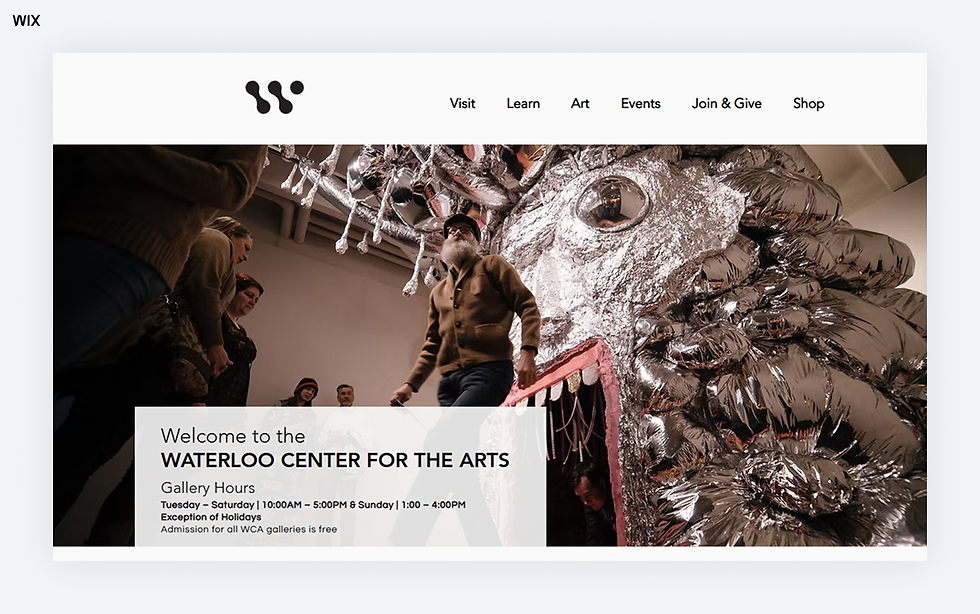
Waterloo Center for the Arts welcomes visitors with a striking hero image and bold headline that immediately capture the energy of its diverse collections. Clean grids, vibrant artwork and a warm color palette create the feeling of stepping into a living gallery highlighting everything from Haitian masterpieces to Mexican painting traditions.
Scroll down and each section unfolds like its own exhibition room. “Current Exhibits” spotlights rotating shows with vivid visuals while “What’s Happening?” and “Artist Receptions” keep the experience lively with performances, talks and festivals. Elegant typography and subtle motion keep the art front and center reflecting the center’s mission to inspire, connect and celebrate creativity across cultures.
Gallery-inspired homepage with a striking hero image and layered visuals that capture the vibrant energy of international and folk art
Intuitive navigation menu featuring learn, art, events, join & give and shop for easy exploration of programs and exhibits
Dynamic exhibition timeline showcasing rotating shows with dates details and featured artworks for a curated viewing experience
Integrated ecommerce shop offering art-inspired merchandise and gifts to extend the gallery experience beyond the visit
Inspired? Here’s the exact Wix template behind this art portfolio:
Template name: Yoga studio website template
05. Advisory portfolio: Riggs Art Consultants

Riggs Art Consultants’ website is a polished example of how to present a professional art portfolio with purpose and clarity. This site highlights the firm’s expertise in curating art programs for businesses, blending creativity with strategic planning. The design is clean and professional, reflecting the company’s commitment to delivering tailored art solutions.
This one-page website is perfect for showcasing an art portfolio or inspiring businesses to integrate art into their spaces with a clean, visually focused design and practical insights.
The homepage immediately communicates the firm’s focus on turning spaces into experiences through art
A dedicated section outlines their three-stage process—Discover, Design, Deliver—making their approach transparent and client-focused
Profiles of team members add a personal touch, building trust and credibility
Quality images of past projects show off the impact of their work, inspiring potential clients
Inspired? Here’s the exact Wix template behind this art portfolio:
Template name: Consultant landing page website template
06. Art acquisition portfolio: CMHO
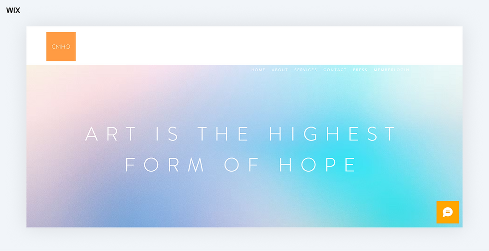
CMHO Fine Art’s website welcomes visitors with a serene, minimalist home screen that feels like entering a refined gallery space. A thoughtful blend of neutral tones and clean typography sets an elegant stage for showcasing contemporary works. A quiet hero image and spacious layout let carefully selected visuals breathe, allowing the art to immediately take center stage without interruption.
Simple navigation leads you to “About,” “Services” and “Contact,” each section neatly arranged for effortless browsing. The “About CMHO” page introduces Christina May Ho’s global expertise, from Christie's Auction House to the Venice Biennale, highlighting her mastery in curating blue‑chip and local Hawaiian art. The site feels polished yet personal, with subtle visual cues and a refined structure that reflect CMHO’s dedication to thoughtful art curation and bespoke client service.
Statement-making homepage built around simplicity and restraint, letting fine art visuals quietly anchor the experience
Bespoke curation positioning emphasized through client services and a personal curatorial statement, giving the consultancy a human voice
Location-forward storytelling bridges Hawaiian and international art markets, with clear nods to place and cultural connection
Integrated artist features present select projects without overwhelming the visitor, balancing exclusivity and accessibility
Inspired? Here’s the exact Wix template behind this art portfolio:
Template name: Art exhibition website template
07. Art gallery portfolio: Saratoga Pop Shop
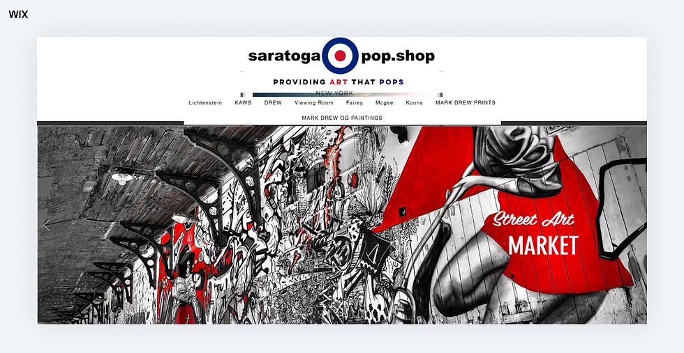
Saratoga Pop Shop delivers a vibrant online experience that mirrors the energy of its urban pop art offerings. The homepage greets visitors with bold visuals and dynamic typography, setting the tone for a curated journey through contemporary street and pop art. The site features a clean layout with intuitive navigation allowing art enthusiasts to explore works by renowned artists such as KAWS, Shepard Fairey and Barry McGee. Each piece is presented with detailed descriptions and pricing ensuring a seamless browsing experience.
Saratoga Pop Shop also maintains a physical space in Saratoga Springs NY, where they host inventory shows and engage with the local art community. Their commitment to both online and offline interactions underscores their dedication to connecting collectors with exceptional art. Whether you're a seasoned collector or a newcomer, the shop offers a diverse selection of artworks that cater to various tastes and preferences.
Playful, collector-friendly tone makes the site feel approachable for both seasoned buyers and casual pop-art fans
Clean product pages focus on art storytelling, with artist bios, edition info and clear availability status
Simple, no-frills navigation prioritizes shopping, events and inquiries without extra fluff
Local-meets-global positioning by balancing street art legends with emerging creators and regional shows
Inspired? Here’s the exact Wix template behind this art portfolio:
Template name: Urban art store website template
08. Art services portfolio: State of the Art
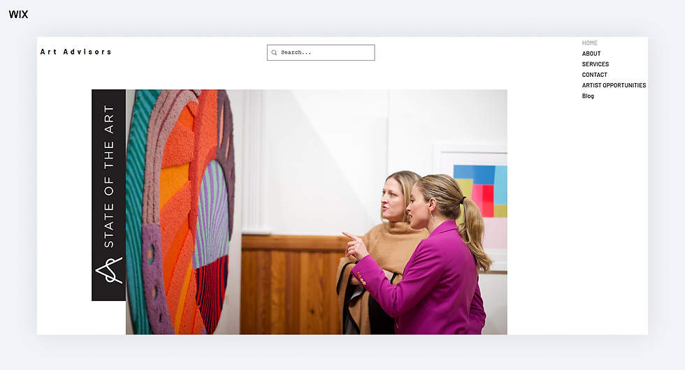
Sota Collection’s website opens with a sleek and modern homepage that immediately sets a refined and curated tone. Clean lines and a minimalist design give the site a gallery-like atmosphere, where each artwork and collection feels thoughtfully presented. The muted color palette allows the pieces to stand out, while smooth transitions and subtle hover effects keep the browsing experience engaging and effortless.
As you navigate through the site, well-organized sections guide you from featured collections to artist profiles and detailed product pages. Crisp typography and ample white space create an airy, sophisticated feel that invites visitors to explore without distraction. The overall design strikes a perfect balance between elegance and approachability, making it easy to discover and connect with the art.
Collector-first experience built around showcasing investment-worthy contemporary works alongside emerging talent
Direct inquiry system over traditional e-comm, encouraging personal relationships between buyers and the gallery team
Balanced mix of established and under-the-radar artists, giving the site fresh discovery value for serious collectors
Editorial-style presentation with thoughtful image pairings and story-led captions that feel more magazine spread than online shop
Inspired? Here’s the exact Wix template behind this art portfolio:
Template name: Art community website template
09. Art matchmaking portfolio: Art Match

Art Match’s website opens with a clean, inviting homepage that immediately sets a tone of thoughtful curation and personal connection. The minimalist design paired with elegant typography and subtle animations creates a welcoming atmosphere for art enthusiasts. High-quality images of curated artworks are thoughtfully displayed, allowing visitors to appreciate the pieces' details and craftsmanship.
Clear sections guide you to services like art sourcing, interior design integration and educational resources. The layout is intuitive, making it easy for users to explore and engage with the content. Art Match emphasizes the emotional and social value of art, aiming to connect collectors with meaningful pieces that resonate with their personal tastes and spaces. The overall design reflects a commitment to quality, personalization and a deep appreciation for the transformative power of art.
Positioned as an art concierge service rather than a traditional gallery, emphasizing personal sourcing over mass browsing
Content-light, call-to-action–driven design prioritizes direct contact and consultation requests above endless image galleries
Niche appeal to interior designers and collectors seeking one-of-a-kind commissions and curated finds
Focused editorial voice with storytelling framed around why art matters in personal spaces, not just how it looks
Inspired? Here’s the exact Wix template behind this art portfolio:
Template name: Art school website template
10. Art community platform with portfolio features: Talan TRA
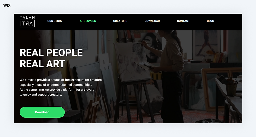
Talan TRA’s website opens with a bold and colorful homepage that captures the spirit of its mission, spotlighting underrepresented creators while connecting art lovers with fresh voices. Vibrant abstract shapes set a welcoming and energetic tone, leading straight into clear sections like “Our Story,” “Art Lovers” and “Creators.” Large headings like “REAL PEOPLE REAL ART” immediately speak to the platform’s purpose and its deeply human approach to art engagement.
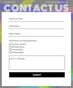
The layout feels like an open canvas—simple intuitive navigation takes you to download options, contact info and a blog that highlights community stories. The “Our Story” section shares a personal origin rooted in gallery visits turned digital advocacy, creating real emotional connection. Clean typography and spacious spacing allow the powerful story and mission to breathe, making the experience feel purposeful welcoming and easy to explore.
Built like a digital gathering space where creators and collectors meet through curated stories, events and direct outreach
Emphasis on creator advocacy, with clear calls for submissions and opportunities to amplify emerging voices
Mobile-forward experience, with app download prompts woven naturally into the browsing flow
Bold, unapologetic tone expressed through typography, slogans and mission-led messaging designed to energize community engagement
Inspired? Here’s the exact Wix template behind this art portfolio:
Template name: App landing page website template
11. Fine artist portfolio: Art Dimensional Studio
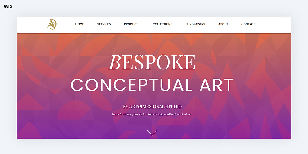
Art Dimensional Studio’s website welcomes visitors with a clean, modern homepage that feels like stepping into a thoughtfully curated creative space. A muted palette of soft neutrals and warm accents sets a calm, inviting tone, while bold imagery highlights the studio’s dimensional artworks. Elegant typography and generous spacing give each element room to breathe, with subtle hover effects adding quiet movement throughout.
The site is structured in a clear, approachable way. Visitors can explore sections like “Portfolio,” “About,” “Process” and “Contact,” each designed with crisp visuals and concise copy that showcase the studio’s work and story. The “Portfolio” section puts the focus on striking sculpture and mixed-media pieces, allowing the artwork to take center stage. The entire experience feels polished, personal and perfectly in tune with the studio’s creative identity.
Portfolio-first design that prioritizes artwork imagery over text, letting dimensional pieces lead the user experience
Commission inquiry emphasis with clear, dedicated prompts for custom projects, signaling a studio open to bespoke work
Simple homepage layout delivering immediate access to galleries and contact options without unnecessary filler
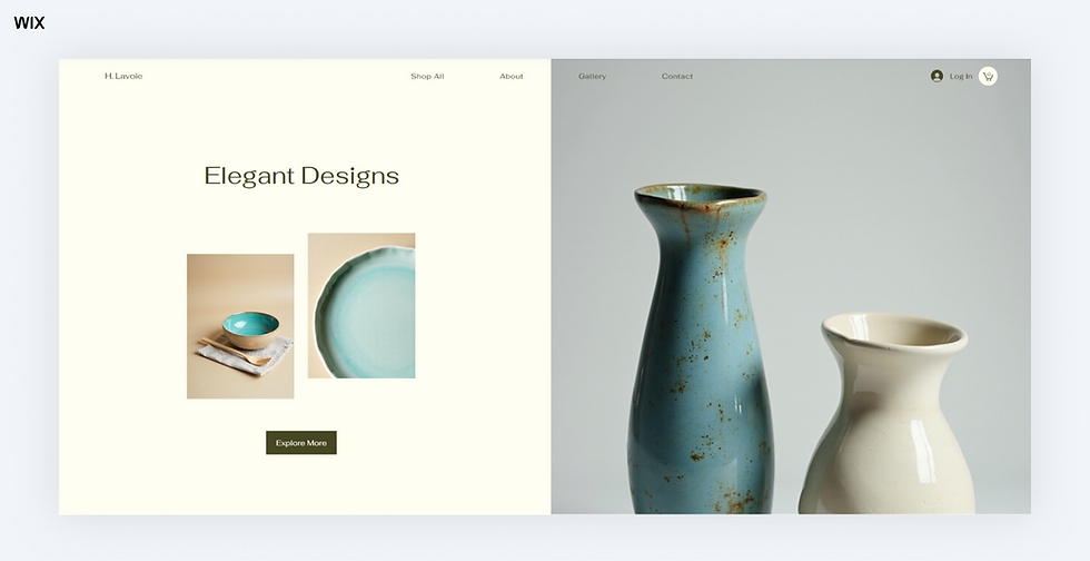
Refined, product photography approach — large, high-resolution shots styled on neutral backgrounds to highlight form, texture and material
Inspired? Here’s the exact Wix template behind this art portfolio:
Template name: Ceramics studio (unique) website template
12. Art curation and exhibition portfolio: Passion Limes

Passion Limes’ site opens with an energetic, creative homepage that feels like stepping into a vibrant artist’s studio. Bold typography and vivid color accents blend with a minimalist layout to showcase its dual role as spiritual healer and art dealer. Clear headings like “What is the life you’re creating?” frame the experience, inviting visitors to explore offerings—from art sourcing with private collectors and designers to spiritual guidance—all thoughtfully organized for a personal feel.
The structure is sleek and intentional. Users can dive into different sections each presented with concise copy and clean design that reflect professionalism and purpose. Subtle interactions and smooth visuals add warmth without distraction.
Concept-driven art platform positioning itself as a creative movement rather than a conventional gallery
Event-centered experience promoting pop-up exhibitions and immersive shows as the core of the brand
Clean, editorial-style layout with bold typography and direct messaging designed to spark curiosity and reflection
Minimal, focused navigation guiding visitors quickly to Concept, Events, FAQ, Portfolio and Contact, with no filler or excess
Inspired? Here’s the exact Wix template behind this art portfolio:
Template name: Art community website template
13. Nomadic art gallery portfolio: Detox Gallery

Detox Gallery’s site launches with a bold, nomadic vibe that speaks to its mission of spotlighting emerging artists from marginalized communities. Vibrant hero visuals and strong typography create an immediate sense of movement and purpose. The homepage acts like a curated popup exhibition space—with clear sections highlighting upcoming shows, wellness events and artist groups—making it easy to grasp the gallery’s unique rotating‑venue approach.
The layout is energetic yet clean. Organized panels guide visitors to learn about the gallery’s story, mission and represented artists. Minimal copy and thoughtfully spaced text give the message room to land, while subtle visuals underline Detox’s identity as AAPI‑led, femme and LGBTQ‑focused. The design feels modern, inclusive and action‑oriented—perfectly aligned with their goal to democratize gallery access and build authentic creative community.
Narrative-driven site structure designed to tell the brand’s story through shows, artist features and mission highlights
Clear emphasis on cultural identity and community activism, woven naturally into exhibition announcements and artist profiles
Compact, mobile-friendly design that mirrors the pop-up, anywhere-anytime nature of their physical events
Warm, activist-leaning brand voice expressed through slogans, headings and curation language that invites participation, not just viewership
Inspired? Here’s the exact Wix template behind this art portfolio:
Template name: Art store website template
14. Artist and educator portfolio: Mizz Conchi
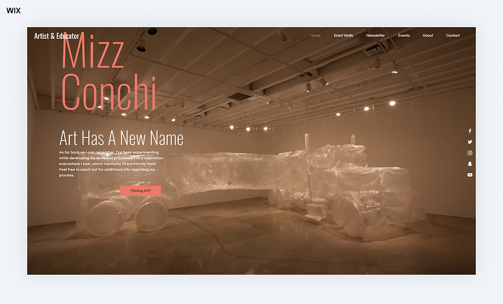
Mizz Conchi’s website feels like stepping into a bold and empowering creative studio. Vivid visuals and confident typography greet you front and center, capturing the spirit of the brand’s work in beauty, fashion and lifestyle. A clean, modern structure paired with punchy color accents allows Mizz Conchi’s personality to shine through from the very first glance.
Every section is laid out with clarity and intention. Crisp images of her projects are supported by short, spirited captions that feel personal and engaging. Interactive touches, such as hover cues and subtle transitions, bring the site alive without distracting from the main focus: her work and message. The end result is a refreshing blend of professionalism and warmth—inviting, creative and absolutely in tune with Mizz Conchi’s vibrant brand.
Collaboration-driven platform designed to attract beauty and fashion partners through clear services, contact prompts and social integrations
Project-focused portfolio structure, highlighting diverse work across editorial, commercial and influencer campaigns
Vibrant personal brand voice carried through captions, CTAs and visual pairings, giving visitors a sense of the person behind the work
Streamlined, mobile-friendly experience built for on-the-go browsing, perfect for PR reps, agencies and potential clients
Inspired? Here’s the exact Wix template behind this art portfolio:
Template name: Modeling agency website template
What should I include in my art portfolio?
On top of showcasing images, an online portfolio (whether its an art or other type of website, such as a model portfolio) allows you to share valuable information such as your CV, artist statement, available works, digital illustrations and press reviews—giving you the online real estate you need to present the full picture.
Once you choose an online portfolio website template as part of updating or you're still learning how to make a website, you’ll have everything you need to get started on your own. As you progress with your portfolio web design, here are a few pages you should consider adding to your website that will elevate it and make your portfolio a successful tool for selling and promoting your work:
Image galleries to showcase your work (use high quality photos).
An About page to provide further insights into your professional background, inspirations and work process.
An online store that will let eCommerce features facilitate quick and easy purchases of your work.
A CV to provide visitors with an overview of your educational and professional background.
A press page, if relevant, to show off critiques and reviews about your work and artist interviews.
An art blog to share your fresh ideas, artistic point of view and simply inspire visitors.
Learn more: What to include in a portfolio

How do I make an art portfolio?
Creating an art portfolio is all about showcasing your best work in order to win more commissions and paying projects. Here's how you can go about creating the best one:
1. Choose your best work: Start with the pieces that make you proud. Your portfolio should reflect your skills, style and range through your strongest work. For variety, include different types of pieces like digital illustrations and traditional oil paintings if you work in multiple mediums. If your art has themes such as conceptual minimalism or classical influences, group your pieces in a way that enhances their impact. A thoughtful selection of high-quality pieces beats an endless scroll of every project you’ve done.
2. Pick an online platform: Now that you have curated your artwork, it’s time to pick a website builder that best suits your goal of displaying your pieces. When it comes to showcasing your art portfolio, drag and drop website building platforms like Wix offer portfolio templates and tools that cater to the needs of an artist's portfolio.
3. Add contact info on every page: Make it easy for someone to reach you the moment they fall in love with your work. Include your email, social media links (or both) and place them on every page. Investing in a business email and business phone number is an easy way to elevate your professional presence. The footer or header are great spots to keep this info consistent and accessible. If you’re creating a physical portfolio, be sure to slip in a sleek business card or include a printed contact sheet in the folder.
4. Organize your work with intention: Think about the flow of your portfolio. Should it be divided by medium (for example, oil vs digital), series or project? Whatever makes your work easier to follow. Use high-quality photos or scans for digital displays and add titles, mediums and the year the artwork was created. If you want to provide more context, include short descriptions or a note about what inspired each piece. These little details can help viewers connect to your work on a deeper level.
“Your portfolio is your handshake before you even meet someone. It should feel personal, polished and easy to navigate. Take the time to present your work like you'd want it remembered.” - Chaya Arbiv, SEO specialist at Wix
5. Keep your portfolio fresh and polished: A portfolio isn’t something you create once and leave alone. It grows as you evolve as an artist. Be sure to update it regularly with new work and don’t be afraid to swap out older pieces if they don’t align with your current style or skill level anymore. Think of your portfolio as a living, breathing catalog of who you are now as an artist.
6. Ask for feedback and keep improving: Before you share your portfolio widely, get a second opinion. Reach out to other artists, friends or even online art forums for constructive feedback. Sometimes a fresh set of eyes can spot things you may have missed like confusing layouts or unclear text. Adjust accordingly and know that even minor tweaks can make a huge difference.
Learn more about how to make an art portfolio.
How long should my art portfolio be?
According to Sharon Hafuta, SEO blog editor at Wix,
“Your portfolio isn’t about quantity — it’s about impact. I’d rather see five unforgettable pieces than twenty that feel like filler. Curate with intention and let your strongest work lead the conversation.”
Remember that the internet is still growing, with more and more people using it every day. This means that there's a large and growing potential audience for your portfolio.
The length of your art portfolio depends on your experience, the type of work you do and the specific requirements of the job or opportunity you are applying for. In general you can divide art portfolios into two main types:
A beginner portfolio can be 5-10 pieces showcasing your best work and your range of skills.
A more experienced artist may have a portfolio of 15-20 pieces that demonstrate mastery of various styles, techniques and mediums.
Regardless of length, the most important factor is quality. Make sure every piece is polished, clearly represents your style and is relevant to the type of work you're looking for. Don't be afraid to streamline your portfolio – less is often more.
Learn more: Writing portfolio examples
What's the best platform or builder for art portfolios?
When it comes to choosing a website builder to build your art portfolio there are a number of features you'll want to focus on.
Customizable portfolio templates, that help you make a professional and creative portfolio easily.
Ease of use, including drag and drop functionality, this means you can create an art portfolio without coding or design knowledge.
In-build analytics and SEO tools are also a plus, as they allow you to optimize and promote your site without having to source other tools.
Social media platform integrations are also a plus, especially if its important for you to share your art work on social media too.
Robust website infrastructure is a must, this usually means advanced security for your site, reliable and secure web hosting and strong website performance.
Learn more: Best mobile website builders
Best art portfolio examples FAQ
How to market an art portfolio?
Leverage social media platforms like Instagram, Twitter or TikTok to share your artwork regularly and use hashtags to expand your reach. Participate in online art communities, forums or local exhibitions to connect with other artists and art enthusiasts. Networking—whether online or in person—is key to getting your portfolio in front of the right audience. Additionally, include your portfolio link in your email signature, on business cards and in résumés for greater visibility. Tailor your outreach efforts toward galleries, brands or clients that align with your artistic style.
How to present an art portfolio online?
Design a layout that’s clean, user-friendly and visually engaging. Your portfolio should guide visitors seamlessly through your work, starting with standout pieces that represent your best efforts. Use neutral backgrounds to keep the focus on the art and offer clear navigation for easy browsing. Highlight your most significant projects, adding context about your process or story behind the work. Keep the interface responsive and functional across devices, and ensure loading times are fast to maintain the attention of your audience.
What to avoid in an art portfolio?
Avoid overwhelming the viewer with too many pieces—quality over quantity is key. Exclude unfinished work (unless it adds value to show your process) or projects that don’t represent your current skill level. Avoid using inconsistent formatting or messy presentations, as they can distract from your work. Lastly, steer clear of clichés or generic pieces that don’t show your unique perspective or artistic voice.
What should an online art portfolio look like?
An online art portfolio should be clean, visually appealing and easy to navigate. It should showcase your best and most relevant work, organized into clear categories or galleries that reflect your unique style and expertise. Include brief descriptions or case studies for each piece to provide context, such as your role, the process and the outcome.
Should I make a website for my art portfolio?
Creating a website for your art portfolio is a great way to establish a professional online presence and make your work accessible to a wider audience. A website allows you to customize the layout, branding and user experience to reflect your artistic identity. Your work becomes accessible to a global audience, giving you a dedicated space to share galleries, tell your story or even sell your art.


















Comments