- Yoon Jeong Cho

- Nov 25
- 16 min read
Updated: 3 days ago

Whether you focus on hair, skincare or makeup, a well-designed website is an essential asset for building your beauty business in today’s dynamic industry. With online channels expected to account for nearly 30% of the global beauty market by 2030, having a strong digital presence has never been more important.
If you’re learning how to create a website for your beauty brand, choosing the right website builder is a key first step. One of the best ways to get started is by exploring successful beauty website examples. In this article, we’ll showcase top beauty websites made on Wix along with other standout beauty websites, giving you creative ideas to craft a site that stands out and drives results.
Create a beautiful, professional site with expert beauty website design.

Need inspiration for your website? With Wix, building a standout site is easier than ever. Choose from hundreds of customizable templates and use Wix’s easy drag-and-drop website builder tools to make your vision come to life. Turn your ideas into reality and see just how simple it is to create a unique, professional website.
TL;DR: best beauty website examples
This article showcases outstanding beauty websites that excel in design, user experience and branding. These examples highlight how local spas, cosmetic brands and wellness coaches create engaging online experiences to attract and retain clients. The table below shows the criteria we used to select the best websites, focusing on creativity, usability, aesthetics and credibility.
Criteria | Description |
Design & aesthetics | Clean visually appealing layouts that reflect the brand’s style. |
User experience (UX) | Easy navigation, clear calls to action and mobile-friendly design. |
Services & products | Effectively showcases offerings with detailed information and visuals. |
Credibility | Includes trust signals like reviews, certifications or professional credentials. |
Innovation | Unique features like booking integrations, interactive tools or educational content. |
15 best beauty websites built on Wix
When you learn how to make a professional website, we recommend exploring the best beauty websites to gain inspiration. Review these 15 best beauty websites below to gain a better understanding of website design and learn what website features to implement on your own. The following examples, all made on Wix, demonstrate how a well-crafted beauty website can elevate your brand in today’s competitive digital landscape.
01. Pacific Brides

Pacific Brides makes a beautiful first impression with its elegant fonts, vibrant colors and a friendly pop-up that invites you to request a personalized quote for hair and makeup. This beauty website uses parallax scrolling to instantly draw you into lively images of real brides, celebrating adventure elopements and the uniqueness of every client. The professional photo gallery and “Our Brides” section show off the team's creativity and skill, while giving you a peek into the diverse destinations and happy moments Pacific Brides helps create. This gives every bride the confidence to dream big for her big day.
Love what you see? Create your own beauty website using this same template.
Template name: Makeup artist website template
Read more: What is a website?
02. Sierra and Sage

Sierra and Sage was started by hair stylists who wanted to celebrate natural beauty and shake up the hair extension scene. If you’re looking for a beauty website example that really connects, Sierra and Sage is a great pick—the team knows their audience and uses messaging that feels honest and welcoming. Right from the homepage you get the brand’s story and a look at their products, all while seeing promises about quality, fast shipping and ethical sourcing to build trust. The whole site has a friendly, upbeat vibe—just check out their live chat with prompts like “Hey Babe! Let us know how we can help” which instantly makes you feel at ease. Every part of the website’s copy and design shows the brand’s thoughtful personality and proves just how much great content can help a beauty business make a genuine connection.
Love what you see? Create your own beauty website using this template.
Template name: Hair extensions salon (luxurious) website template
03. Sugar and Silk

Sugar and Silk’s website is a seamless blend of elegance and approachability, perfectly capturing the essence of their beauty services. The homepage welcomes visitors with a warm, inviting hero image paired with a clean, modern layout that highlights their offerings. Soft pastel tones and refined typography create a calming atmosphere, while high-quality visuals showcase the results of their expert treatments. To enhance the user experience, the site features an easy-to-navigate menu that guides visitors to learn more about services, pricing and booking options. A dedicated testimonials section adds a layer of trust, with glowing reviews from satisfied clients.
Love what you see? Create your own beauty website using this template.
Template name: Essential oils store (organic) website template
04. Dironnia Beauty

Dironnia Beauty is all about luxury haircare and accessories, and it’s a standout in best website designs because it guides visitors exactly where they want to go. The site greets you with a bold gradient background and a free shipping notice, plus a menu and brand name you can’t miss. The whole experience feels welcoming and makes it so easy to browse their shop, instantly showing off their theme of “the luxury you deserve.”
Love what you see? Create your own beauty website using this same template.
Template name: Wellness shop website template
05. Esthetique Head Spa

Esthetique Head Spa, a London-based Japanese scalp and hair treatment destination, is a fantastic beauty website example for anyone offering specialized services. The design uses a clean layout with a soft color palette that feels both calming and professional, perfectly matching its spa-like offerings. What’s especially smart is how the site clearly breaks down the steps of its unique 75-minute head spa treatment using numbered points and icons making a complex service easy to understand and very appealing. You can learn from their focused approach by using detailed descriptions and strong calls to action like "BOOK NOW" to build customer trust and encourage direct bookings.
Love what you see? Create your own beauty website using this template.
Template name: Spa (sleek) website template
06. Glow by Tomoko

Glow by Tomoko is a beauty website example that makes exploring Tomoko’s skin and beauty treatments simple and welcoming. The layout is clean and inviting, with custom illustrations and real photos that give you an instant feel for the brand. Take a look at the “Meet Tomoko” section—it’s a great way to get to know her story and what inspires her work. Testimonials and press mentions pop up throughout, helping you feel confident in booking your own appointment. You’ll see real results, feel inspired to try the treatments, and appreciate how the site brings together personality, trust and a smooth booking experience.
Love what you see? Create your own beauty website using this template.
Template name: Spa hotel (soft) website template
07. Hair by Ash Nicole

Hair by Ash Nicole immediately highlights Ash’s identity as a global hairstylist and licensed cosmetologist. The homepage keeps the focus on her brand with bold text, clean sections and straightforward navigation that quickly introduces who she is and what she offers. Visitors can explore her work, read about her background and use the “Book with Ash” call to action to request an appointment. One of its most effective features is the clear navigation that divides work into categories like "TV & FILM," "EDITORIAL," and "EVENTS," allowing potential clients to jump straight to the work that matters to them. You can learn from this site’s direct approach by using strong visuals and a simplified menu to guide visitors to your most impressive work.
Love what you see? Create your own beauty website using this same template.
Template name: Musician website template
08. Mahima Med Spa

Mahima Med Spa, a cosmetic clinic in Bradenton, serves as an excellent example of a well-designed beauty website for advanced treatments. The site features a clean, professional layout with a calming color scheme, creating an immediate sense of trust. Notably, services like "Skin Rejuvenation" and "Body Contouring" are clearly categorized, each with a "Learn More" link, making it easy for visitors to find detailed information. You can draw inspiration from this approach by organizing your services into distinct sections with dedicated pages to educate customers and encourage bookings.
Love what you see? Create your own beauty website using this same template.
Template name: Alternative therapist website template
09. The Hair Studio Sherman Oaks
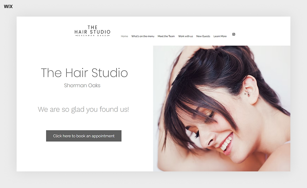
The Hair Studio Sherman Oaks offers a friendly and direct approach, making it a great beauty website for local salons. The website design is warm and personal using bright photos and a simple layout that makes you feel welcome before you even step inside. Its most helpful feature is the dedicated "New Guests" page which walks first-time clients through a simple three-step process to book an appointment and feel comfortable. You can learn from this site's customer-focused design by creating a special section for new visitors to answer their questions and make booking a service feel easy and straightforward.
Love what you see? Create your own beauty website using this same template.
Template name: Home organizer website template
10. Enhanced Clinic

Enhanced Clinic is a beauty and medical-aesthetics center that offers a wide range of services for clients looking to refresh and rejuvenate. Its website features a sophisticated design with high-quality images and a clean layout, creating a luxurious and trustworthy feel. The "Your Enhanced Team" section is a great touch, introducing each professional with a photo and detailed bio. This helps build a personal connection and establishes expertise. You can use this idea on your own beauty website by featuring your team to humanize your brand and build client confidence before they book an appointment.
Love what you see? Create your own beauty website using this template.
Template name: Skincare products company (fresh) website template
11. Rebecca Casciano

Rebecca Casciano is a holistic beauty and wellness coach, and her website serves as an excellent example for coaches and consultants. Right away, you’ll notice the warm, natural photos and earthy colors—there’s this instant sense of calm and balance. What really makes her site shine is how clearly it speaks to women over 40. That focus is front and center, making visitors feel seen and appreciated. It’s a great reminder of how powerful it can be to know your audience and talk to them directly, building real connections and a supportive community.
Love what you see? Create your own beauty website using this same template.
Template name: Coaching professional website template
12. Sandy Xiong Beauty

If you’re searching for bridal hair and makeup that feels both effortless and elegant, Sandy Xiong Beauty is a name to know. This site brings upscale salon vibes straight to you, thanks to a team skilled in on-location services. Browsing the website is a breeze—the clean design and high-quality images let you get a real sense of Sandy’s style, while easy navigation helps you find pages like the Portfolio and Services without any guesswork. It’s also great to see genuine testimonials and a live Instagram feed, so you can peek at happy brides and recent looks. This beauty website shows how a photo-rich layout and clear call-to-action buttons can welcome new clients and make planning your big day a little simpler.
Love what you see? Create your own beauty website using this template.
Template name: Makeup artist website template
13. Tatiana Spa

Tatiana Spa offers specialized spa services like wood therapy and a range of relaxing treatments. Its clean, direct layout is typical of modern pink websites, using a simple black-and-white color scheme with pops of pink for a fresh, inviting feel. A standout design choice is the integrated booking system on the homepage, which lets visitors book services immediately. Take a page from their book by making your own booking process front and center, so clients can easily schedule appointments without clicking through multiple pages.
Be inspired by these purple website examples or these blue website examples for something a little different.
Love what you see? Create your own beauty website using this same template.
Template name: Beauty salon website template
14. Rotella Beauty

Rotella Beauty is a Northern Colorado-based hair and makeup artist specializing in natural bridal looks. The website feels like a chat with a friend, thanks to Danielle’s personal welcome right on the homepage. What makes this site shine is how it talks to anyone who wants to feel confident—but never overdone—on their wedding day. To create a similar friendly approach on your site, use a personal tone and reassuring copy. This will help you connect with your ideal clients and make them feel understood.
Love what you see? Create your own beauty website using this same template.
Template name: Beauty salon website template
15. Amuse Cosmetic

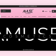
Amuse Cosmetic is a wholesale and retail makeup brand with a vibrant, engaging website. The design features bold colors and an engaging layout that instantly grabs your attention. You’ll also notice how easy it is to explore their site thanks to a well-categorized menu right up top, making it simple to find everything from new arrivals to skincare. A standout feature is the integrated Instagram feed on the homepage, showcasing real customers using their products and fostering a strong sense of community. This site is a great example of how connecting your social media directly to your homepage can provide social proof and highlight your brand’s personality.
Love what you see? Create your own beauty website using this same template.
Template name: Jewelry store website template
Most popular beauty brand websites
In addition to the small businesses mentioned above, you can get inspiration from some of the most popular beauty websites used today.
01. Sephora
As one of the most trendy beauty retail businesses today, it makes sense that iconic Sephora aims for the best kind of website design to represent their online store. Full of vibrance, the site uses a diverse palette that’s put to practically good use. Each category of beauty merchandise is assigned a different color to break apart the most popular must-haves of today.

02. Brown Girl Jane
The fragrance brand Brown Girl Jane is anchored in fine craftsmanship, a brand trait which is perfectly reflected in their well-crafted website copy. The beauty website uses lively descriptions to sell their products, giving personality to their ingredients that will captivate customers who resonate.
03. Ulta
Ulta’s bright color scheme is used as a launching pad for visual enhancement. The orange palette immediately draws to mind vibrant beauty, whether it’s the orange background gradient or pink accents. A “discover” section cleverly engages with visitors, providing trends reports, guides, beauty quizzes and more.

04. Glossier
Being bold and trendy is Glossier’s trademark, as a beauty brand that combines its beauty care with on point and forward thinking branding. Using larger than life photos to set the aesthetic tone for their site, the online shop draws in visitors and encourages them to explore their skincare and makeup collections. To showcase each product at its best, the cosmetic website combines enticing professional imagery with succinct but informative captions and pricing, and using an organized layout for a strong user experience.
05. Kylie Cosmetics
Kylie Cosmetics’ beauty and skin care products are all about pampering their customers. The calm, monochrome palette used to represent Kylie’s growing cosmetic empire puts a diverse range of makeup products in the spotlight. With such a variety of products to speak to individual shoppers, it’s important to make browsing the online store easy. The beauty website does this with an organized menu that uses clear descriptions and a filter system that helps visitors find what they're looking for, making it easy and fun to browse through the plethora of shades and colors.
What are the benefits of having a beauty website for your business?

When starting a beauty business—whether it involves selling cosmetics and hair care products, or providing expert pampering services—having a website to represent your brand has become one of the most important parts of finding success in the industry. (The success story of Natalie Lucas Studio is a case in point).
The best beauty websites serve as a powerful platform to connect with potential customers, showcase products or services, and establish a strong online presence. Here are some reasons why:
Build credibility online
A great beauty website serves as an online ambassador to your beauty brand, promoting your business around the clock, while also acting as a home base to help your customers. Since an increasing number of customers rely on beauty websites to search for products and services, this type of website should help attract more customers. Once it gains more web traffic, a polished and professional beauty site creates a positive first impression, inspiring confidence and trust in future clients.
Stand out from the crowd
In a booming industry like the beauty business, your brand needs to distinguish itself from the rest. A website is one of the best ways to do that, by allowing you to showcase the distinctive qualities of your brand, products, services and knowledge.
"A strong online presence is essential for small businesses. It enables reaching diverse audiences beyond geographical boundaries, enhancing brand recognition and opening up new revenue streams. Embracing digital platforms levels the playing field, allowing small businesses to compete more effectively in a competitive marketplace." - Idan Cohen SEO Growth Specialist at Wix.
Increased sales potential
Whether your beauty website is service based, selling products—or both—allowing online purchases and appointment scheduling can significantly boost sales and revenue. Focusing on website sales can broaden your audience online, while giving already loyal customers more convenient purchasing and booking.
Better business management
A business website, equipped with integrated marketing and management tools, helps support your beauty brand’s growth in a sustainable way. On top of design features to elevate your brand’s visual appeal, you'll have access to a suite of tools that can optimize operations and improve customer engagement—from payment processing and search engine optimization (SEO) to analytics, email marketing, live chats, and online forms.
“Choosing the right website builder isn’t just about comparing specs—it’s about understanding how it actually feels to use. We tested each platform the way a real user would: building pages, booking appointments, customizing templates and navigating setup tools. It’s the only way to truly see which builders deliver value beyond the sales pitch.” - Sharon Hafuta, SEO blog editor at Wix
Connect more with your audience
With a beauty website, you can connect more with customers by providing engaging content such as tips, tutorials, product reviews and special offers. Over time, this can foster a sense of community and loyalty. A website also provides valuable analytics tools and backend data that give insights into customer behavior, such as their shopping frequency, preferred times and popular products. This knowledge empowers you to make informed decisions that enhance customer satisfaction and drive business growth.
Learn more: Salon website examples
What are the components of a beauty website?
Using a website builder is a great way to save time when it comes to how long it takes to build a website. It’s also a cost efficient solution when considering the cost of a website, especially if your blooming beauty business doesn’t have the budget to hire a professional.
But when you find the right website builder, knowing how to plan a website and what to include is one of your next first steps. Whether your intention is to gain an audience or increase sales—or both—each part of a website plays a specific role in helping you reach your goals.
Learn more about some of the best AI website builders for creating a great site, fast.
The best beauty websites combine functional, informational and aesthetic elements to represent the brand behind the business. Below, we’ve listed some of the most important components to consider.
Pro tip: Kick-start your creation process by using a customizable website template that already includes the foundational components you need to get your business online.
A domain name
Your site’s domain name refers to the digital address visitors will type into their browser to access your website. It’s important to keep this web address simple and on brand. Most beauty websites use a combination of their business name with a top level domain (TLD) that makes it easy to remember—for example, a common TLD like .com, .org, or .net, or a newer one that relates to the industry, such as .beauty, .store, .care, .salon or .spa.
Pro tip: If you don’t have a business name yet, use a business name generator tool for ideas and inspiration or opt for a specific beauty business name generator

Branded website elements
Building your brand is one of the most important parts of how to start a business. Branded elements can be incorporated into various aspects of your web content, such as your logo, fonts and colors and the language you use to communicate with visitors.

Web pages with a purpose
Beauty websites are typically composed of a combination of web pages that include different forms of web content to help visitors reach their goals—from titles, headlines, body content, images, videos and more.
The most common types of web pages included in beauty websites include:
A homepage that greets visitors with the most important information about your beauty brand, including your logo, navigation menu, business name and a description of who you are.
An About Us page that tells your brand's story and establishes a connection with your audience. Here, you can share your values, mission and team members to build trust.
An online store to streamline product sales, accept payments and manage shipping using an eCommerce platform.
A contact page that makes it easy for customers to reach you by providing contact information, including your phone number, email address, and social media links.
Product or service pages to showcase your offerings in detail. Include high-quality images, detailed descriptions, and pricing information.
A bookings page is extremely useful if your beauty website sells scheduled services like facials, haircuts, makeup and more.
Landing pages to promote specific events, product launches or sales. You can use a landing page builder to design a custom page quickly, using a template with built-in tools.
User friendly design
Before you press publish, ensuring a user friendly design is one of things you’ll want to cross off your website launch checklist. One key element is having a user interface that caters to visitors using mobile devices or desktops. Additionally, web accessibility and performance can significantly impact the user experience.
Foundational SEO elements
By implementing strategic SEO practices, you can position your beauty site web towards the top of local search results. While SEO can be developed into a long-term organic marketing strategy, your website should include relevant keywords within the foundational elements of your website. This includes optimizing meta-data, headers and alt texts.
Best beauty website examples FAQ
Which beauty services are the most popular?
The most in-demand beauty services include skincare treatments like facials, hair styling and coloring, nail care and makeup application. Services such as lash extensions and brow shaping are also growing in popularity due to their long-lasting results and convenience. These services cater to a wide range of clients seeking both everyday maintenance and special occasion looks.
What is the typical cost of a beauty service?
The cost of beauty services varies widely depending on the type of service and location. For example, a basic manicure might cost $20-$30, while a professional hair coloring session could range from $100 to $300. Always check for pricing details and package options to find services that fit your budget.
What is the most popular beauty website?
Popular beauty websites include platforms like Sephora and Ulta, known for their extensive range of beauty products and personalized recommendations. These sites are favored by beauty enthusiasts for their combination of product variety and expert advice.
How to create a beauty website?
You can create a beauty website easily with a website builder, like Wix. When you choose to use a website builder, your hosting and security are all included. With a paid plan you can also choose and register a domain name. With a website builder you can choose from hundreds of templates, including those designed especially for all types of beauty businesses, you can also add booking and scheduling software and sell beauty products online.










Comments