- 5 days ago
- 15 min read

In this article, we showcase 15 nonprofit website examples and explain the type of website that works best for different goals, helping you build a captivating and purpose-driven site.
Nonprofit website design is an essential step for any organization looking to grow its impact. By choosing the right features and design, you can create a website that helps raise donations, attract new volunteers and spread awareness about your mission.
In fact, 80% of charities say improving their nonprofit website is a top priority, emphasizing the need for a well-designed and effective site. If you’re wondering how to make a website that truly engages your audience, focusing on usability, content and visuals is key.
Create a website that amplifies your cause with a website builder for nonprofits.
Need inspiration for your website? With Wix's website builder, building a standout site is easier than ever. Choose from hundreds of customizable templates and use Wix’s easy drag-and-drop website builder tools to make your vision come to life. Turn your ideas into reality and see just how simple it is to create a unique, professional website.
TL;DR: Nonprofit website design examples
A nonprofit website needs to do more than share a mission, it has to inspire action, build trust and make it easy for people to get involved. This guide features nonprofit website examples that do just that, with thoughtful design choices, compelling storytelling and clear calls to support their causes.
Along with visual inspiration, you’ll find practical tips on how to design a site that reflects your organization’s purpose and encourages donations, volunteer signups or community engagement. Whether you’re just getting started or refining your website, these examples offer a strong foundation to build on.
How we selected the nonprofit website design examples
Selection criteria for nonprofit websites | Why its important |
Mission clarity | Clear, concise messaging that explains what the organization stands for |
Impact storytelling | Real stories or stats that show how the work is making a difference |
Donation-ready design | Built-in tools and prompts that make it easy to give |
Volunteer and contact access | Clear pathways for people to get involved or reach out |
Brand consistency | Cohesive visuals and tone that reflect the nonprofit’s identity |
Mobile and accessibility | Ensures the site works well for all users, across all devices |
Engaging visuals | Photos, videos or illustrations that create emotional connection |
Simple, intuitive layout | Helps visitors quickly find what they’re looking for |
"The most important thing before building a website is good research. Know what you want to do and collect good inspirations that will contribute to your design." - Anna Suntsov, blog and social design team lead at Wix
15 best nonprofit website examples
01. Kode with Klossy

Kode with Klossy isn’t just a fantastic nonprofit website—it’s a masterclass in nonprofit web design best practices. With sharp color contrasts, engaging scrolling effects and a highly dynamic layout, the site promises a stimulating experience if they participate in the coding program. We especially love that the site’s hamburger menu opens up a full-screen popup menu. With its funky shapes and interactive hover effects, it’s surely a crowd-pleaser.
Like what you see? Create your own nonprofit website using the same template:
Template name: Social welfare organization (serene) website template
02. HERoines Inc.

Because HERoines Inc. works to provide women with a safe space to learn and grow, it’s important that their site design exudes softness and warmth. To that end, the nonprofit website utilizes a color palette with coral, bubble-gum pink and vivid blue. From dynamic scrolling effects to simple animations, this striking and inviting website utilizes a variety of techniques to maintain the attention of its visitors.
Related reading: Best AI website examples
Like what you see? Create your own nonprofit website using the same template:
Template name: Environmental NGO website template
03. Know Your Rights Camp

Colin Kaepernick founded the Know Your Rights Camp to empower Black and Brown communities with resources and education that’ll help them stay safe during interactions with law enforcement. This nonprofit website does a great job of prominently exhibiting its “Donate” calls to action (CTA). The bright red buttons look all the more vibrant against the black background, evoking a sense of urgency.
Learn more: What is Wix for nonprofits?
Like what you see? Create your own nonprofit website using the same template:
Template name: Creative conference website template
04. Literacy

From its very first fold, Literacy is quick to deliver every detail site visitors need to know: the name of the organization, three words that describe what it does and a prominent CTA for donations. Combined with a fullscreen photo of children reading and badges that add credibility and reliability, this website’s homepage ticks all the right boxes. The rest of the website is just as enticing, with animated infographics, a split-screen website layout and parallax scrolling.
Learn more: What is Wix Donations?
Like what you see? Create your own nonprofit website using the same template:
Template name: Disaster relief organization (bold) website template
05. Gay and Sober

The mission of Gay and Sober is clear: to provide a safe, fun and enriching experience to sober individuals across the United States and abroad. This LGBTQ website does a great job of making supportive resources accessible for their growing online community. By keeping the site updated with relevant events, including a “meeting finder” search section and a treatment center directory, Gay and Sober calls on visitors to participate in person.
Learn more: How to make a nonprofit website for free
Like what you see? Create your own nonprofit website using the same template:
Template name: Musician website template
Editor’s note: Don’t worry about the template’s original niche. Wix templates are fully customizable, so choose a design that feels right and adapt it to your brand.
06. Barco Sorriso

This nonprofit organization, whose Portuguese name translates to “smile boat,” provides free dental care and health education to isolated coastal communities in Brazil. Barco Sorriso’s multilingual website features an elegant logo, uses illustration, optimistic language and a slideshow of smiling faces to inspire visitors to contribute to the cause.
Like what you see? Create your own nonprofit website using the same template:
Template name: STEM camp website template
07. The African Narrative

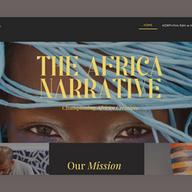
The African Narrative shows us how creating a nonprofit website with strong branding can make an impact. The gradient background of fiery orange and soft yellow-green match the organization’s logo, creating a cohesive aesthetic. The Work Sans Semi Bold font was a smart choice for the site as it is highly legible and exudes confidence.
Dedicating a page to the board of directors further instills a sense of familiarity in viewers. Meanwhile, several pages that describe The Africa Narrative’s work help to engage and establish trust with visitors.
Like what you see? Create your own nonprofit website using the same template:
Template name: Christian charity organization (warm) website template
08. Hold Your Fire

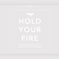
Horrified by the Parkland shooting that occurred 20 years after her own father became a victim of gun violence, Kristina Filler started selling apparel in her online store to raise money and awareness. The Hold Your Fire website describes its cause using Fillers’ own words: “It aches to know that other people are going through what my family and I went through, especially when in both cases, the deaths were so preventable. Hopefully, this shirt can do a small part to help prevent more of them.” By selling products with the organization’s motto (“Hold Your Fire”), Filler is able to spread awareness about her mission (both online and offline), while raising money for a good cause.
Like what you see? Create your own nonprofit website using the same template:
Template name: Illustrator website template
09. Ascend

Ascend uses a two-year mountaineering program to teach young women from marginalized groups leadership skills. In order to prevent the wealth of information that the site offers from becoming overwhelming, the designer employs a modular layout to break up the content into easily digestible sections. For example, potential volunteers can pick between various activities, locations and skills, all of which have individual pages with informative descriptions and real-life imagery.
Like what you see? Create your own nonprofit website using the same template:
Template name: Artist website template
10. CharacTours

Andrew Davies and Jonathan Goldstein founded CharacTours to educate people about U.S. history through interactive, theatrical walking experiences. The antique aesthetic of the nonprofit website demonstrates the immersive experience visitors can expect from the tours. A featured YouTube video on the homepage provides a glimpse into their program, showcasing the engaging and educational nature of the tours.
Like what you see? Create your own nonprofit website using the same template:
Template name: Food stylist website template
Tip: Make sure your visuals are optimized by using the right sizes, formats and colors. If you’re making a website with Wix, the Editor will automatically compress files upon loading to reduce upload time. Non-Wix users can change the dimensions of their image in seconds with our free image resizer tool.
11. Waste Not

One of the most important parts of designing a website is choosing the best typography. Waste Not’s well-thought-out font pairing of a handwritten script and a modern sans serif creates the perfect balance of text that’s full of personality. Stats and infographics, which are spread throughout the site’s homepage, create an interactive vibe that’s sure to engage visitors.
Waste Not’s use of typography is incredibly impactful, so much so that they've used it as the primary visual aid across the first two folds of the nonprofit website. By doing this, they've effectively turned their messaging into an art form that captures and maintains the visitor's attention.
Like what you see? Create your own nonprofit website using the same template:
Template name: Charity organization website template
12. The Hands for Nature Project

Hands for Nature Project is committed to using collective action to fight climate change, both by preserving our natural environments and by responding to the impact of natural disasters. Greeting visitors with a slideshow of vibrant landscapes and sea life, this nonprofit website immediately grabs the attention of nature lovers. The website’s color scheme is made up of earth-loving colors—a mix of greens, blues, turquoise and white emphasize the organization’s mission. We love how clearly the organization explains its three initiatives and the work that it has done for each.
Like what you see? Create your own nonprofit website using the same template:
Template name: Environmental NGO website template
13. Culture of Solidarity

There’s plenty to rave about when it comes to the Culture of Solidarity site, but perhaps the best design choice was to feature a video above the fold that showcases the organization’s work. Without having to read a word about the nonprofit, a visitor knows that the organization’s volunteers work hard to feed members of their community who might otherwise go hungry.
Like what you see? Create your own nonprofit website using the same template:
Template name: Creative agency website template
14. We Rise Production

The mission of We Rise Production is to empower artists who seek to promote critical thinking about oppressive systems and inspire action against them. The nonprofit's website serves as an effective platform to showcase the team’s impactful projects, with dedicated web pages highlighting their podcasts, videos and visual works. One notable feature is the CV page, which comprehensively lists the diverse range of projects the organization has been involved in. This thoughtful inclusion demonstrates the effectiveness and breadth of We Rise Production's work, serving as a testament to their commitment and success in fulfilling their mission.
Like what you see? Create your own nonprofit website using the same template:
Template name: Acting resume website template
15. Lead Foundation

Although individual donations are critical to nonprofits, corporate sponsorships can make a particularly significant difference. The Lead Foundation, which is dedicated to the development of student-athletes, does a great job of using its website to spotlight corporate sponsors such as Adidas, DICK’S and the NFL. In doing so, the nonprofit demonstrates its credibility to people who are familiar with those brands and attracts the attention of other corporations that are working to improve their brand perception through association with nonprofits.
Like what you see? Create your own nonprofit website using the same template:
Template name: Fitness trainer website template
Nonprofit website templates for inspiring designs
Now that you’ve gained inspiration from the remarkable nonprofit website examples above, it’s time to get to work on your own best nonprofit website design. Wix’s fully customizable nonprofit website templates make it easy to start building your organization’s online presence. Below, you’ll find some of our newest designs, which you can customize with your own branded elements and content.
01. Empowering Women NGO nonprofit website
Template name: Women empowerment NGO website template
A compelling template for an inspiring cause, this is the best nonprofit website design for starting a nonprofit website that focuses on female empowerment. It features a bright color scheme and diverse stock photos of powerful women, but you can easily update it with your own brand colors and imagery. The template includes a mailing list sign-up form, which is incredibly useful for building relationships with donors, volunteers and other interested parties.
02. Community center nonprofit website
Template name: Community center website template
When your mission is to create a safe and inclusive space for your community, it’s vital that you do so both online and off. With this template, you can create an inviting site that puts your center’s members front and center. We love that it features a gallery page so that you can showcase all of your past programs. This template also integrates seamlessly with Wix Events, which makes the process of managing and promoting your programs almost effortless.
03. Social NGO nonprofit website
Template name: Social NGO website template
If your mission revolves around raising awareness, look no further than this attention-grabbing nonprofit template. The content is pared down to the essentials so that your message takes center stage. With customizable elements, such as the full-screen background, bold typography and prominent buttons, you have the power to tailor the template to your organization's unique content and story.
Best practices for nonprofit website design

Designing an effective nonprofit website takes careful planning, engaging content and a people-first mindset. Following best practices ensures your site supports your mission, attracts supporters and encourages action.
01. Define your goals and know your audience
Pin down clear goals for your website, such as boosting donations, getting more volunteers or raising awareness for your cause.
Understand your target audience their motivations, interests and what action you want them to take.
Shape your content and design choices so they connect with the people you want to reach.
02. Choose a website builder
Select a website builder that suits your nonprofit needs, considering factors like ease of use, customization options and cost.
Wix offers features that are relevant for nonprofits, such as event management, online donation forms, volunteer sign-up forms and newsletter integration. As Ashley Reckdenwald, founder of Land of Lovies, says: “Wix is really the platform for this type of work, because as a nonprofit, there's so many other things to worry about. You don’t have to rely on anyone for coding or website design. Wix covers all of that.”
Learn more:
03. Create a clear website structure
Map out a logical, simple web design structure with easy navigation and menus.
Make the big pages—like your mission, donation info and contact details—easy to find.
04. Craft engaging content with storytelling
Write content that shines a light on your organization's mission, real impact and inspiring stories.
Use formats like blog posts, videos, infographics and case studies. Check out how to start a blog.
Bring stories to life with photos, videos and testimonials that connect emotionally and highlight the people you help.
Keep content up to date to give supporters a reason to come back.
05. Optimize for mobile devices
Make sure your site works well on any screen, especially phones and tablets.
Test on different devices to see your site through your audience's eyes.
06. Create strong calls to action and secure donation options
Lead visitors toward goals like donating, volunteering or signing up for updates with clear, appealing call-to-action buttons.
Offer a secure, user-friendly online payment processing experience so giving feels easy and safe.
Lay out the donation process so it's transparent and simple to follow.
07. Prioritize accessibility
Make your website work for everyone, including people with disabilities.
Use readable fonts, high-contrast color choices and alt text for images.
Check your site meets accessibility standards with the right tools.
08. Incorporate social media integrations
Add social media buttons and live feeds so supporters can engage and share.
Stay active on social channels to draw people back to your website and boost your cause's visibility.
09. Maintain and refine with updates and feedback
Keep the site fresh—add news, updates and upcoming events often.
Fix broken links, stay current with browser updates and keep everything running smoothly.
Ask for feedback from users, volunteers and donors. Use surveys or quick polls to get insights.
Make updates based on feedback so your website grows with your goals and the needs of your community.
10. Use analytics and data-driven insights
Track website traffic, behavior and conversions using analytics tools.
Let data show you what works. Run A/B tests to fine-tune design and content.
Mix numbers with honest feedback to keep improving your website.
Pro tip: If you're a younger learner or introducing web creation to younger students, try Wix Tomorrow. This offers meaningful learning and creating experiences at every stage of a young learner’s web creation journey, from creating a first website to learning industry-standard skills, to making real-world impact with hands-on projects.
Create the perfect site for you with Wix's website builder.
Is Wix good for building a nonprofit website?
Yes, Wix can be a good platform for building a nonprofit website. Wix user-friendly tools and features that can help you create an engaging and effective nonprofit website to promote your nonprofit's mission and activities. Here are some reasons why:
Wix provides a drag-and-drop website builder that is easy to use, even for individuals without extensive technical skills. This can be beneficial for nonprofit teams with limited web development experience.
Wix offers a variety of professionally designed nonprofit templates that can be customized to match your nonprofit's branding and style. Some templates are specifically designed for nonprofit organizations.
Wix offers features that are relevant for nonprofits, such as event management, online donation forms, volunteer sign-up forms and newsletter integration.
You can also explore all types of best websites, from a fundraising website to the best law websites or the best church websites built on Wix.
Explore other types of websites:
Best nonprofit websites FAQ
What's a nonprofit website?
A nonprofit website is a website that is owned and operated by a nonprofit organization. Nonprofit organizations are tax-exempt organizations that are dedicated to social, educational or religious causes. Nonprofit websites typically serve a variety of purposes, such as:
Providing information about the organization and its mission
Sharing news and events
Fundraising
Recruiting volunteers
Advocating for the organization's cause
Can a nonprofit get a free website?
Yes, there are a number of ways for nonprofits to get a free website. Some options include:
Using a website builder that offers a free plan for nonprofits.
Applying for a grant from a foundation that provides funding for nonprofits to create websites.
Partnering with a volunteer web developer who is willing to donate their time and expertise.
Can a nonprofit have a .com website?
Yes, nonprofits can have a .com website. In fact, a .com domain is a good option for nonprofits, as it's the most recognizable and trusted domain extension. However, nonprofits can also use other domain extensions, such as .org or .net.
Should I use .org for a nonprofit website?
Using a .org domain for a nonprofit website is a common practice, as it shows clearly an organization's nonprofit status. While it's not mandatory, the .org extension can help establish credibility and trust among visitors. Check the domain is relevant to your nonprofit's name and mission.
What is the best domain for a nonprofit organization?
The .org domain extension is widely recognized as the standard for non-profit organizations, as it conveys trust and credibility. It helps immediately signal to visitors that your website represents a mission-driven entity rather than a commercial business. To strengthen your branding, choose a domain name that's easy to remember, aligns with your organization’s name and reflects its mission. Additional options like .ngo may also be suitable for international non-profits seeking a more specific extension.
How can we effectively tell our organization's story on the website?
To effectively tell your organization's story:
Create a compelling "About Us" page
Use visuals: photos, infographics and short videos to engage
Share your founder's story and mission statement
Highlight key milestones and achievements of your organization
Include beneficiary testimonials
Showcase impact with data and success stories
How can we integrate donation capabilities into our website?
To integrate donation capabilities with Wix:
1. Use Wix Payments or connect PayPal for secure transactions
2. Add a "Donate" button to your homepage and navigation
3. Create a dedicated donation page with multiple giving options
4. Implement Wix Forms for custom donation amounts
5. Set up recurring donation options
6. Use Wix Automations for thank-you emails
7. Display a donation progress bar
8. Integrate with CRM for donor management
What's the importance of transparency on a nonprofit website?
Transparency on a nonprofit website is crucial because it:
Builds trust with donors and stakeholders
Demonstrates accountability for funds and actions
Increases credibility and legitimacy
Encourages continued support and donations
Meets legal and ethical requirements
Differentiates from less transparent organizations
Provides clarity on mission and impact
Fosters long-term relationships with supporters
Enhances overall reputation and public image
What's the best way to showcase our team and board members?
To effectively showcase your team and board members create a dedicated "Our Team" page, make sure to use professional headshots for consistency. Then include brief bios highlighting expertise and passion with links to individual LinkedIn profiles. You want to showcase the diversity and skills of your team and you can consider including quotes or personal statements. Just remember to update everything regularly so it's not outdated.
What legal information should we include on our nonprofit website?
Essential legal information for a nonprofit website includes:
501(c)(3) status and EIN number
Privacy policy
Terms of use
Donation disclaimer (tax-deductible status)
Annual reports and financial statements
Board of directors list
Conflict of interest policy
Whistleblower policy
Copyright notice
Contact information for inquiries
Charitable registration disclosures (state-specific)
Non-discrimination statement


