- Emily Shwake

- 4 days ago
- 22 min read
Updated: 2 days ago

If you want to turbo-charge your digital business results, there’s no better rocket fuel than an effective landing page. These powerful assets play a key role in website creation because they clearly showcase your offering and encourage visitors to take action—all within a single focused page. To help you build your own high-performing pages, we’ve put together a list of the best landing page examples to learn from, along with insights into what makes each one successful. Later in this article, we’ll also review essential landing page best practices so you can confidently apply them to your site.

Need inspiration for your website? With Wix, building a standout site is easier than ever. Choose from hundreds of customizable templates and use Wix’s easy drag-and-drop website builder tools to make your vision come to life. Turn your ideas into reality and see just how simple it is to create a unique, professional website.


TL;DR: best landing page examples
We selected these landing page examples for their focused messaging, strong visual hierarchy and ability to guide visitors toward a clear goal. Each one demonstrates how good design and smart strategy work together to drive action, whether that’s getting sign-ups, generating leads or launching a new product.
Here’s what we looked for when choosing the examples:
Clear, compelling headlines that immediately communicate value
Clean layouts that keep the focus on the CTA
On-brand visuals that reinforce the message
Trust elements like testimonials, social proof or credentials
What makes a great landing page
Feature | Why it matters |
Strong headline | Grabs attention and sets the tone for the rest of the page |
Clear call to action | Tells visitors exactly what to do next |
Focused, benefit-led copy | Keeps users engaged and informed without distractions |
Clean, mobile-friendly design | Supports fast, intuitive navigation on any device |
Visual hierarchy | Guides the eye naturally toward the most important elements |
Social proof | Builds trust and credibility quickly |
Fast load speed | Reduces drop-off and improves user experience |
What each example brings to the table:
Conversion-focused copy that speaks directly to the target audience
Purposeful design choices, from button color to whitespace
Mobile-optimized layouts that perform well across devices
Seamless user flow that reduces friction and encourages clicks
What is a landing page and how does it work?
A landing page is a web page that offers visitors a standalone experience that helps them accomplish a specific goal without much effort. Whether visitors reach the landing page through an advertisement, a search results page or an email, it should meet their expectations.
The singular focus of a landing page is what sets it apart from other webpages. A home page, for example, broadly communicates your brand identity and business proposition and it invites further exploration. Home page visitors may want to explore multiple categories, view video content or look up customer service contact information. By contrast, a landing page typically focuses on a single call-to-action (CTA) that is hard to miss. Every element of a landing page works to help visitors complete that single action without distraction or confusion.
Ready to create a landing page? Check out today's top AI landing page builders or get started with Wix today.
What is the purpose of a landing page?
From a business perspective, a landing page exists solely to drive conversion, whether in the form of selling a product, capturing new subscribers or enrolling attendees for an event. The amount of people who fill out a form or click CTAs is usually pretty high. Unbounce found that landing page conversion rates range between 10% and 19%.
As Yiftach Koronio, head of Social at Wix, puts it:
"A lot of market research goes into a great landing page. If you don’t know exactly what this person is thinking, you can’t convince them. If I can’t convert wherever I’m convinced, then it’s such a loss."
To make sure visitors move smoothly from looking to doing, marketers often create landing pages that go along with their marketing campaigns. This way, visitors are more likely to take the plunge and convert. Keeping tabs on how each landing page performs can give marketers a good sense of how well the whole campaign is working.
Use Wix’s landing page builder to generate an effective landing page of your own.
13 of the best landing page examples
A successful landing page is a snap for visitors to navigate—but creating it requires more effort. The page needs to communicate credibility without getting bogged down in details. How you strike that balance will depend on your industry, intended audience and unique business requirement.
To kickstart your inspiration and planning, we’ve rounded up some of the best landing pages on the Internet and highlighted the takeaways you can use for your own landing page designs.
01. Wix

Our marketing team designed this landing page to attract potential clients just starting their digital business journey and provide inspiration for anyone searching for how to create a landing page. The content “above the fold” (meaning the top section of a web page) includes all the essential elements you’d expect to find when creating a landing page: the company logo, a concise headline conveying authority, engaging visuals and a prominent CTA.
What you can learn from Wix’s landing page:
Include a prominent CTA: The message “start now” is clear and conveys a sense of urgency. It’s useful that the CTA button appears in every section so that visitors don’t have to scroll to find it.
Use visuals that support your story: From playful AI-generated images to friendly product shots, every visual is engaging and reinforces the message that getting started should feel fun and achievable.
Show real results: Highlighting that over 15,000 sites go live each day and including shout-outs to thriving user projects, Wix reminds visitors that real success is right at their fingertips.
02. ExpressVPN

Virtual private networks (VPNs) add an additional layer of security to WiFi browsing, and ExpressVPN has created a landing page that communicates safety and simplicity. The main headline promises visitors a seamless online experience, and the graphic of someone accessing a variety of digital experiences reinforces that message. As visitors scroll down, the text describes the chief benefits of the service, accompanied by simple graphics that help make abstract concepts like “global access” more concrete.
What you can learn from ExpressVPN’s landing page:
Build trust on multiple levels: Given that ExpressVPN is a security tool, establishing credibility is important. With muted graphics and simple language, this landing page manages to do so without alienating the visitor. Prominent TrustPilot and app store reviews further signal that the company is reputable.
Put customer service in reach: While this landing page maintains a tight focus on the main CTA, it includes one other link—a button that connects visitors to 24/7 tech support. This exception reinforces the idea that visitors can quickly and easily get the help they need to get ExpressVPN working on their devices.
03. Blue Apron

Meal planning and ingredient delivery service Blue Apron aims to win new customers with a landing page that emphasizes the variety of menu options available. High-quality food photography entices visitors to keep scrolling, with content down the page emphasizing the service’s value, flexibility and convenience. CTAs like “Shop now”, “Browse the full menu” and savings offers keep users moving toward a decision.
What you can learn from Blue Apron’s landing page:
Offer real solutions: Blue Apron’s landing page doesn’t just sell meal kits; it solves the “what’s for dinner?” problem. Each section directly addresses a common dinner-time dilemma, like lack of time or the desire for variety. The page uses strong visuals and clear, bite-sized copy to walk you through the solutions, making it feel like Blue Apron understands your daily challenges and has the perfect answer.
Tell a visual story: The high-quality photos of delicious meals are the stars of the show. They do more than just look good; they help you imagine preparing and enjoying these dishes in your own home. By letting the food do the talking, Blue Apron creates an emotional connection and makes the idea of cooking feel exciting and achievable.
04. LinkedIn Ads

This landing page outlines the benefits of advertising on LinkedIn to potential business customers. A fixed header menu with the CTA button “create an ad” stays anchored as visitors scroll through the content and the button appears twice more.
What you can learn from LinkedIn’s landing page:
Use a carousel to engage attention: In the middle of this landing page, visitors can click through a carousel presentation of the key benefits of LinkedIn Ads. The design gives each concept room to shine without devouring too much screen real estate.
Describe processes succinctly: The page concisely outlines the three-step process for launching an ad, signaling that visitors won’t waste time with a cumbersome backend system.
05. Hootsuite

Hootsuite is a social media management tool that helps marketers create, schedule and track all their social content in a single dashboard. Hootsuite’s scheduling landing page makes its value clear right away: it helps you save time and simplify your social media management. Key benefits like automated scheduling across major platforms, AI-powered best-time posting and bulk scheduling are highlighted throughout with a repeated 30-day free trial CTA that makes it easy to get started. Paired with recognizable brand logos for credibility, the page strikes a great balance between clear benefits, trust signals and conversion-focused messaging.
What you can learn from Hootsuite’s landing page:
Lead with a clear value proposition: Hootsuite opens with a bold headline (“Save 100+ hours with Hootsuite scheduling”) paired with a prominent free trial CTA, so visitors instantly understand the core benefit and action you want them to take.
Include social proof early: Well‑known brand logos near the top build trust and credibility right after the headline, signaling that reputable companies use the product and making visitors more comfortable engaging further.
06. The Great Courses Plus

The landing page for The Great Courses Plus uses a tiled background of movie title graphics to showcase the breadth of the service’s offerings, with a prominent CTA highlighting a free trial offer. Testimonials from well-known Internet creators provide proof points that the service is worth exploring, while a FAQ proactively explains more details of the service.
What you can learn from The Great Courses Plus's landing page:
Use an FAQ to delve deep: In keeping with The Great Courses Plus's educational focus, a prominent FAQ provides details about the service and reveals additional benefits, such as a quarterly magazine and audio-only streaming capabilities.
07. Uber for Business

Uber’s landing page for Uber for Business is designed to get companies to quickly create an account and start managing business rides efficiently. The hero section features a clear headline, “Let’s get started,” with a prominent Sign up for free CTA that directs visitors straight into the account setup process. Below the fold, three concise benefit points highlight key advantages for corporate travel: saving time on expense reporting, arranging rides for employees or customers without smartphones and boosting customer engagement with ride vouchers. The clean minimal layout keeps the focus on the signup form while Uber’s logo and familiar navigation maintain brand consistency, making it easy for businesses to take action and start managing rides effectively.
What you can learn from Uber’s landing page:
Keep the layout minimal: Uber's landing page uses a clean, simple design that directs attention to the signup form, reducing distractions and guiding users toward conversion.
Highlight concise benefits: Three short, benefit-focused statements explain key advantages like saving time on expense reporting, arranging rides for employees without smartphones and boosting customer engagement, helping corporate audiences grasp the value quickly.
08. Skillshare

This landing page design for online course provider SkillShare includes a navy blue background with text in high-contrast white and lime green. Tiled photos showcase the variety of course types available via the service, from cooking to computer skills. Using an F-pattern layout, the page uses the right-hand side to detail three key differentiators. The signup form requires just a name and email address to get started and visitors can use existing social media logins that are integrated with the site.
What you can learn from Skillshare’s landing page:
Keep signups simple: By keeping the number of required fields to a minimum, Skillshare’s page keeps visitors moving toward the goal of signing up for the service. Integrating with other login services makes the process even easier, allowing new customers to avoid needing another username and password to remember.
09. Snowflake

Snowflake’s free trial signup landing page makes it really easy for people to dive in and start exploring the platform on their own. Instead of bombarding visitors with technical details, the page puts the signup form right up front so you can get started with just a few basics. The messaging is simple and reassuring, explaining that you get full access to the Snowflake Data Cloud plus generous usage credits, so you know exactly what you’re signing up for. The clean layout and straightforward steps help remove friction, making Snowflake feel approachable and easy to try, especially for busy teams and data professionals who want a hassle-free way to test a data warehousing and analytics solution.
What you can learn from Snowflake’s landing page:
Prioritize the main conversion goal: Snowflake centers its entire page around one core action — starting a free trial — with the signup form immediately visible. This eliminates friction and keeps users focused on completing the most important task.
Lower barriers to entry: By only requesting essential information and clearly communicating what happens next, Snowflake builds confidence and reduces hesitation, which can significantly improve conversion rates.
10. Spatium

Spatium instantly grabs your attention with rich purple tones and stunning outer-space imagery, making it hard not to want this Chrome extension on your computer. The generous use of white space keeps everything clean and easy to read, while the minimal text helps the design feel simple and inviting. The CTA clearly reminds users that the extension is free, which removes hesitation, and if you want more details, the page smoothly guides you through its features with beautiful visuals plus a clear list of widgets and customization options included in the download.
What you can learn from Spatium’s landing page:
Keep it simple: If the CTA can be accomplished quickly with little risk or cost to the visitor, there’s no need to over-elaborate. While you should spell out essential details (such as shipping costs for a product or which devices are compatible for a download), make the action as easy to take as possible and be sure any checkout or download processes are similarly streamlined to keep visitors on track to completion.
11. Beats by Dre

Beats by Dre uses its landing page to do exactly what great product pages should do, giving plenty of space to showcase style, craftsmanship and standout technical features. This wireless headphones page dives into what matters most to shoppers, including sound quality, charging performance and built-in functionality. Large visuals paired with short, easy-to-read text make the benefits clear at a glance, and the prominent “add to bag” button takes users straight to the cart, helping speed up the path to purchase.
What you can learn from Beats by Dre’s landing page:
Use a floating header: If a landing page is long, visitors can lose track of the initial CTA. Repeating the button at several points throughout the page is one solution, but it’s more elegant to use a floating header that anchors the button at the top of the screen at all times, keeping it within reach.
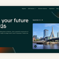
12. Inbound by Hubspot

Inbound’s conference landing page makes it easy to secure tickets with a focused CTA and persuasive content to convince visitors that the event is worth their time. Video, photos and speaker bios showcase the event’s subject matter and aggregation of expert talent, while clearly-delineated descriptions of the two available ticket types make it easy for visitors to select the right price point for them.
What you can learn from Inbound’s landing page:
Hone the purchase options: While it can be tempting to show a variety of price points and products to appeal to multiple tastes, having too many options to choose from can confuse and overwhelm viewers. By sticking to the two ticket types available to attendees who aren’t also exhibiting as vendors, HubSpot avoids complicating the selection and gives page visitors a binary choice.
13. Masterclass

Online course provider Masterclass has set the standard for marquee instructors and its offering for screenwriting is no exception, with Oscar winner Aaron Sorkin teaching the ins and outs of the trade. For those who search for the class using Sorkin’s name, Masterclass has devised a landing page with his photo front and center and a simple red CTA that makes it straightforward to claim a class spot. Video preview clips and a course outline help visitors decide whether the content will meet their needs.
What you can learn from Masterclass’ landing page:
Use star power: If you’re working with an influencer or have a celebrity connection, by all means put their endorsement or credentials front and center. Masterclass appeals to its target audience with this approach, attracting visitors who want to be able to name-drop their instructors at cocktail parties. The clean and simple design of the rest of the page concentrates attention on the celebrity, while the preview clip demonstrates why they’re worth paying for.
8 keys to success for landing pages that convert

As you can see from the variety of one-page websites above, the specifics of your business and your landing page goal will influence the design and content choices you make. Even so, a core set of best practices apply. Whether you’re using a landing page template or decide to code your page from scratch, keep these principles in mind:
01. Know your audience
The design, messaging and CTAs should align with your intended audience’s needs. Research in advance what motivates potential customers or clients. Analyze the performance of your current website content to identify successful tactics and target your landing page to a specific cohort and situation.
Once you’re ready to assemble the landing page, develop its elements with the goals of building trust and persuading visitors to take the next step. Content to tailor includes:
Explanations: if your products are complex or your potential buyers tend to research purchases heavily, consider a FAQ. Comparison charts, instructional videos, detailed specs and even head-to-head comparisons with competing products can also be effective. Not only do these elements provide clarity about the product or service, but they demonstrate that you care enough to proactively address key questions in a format that works for your audience.
A curated list of social networks: While you want to make the CTA the primary focus on the page, including a feed of user-generated content and linking out to social hubs can signal that your brand has an established community that visitors can join. But don’t be indiscriminate; selecting the social networks most relevant to your specific audience is a way to signal that you’re attuned to their preferences.
02. Spotlight your CTA
A clear and compelling CTA is the single most important element of a landing page. The CTA is why the page exists; all the other content elements should support it. For landing page visitors, the CTA represents the solution to the problem, challenge and question that caused them to check out the content in the first place. To maximize conversion, heed these tips:
Use an eye-catching design: The CTA button or form should align with your brand’s overall look and feel, but don’t be afraid to use bold colors and fonts.
Get pithy with language: Ideally, your CTAs should be short and sweet. They shouldn’t be longer than four words. Make sure to use action-oriented verbs such as “Subscribe” or “Try.” Do your best to keep your CTAs in your brand’s tone of voice.
Keep it front and center: Wherever visitors are on the page, they should be able to see the CTA without needing to scroll in either direction. You can either make the button sticky so that it’s always in view or copy the button to every fold.
Streamline other navigation: To keep the focus on the CTA, remove links that could potentially distract visitors and send them meandering away. There’s no need to include a website menu leading to multiple pages. Carefully curate what navigation and links you do include so that they all support the CTA. Make sure to set links to open in new tabs to ensure the landing page stays accessible.
03. Design for a quick skim
In today's fast-paced digital world, consumers have shorter attention spans and countless distractions, which means they anticipate immediacy and convenience from online content. According to analytics firm ContentSquare, attention spans onscreen are under a minute and 50% of users no longer bother to scroll. Landing pages are under special pressure since their goal is to drive conversion, so the message has to be instantly clear and persuasive. To make the most of limited time and attention, consider these tactics:
Showcase your brand identity: All the elements on the page should work together to establish a recognizable identity within seconds. Every choice, from the color scheme to the tone of the text, is an opportunity to reinforce your brand.
Keep text clear and short: Most of your page copy should be concise and no longer than a sentence or two. If you want to communicate more elaborate concepts, use bullets, an FAQ format, collapsible accordion sections and tabs to avoid overwhelming visitors with large blocks of text.
Use visuals to communicate: Everything from image composition to the color palette affects the user experience, so it’s vital that you carefully consider every design choice you make to ensure that they are serving your goal for the landing page. Use video and images to illustrate features, functionality and quality in an eye-catching way.
Say it all above the fold: The most crucial information should appear above the fold, as this initial screenful will determine whether visitors keep reading, click or leave. Keep verbiage to 11 words or less and include a prominent CTA. If essential content is located lower down on the page, consider adding internal anchor links above the fold to enable visitors to skip to the topic that interests them most.
Incorporate whitespace: Whitespace refers to the amount of blank space surrounding a webpage’s visual elements. Leaving a significant amount of whitespace draws the user’s eye to important elements and makes content easier to process.
Align your design with proven skim patterns: Eye-tracking studies from leading web design and usability firm Nielsen Norman Group show that web users generally skim pages in either an "F-pattern" or a "Z-pattern." In the F-pattern, they read straight down from the top left, then scan across horizontally. In the Z-pattern, they read from left to right along the top, then diagonally down to the left, and then from left to right again. By using these patterns to construct the anatomy of your landing page, you can conform to their skimming patterns so as to hold their attention and increase engagement.
04. Mobile-first is a must
According to Insider Intelligence, consumers now spend more time on their phones than they do watching TV and the majority of web traffic comes from mobile devices. To maximize your landing page’s chances of success, pay special attention to the mobile version of your landing page. Wix’s website design AI automatically reengineers desktop layouts to fit on mobile. It’s also easy to toggle between the desktop designer and the mobile designer so you can make your own adjustments.
Be inspired by these mobile landing page examples.

05. Connect the experience across touch points
To maximize the impact of your advertising campaigns, it's crucial that your landing pages offer a consistent and cohesive experience. Regardless of whether visitors arrive via a sponsored social post or a search ad, they should immediately recognize the landing page as a natural extension of their prior interaction. This means using consistent color schemes, images and promotional offers throughout the entire funnel. Note that some of the best landing page builders have built-in branding tools to help you manage your visual identity and messaging across all fronts.
06. Reduce friction for quick action
Integrate services such as Google Login or Venmo payments into your landing page to make it as easy as possible for visitors to respond to the CTA. These third-party services enable visitors to skip the tedious task of filling out form fields, and they can also provide reassurance that sensitive information will stay secure. For example, a Venmo option allows customers to place purchases without keying in sensitive bank or credit card details.
07. Put the squeeze on squeeze forms
While user data is valuable, it's important to strike a balance when requesting information on a landing page form. Long forms can be off-putting, especially on mobile devices with cramped keyboards and limited screen space. Consulting and research firm Gartner recommends limiting your form to between three and five fields. If your form asks for sensitive information, explain why the information is necessary and link to your privacy policy.
08. Test and retest
Landing pages aren’t “set it and forget it” projects—it takes time to perfect a landing page and figure out what resonates with your audience. Luckily, landing pages offer a controlled experiment due to the limited number of outcomes. Therefore, it's much easier to track and analyze their performance compared to other complex marketing campaigns.
A/B testing is an effective way to determine the effectiveness of different elements on your landing page. By changing just one variable at a time and measuring its impact, you can identify what works and what doesn't. At Wix, our landing page optimization process can be as granular as testing the impact of the color of a CTA button on its performance. Options for elements to tweak include:
Shorter or longer text: Although landing pages are generally more effective when they are concise, certain sections may require more detail in order to effectively convey their message to visitors.
More direct or time-sensitive messaging: Does the verbiage of your CTA explain enough while motivating action? Does it help to add a countdown or deadline to drive more immediate conversions?
Background or text colors: Make sure your CTAs and headers stand out without being jarring.
Size and placement of CTA: Is the link to take action coming too soon? Is it buried too deep on the page? Experiment with both Z and F pattern layouts to see if either yields a better conversion rate.
Image selection: Videos and images can have a massive effect on the performance of a landing page. Experiment with different types of media—such as closeups versus lifestyle photos, or videos versus still image carousels—to find what resonates best with your audience.
Promotional offer: To improve your landing page, it's important to test different offers such as a free trial versus a low monthly fee or a percentage discount versus a free gift. By tracking the results, you can not only optimize your landing page but also gain insights that can inform your other digital promotions.
Landing page design best practices
Landing pages are crucial for capturing leads, driving conversions and achieving your marketing goals. To create and design effective landing pages, follow these best practices:
Define a clear objective: Before creating a landing page, clearly define its objective. What do you want visitors to do when they land on the page? Whether it's signing up for a newsletter, downloading an eBook or making a purchase, having a clear goal will guide the design and content of the landing page.
Target specific audiences: Tailor your landing page to the specific audience you want to attract. Understand their needs, pain points and interests to craft messaging and visuals that resonate with them.
Craft compelling headlines: Your headline is the first impression you make, so make it count. Use strong action verbs, benefits-oriented language and a clear value proposition to capture attention and entice visitors to read further.
Use engaging visuals: Visuals are powerful tools for storytelling and conveying emotions. Use high-quality images, videos or infographics that complement your message and showcase your product or service in a visually appealing way.
Write persuasive copy: Your copy should be clear, concise and persuasive. Explain the benefits of your offer, address any potential objections and use a conversational tone that connects with your audience.
Include a strong CTA: Your CTA is the button or link that tells visitors what you want them to do. Make it clear, prominent and easy to find, using action-oriented language that encourages immediate action.
Keep the design simple and focused: Avoid clutter and distractions. Use a clean and uncluttered design that guides visitors' attention towards the CTA. Use whitespace effectively, and make sure the layout is intuitive and easy to navigate.
Optimize for mobile devices: A significant portion of web traffic comes from mobile devices. Ensure your landing page is optimized for mobile viewing, using a responsive design that adapts to different screen sizes and provides a seamless user experience.
Track and analyze performance: Implement tracking tools to measure the performance of your landing page, such as conversion rates, bounce rates and time on page. Use this data to identify areas for improvement and optimize your page for better results.
Explore other website examples:
24 best websites for inspiration
Best landing page examples FAQ
What is on a landing page?
A landing page is a standalone web page that is designed to achieve a specific goal, such as generating leads, making sales or getting visitors to sign up for your newsletter. Landing pages are often created as part of a marketing campaign, and they are typically linked to from other pages on your website or from paid advertising.
Here are some of the key elements that are typically found on a landing page:
A clear and concise headline: The headline should be clear and tell visitors what the landing page is about.
A brief overview of your product or service: The landing page should provide a brief overview of your product or service, and it should highlight the benefits that visitors will receive.
A strong CTA: The landing page should include a strong call to action, such as a button or link that visitors can click.
Testimonials: Testimonials from satisfied customers can be a great way to build trust and credibility.
A contact form: If you want visitors to contact you, you should include a contact form on your landing page.
What's the difference between a landing page and a website?
The key difference is that a landing page is just one page with a more focused design and purpose, while a website has more pages and is designed to provide visitors with information about your company and your products/services.
How can I create an effective landing page?
An effective landing page is one that achieves its intended goal, whether that's generating leads, making sales or simply getting visitors to learn more about your product or service. To create an effective landing page, you need to:
Focus on a single goal: Your landing page should have one clear goal. If you try to do too much, you'll likely confuse your visitors and they'll be less likely to take action.
Keep the design clean and simple: Your landing page should be easy to read and navigate. Avoid using too much text or flashy graphics, as this can be overwhelming and distracting.
Write clear and persuasive copy: Your landing page copy should be concise and persuasive. It should explain the benefits of your product or service and why visitors should take action.
Use high-quality images or videos: Images and videos can be a great way to break up text and make your landing page more visually appealing. However, make sure that the images or videos you use are high-quality and relevant to your product or service.
Include a clear and compelling CTA: Your landing page should include a clear and compelling call to action. This is the button or link that visitors will click, such as signing up for your newsletter or making a purchase.
How important are testimonials on a landing page?
Testimonials can be very effective on a landing page as they build trust and credibility. They show potential customers that others have had a positive experience with your product or service. However, it's important to use testimonials that are relevant to your target audience and that are genuine.
Should my landing page be mobile-friendly?
Absolutely. With the increasing use of mobile devices to browse the web, it's critical that your landing page is mobile-friendly. This ensures that visitors can easily navigate and complete the intended action, no matter what device they're using.
What should be avoided on a landing page?
There are a few things that you should avoid on a landing page, including:
Unnecessary information: Your landing page should only include the information that is essential to achieving your goal. Avoid including any unnecessary information, such as your company's history or contact information.
Distractions: Anything that could potentially distract visitors from taking action should be avoided on your landing page. This includes things like flashing graphics, pop-ups and too much text.
Complex jargon: If you're using jargon, make sure that you define it clearly. You don't want visitors to be confused about what you're talking about.
Anything else that could deter a visitor from taking action: The goal of your landing page is to get visitors to take action. Anything that could potentially deter them from doing so should be avoided.
What are product landing pages?
Product landing pages are dedicated web pages designed to showcase and promote specific products. They provide concise product information, visuals and clear calls-to-action, aiming to convert visitors into customers. Effective product landing pages focus on key features, benefits guiding potential buyers towards making a purchase.
What's a good conversion benchmark for a landing page?
A general conversion rate for landing pages across all industries is around 5.89%. But this can vary widely across industries.
How does page load speed impact landing page performance?
Page load speed can dramatically impact landing page performance - for every 1-second delay in page load time, conversions drop by an average of 7%. Pages loading within 2 seconds have conversion rates nearly double those of pages taking 5+ seconds. Mobile users are especially sensitive, with 53% abandoning sites that take over 3 seconds to load.


Comments