- Oct 17, 2018
- 4 min read
It was at a low point in her career, broke and full of anxiety after having just lost a client, that Danielle Evans discovered what it is that she wants to do for a living. She and a friend were sipping lattes when Danielle said something about how design should be a multi-sensory experience, not unlike enjoying a good cup of coffee, which has to do with so much more than the flavor itself. “The experience is as much about the heat from the cup and the aroma of the bean, as it is the taste on my tongue,” Danielle explained. The friend had a hunch this could turn into more than just a cute metaphor. “She literally encouraged me to make lettering out of coffee,” Danielle recalls, “and the rest is history.”

Spelling it out
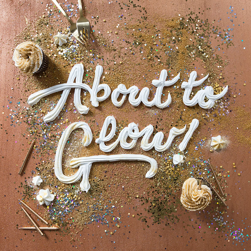
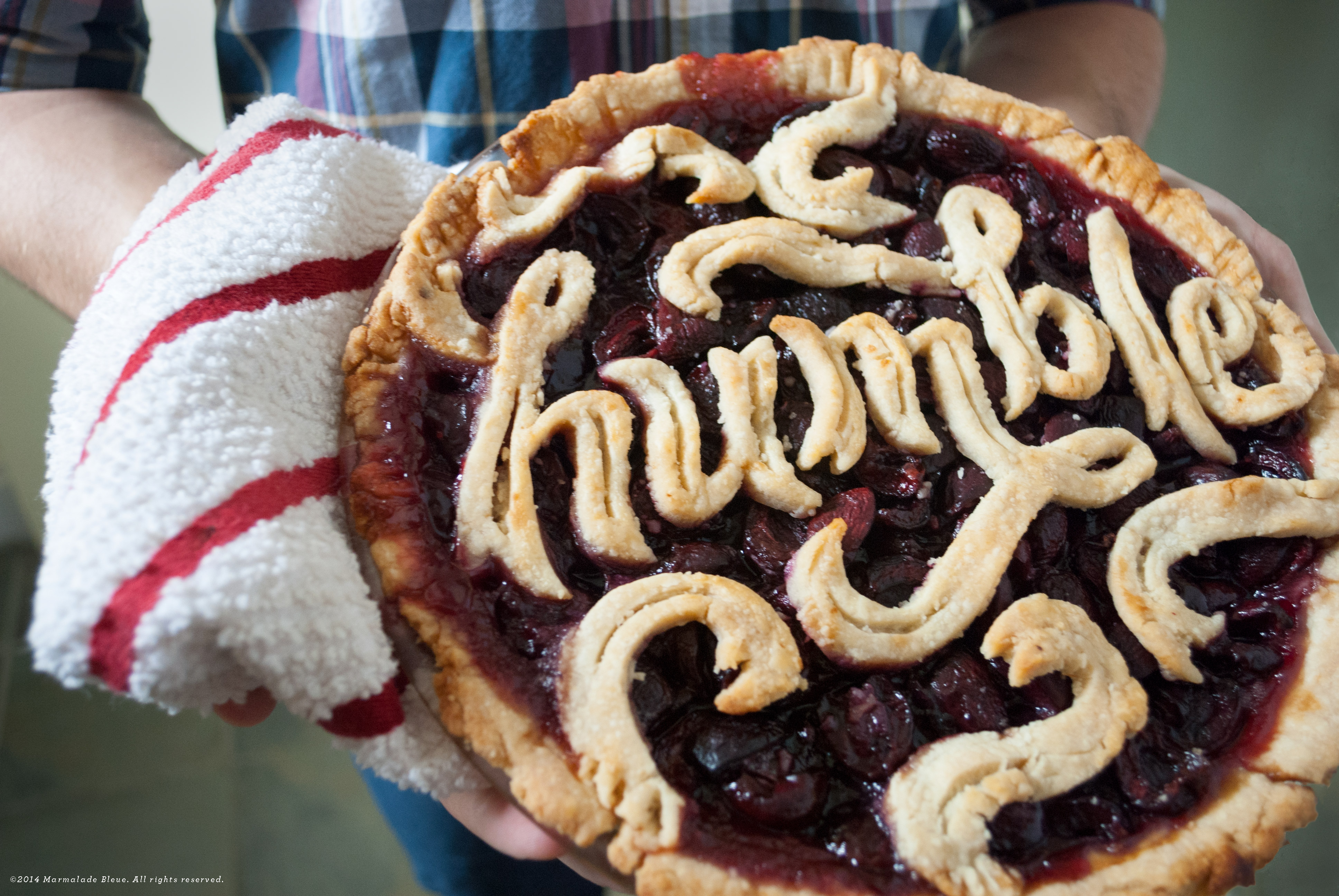
It’s been a while since that early epiphany. Today, Ohio-based Danielle Evans is a food typography specialist, well-known for her hand lettering pieces, created out of an assortment of unconventional ingredients. With a strong emphasis on materials, dimensions, and textures, she’s handcrafted greeting cards out of leather studs and sprinkles, devised McDonald’s social posts solely out of guacamole and salsa, and recreated Mean Girls quotes with candy corn and millennial pink pencils. “I find the world around us, especially food, to be drenched in meaning,” Danielle tells. “Memories, politics, and various movements are wrapped up in everything we imbibe and use. When these materials are wielded into something artistic, the work absorbs those messages as well.”

This spelling out of messages is what interests Danielle most of all. Finding pictorial images too “conceptually vague,” her preferred way of telling a story is through typography. She’s drawn to how “typographic illustrations are more direct in their message,” conveying their narrative in a very clear and fun way. She enjoys combining materials, words, and lettering styles in a way that adds meaning to every item involved, like crafting the sentence “A POP of color” out of pink balloons and white ribbon.
When you mean to say ‘cool’ and then start to say ‘great’. Danielle Evans’ tribute to cult classic Mean Girls
Danielle explains that bringing familiar, relatable items into the world of type, helps us take in the text with a fresh perspective. To explain her point, she refers to a historical example. “When the pencil first hit the scene,” she says, “it was a stark contrast to the elegance of a fountain pen.” Back in its early days, the pencil was a medium associated with the working class, with scrappiness, with the speedy jotting down of notes. It carried a meaning and was read in context. With time, however, “the pencil has become ubiquitous,” Danielle mentions. “Its voice has diminished.” This is the sort of voice that she wishes her typography to express. “Since using objects is fairly new,” Danielle adds, “their meanings are obvious and can play to or against the overall artistic concept.”

The Kanye and the egg
One of Danielle’s main sources of inspiration is music. Lyrics from a song that she’s been listening to can inspire a new lettering piece, and at other times, it’s an entire discography, as was the case in Danielle’s Kanyegg project. It first hatched when Danielle found herself relating to different themes in Kanye West’s songs. “While the media mogul may be known for his ego,” she says, “there’s a lot of range in his work – anxiety, self-doubt, elation, desperation – he’s human, and the complexity makes him interesting.” Starting with carving ‘Kanye’ onto an emu egg, the project soon expanded to become a series of lettering pieces that make Kanye West lyrics synonymous with everyone’s favorite breakfast.
Danielle’s image-making process is crafty and requires working around the perishable quality of her tools. “Each material presents a unique challenge. This can be a short lifespan, a funky smell, or rigidity that contrasts the ideal lettering style I wanted,” she says. “I’m problem-solving and switching mediums for each project.” In the case of Kanyegg, Danielle took the time to get acquainted with her new Yolky lettering equipment. “Eggs have a range of movement or physical limitations,” she explains. “I learned that I couldn’t predict runny eggs but would discover their rhythm if I made enough. Every process involved making, baking, or dropping something repeatedly until it was right.”

Own your web presence
When launching Kanyegg with a website of its own, Danielle knew she needed to stray far away from her comfort zone in order to showcase her work at its very best. “As a lettering artist, using Helvetica everywhere was a painful choice,” she admits, “but I needed something muted to highlight the lettering.” The result? A beautiful one-pager that makes use of bold, large (Helvetica) type that’s contrasted against the embellished food lettering works, and a color palette that alludes to Kanye West’s album covers. Danielle shares with us her best advice on creating an online portfolio or website, with three simple points: “Be clear because the work will speak for itself if you give it ample space. Be original, as the weirder you are, the better chance you’ll have to carve your own SEO path.” And lastly, Danielle concludes: “Be unapologetic. The work exists for a reason.” And pop lyrics recited by eggs? Definitely, no need to apologize for that.
We loved Danielle’s Kanyegg website so much, that we invited her to create a custom template in the same spirit. Visit Danielle Evans’ signature template to make it your own.


