Every website owner wants to create an aesthetically pleasing experience for their visitors. Images play a big part in attracting people to your content and adding compelling or valuable text to your pictures can help them stand out. Learning how to make a website that features beautiful images with a few short words and which can capture what you do and who you are, has a far better chance of encouraging visitors to stick (and click) around.
The good news is, you don’t need to be a graphic designer to add text to images. Here are some quick tips to help you place text on your website images like a web design pro.
01. Use a fun, free tool to edit images
There are many free online websites that make it easy to edit and embellish your images in a matter of minutes. Here are some of our favorite tools for making a splash with one-of-a-kind images.
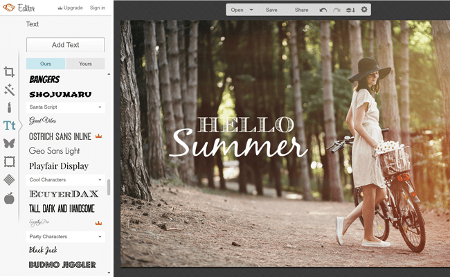
PicMonkey is an online image editor that you can add on as an extension to your browser. You can either edit photos that you upload from your computer or take a screenshot and edit it in the PicMonkey editor. Many of the tools are available for free, but for $4.99/month you can use their “Royale” features.

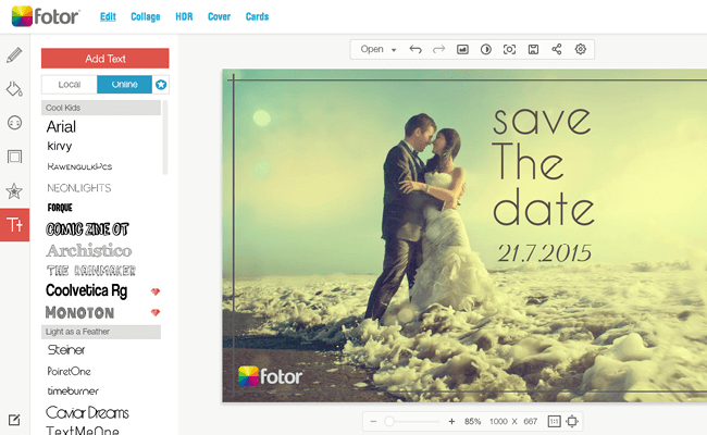
With Fotor’s intuitive photo editor, you can spice up any image. Add text, frames, stamps, shadows and more. Fotor is free and you access their premium features just by signing up. The program also makes it easy to download, resize or share your images on social media. You can even use the Fotor app to edit photos straight from your phone or tablet.

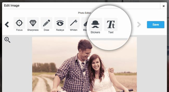
Best (and easiest) of all, you can edit images straight from the Wix editor. Start by adding the image to your site. Then click on image settings and edit at will! You can crop the image, change its look and feel and add the text of your choice.

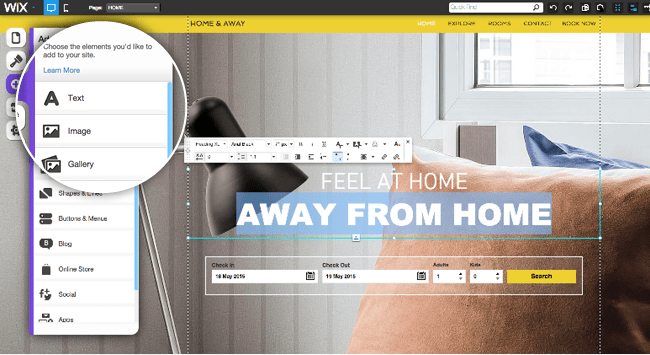
You can also create a similar effect by adding a text box to your site. Place the text box over the image and make sure the text is in front of the image. It’s that easy!

Play with some of these image editing tools to find the one you are most comfortable working with. All of them will do the trick. Remember to save your image in a high enough resolution so that it will look good on larger screens.
02. Choose your words
Once you’ve chosen a program to work with, you have to decide what message you want to send. Remember to keep your text short, simple and relevant. The words should jump out immediately to the visitor without them having to take the time to read a long block of text. The copy should also explain something about what your business does. Consider highlighting keywords in the text that emphasize what you do. You can encourage the visitor to take a specific action on your site with a call to action such as “Start Now,” “Shop” or “Contact Us.” Have the image link to the relevant page on your site.

03. Pick your colors and fonts wisely
Pick font colors that match the image and the rest of your website. One or two colors is all you need. Make sure the words contrast with the image so they’re easy to read at a glance. Light-colored text on a light background can get lost. Choose a font that is large, easy-to-read and matches the feel of your site. Your font doesn’t need to be fancy to look beautiful.
Ready to add your new images to your very own website? You can start building your free website today. If you can clearly express what your business is about and attract the eye of each new visitor on your site, you’re well on your way to snagging a new client.