- Yoon Jeong Cho
- Sep 8
- 15 min read
Updated: Nov 18

In this day and age, creating a responsive website that ensures that websites behave well on a variety of screen sizes and resolutions is pretty much table stakes. As of July 2025, around 64.35% of global web traffic comes from mobile devices, making responsiveness an essential—not optional—part of modern web design.
We’ve put together a collection of responsive websites from different industries to inspire you. Each example uses creative strategies like flexible grids, multiple columns and zigzag layouts to ensure their design works smoothly on any device. If you’re ready to make your own, a mobile website builder can help you apply these strategies easily. Before jumping into the examples, let’s go over some common questions about responsive design and building a mobile-friendly website.

Need inspiration for your website? With Wix, building a standout site is easier than ever. Choose from hundreds of customizable templates and use Wix’s easy drag-and-drop website builder tools to make your vision come to life. Turn your ideas into reality and see just how simple it is to create a unique, professional website.
TL;DR: responsive website examples
Your visitors aren’t just browsing on one screen size, and your website shouldn’t be either. This roundup features responsive websites that adapt seamlessly across desktops, tablets and mobile devices, without compromising on design or function. These examples show what’s possible when flexible layouts meet smart UX decisions.
Alongside each example, you’ll find takeaways you can apply to your own site, like how to prioritize content, keep navigation clear and use mobile design to your advantage.
Criteria we considered | Why it matters |
Mobile adaptability | Ensures a smooth experience on any device |
Scannable layouts | Helps users find what they need quickly |
Clear calls to action | Guides visitors to take the next step |
Visual consistency | Maintains brand identity across screen sizes |
Performance and loading speed | Keeps your site fast, no matter how it's accessed |
"If your site isn’t mobile-friendly, it’s not search-friendly. At Wix, we design with mobile performance in mind—because great SEO starts with a seamless experience on every device." - Sharon Hafuta, SEO blog editor at Wix
19 responsive website examples
01. Maya Lynne Adar

Maya Lynne Adar is a multidisciplinary designer whose website uses unconventional typography that combines an italicized serif with a sans-serif font. The site additionally features cutout shapes that pop in and out of the screen and a dice-like mechanism (built with custom CSS) that allows visitors to toggle between various color palettes. Animations, website hover effects and horizontal scroll further add an element of playfulness and surprise.
Minimalist layout emphasizes elegance and simplicity on smaller screens.
Strong information hierarchy organizes the artist’s work across multiple menus.
Mobile view replaces horizontal scrolling with an intuitive card-like menu.
Lighter design improves usability and ensures faster loading on mobile devices.
Want a site like this? The template behind it is available to customize into your own responsive website.
Template name: Creative agency responsive template
02. Ethical Essence

Ethical Essence’s eCommerce website stands out for its strong branded touches: earthy tones, high-definition videos, sans-serif typeface and well-lit product photography. The company emphasizes these nature-themed visuals, showcasing eco-friendly skincare products against a backdrop of sudsy beach waves and rocky terrain.
Fully responsive design adapts seamlessly to different breakpoints and screen sizes.
Website shrinks and expands smoothly, maintaining consistent formatting across devices.
Product gallery shifts from four items on desktop to a single item with slider on mobile.
Design keeps product images front and center while allowing related items to be browsed.
Key takeaway: give assets space to breathe on smaller screens.
Want a site like this? The template behind it is available to customize into your own responsive website.
Template name: Fragrance store responsive template
03. The Boathouse Agency

The Boathouse Agency's website exudes coolness and creativity, with meticulous attention to detail. The website glides gracefully when scrolling. The combination of videos, animations and unique scroll behaviors creates a non-traditional experience—a perfect complement to a portfolio that showcases innovative design projects and celeb collaborations. Notice how the logo plays well on all sections because it changes based on what’s behind it, keeping the agency’s branding neutral and letting their work do the talking.
Mobile version delivers a simplified and streamlined experience.
Opening with a video on handheld devices sets the brand apart.
Scrollable list view highlights different case studies for easy browsing.
Clean, professional layout emphasizes The Boathouse Agency’s impressive client portfolio.
Be inspired: Luxury website examples
Want a site like this? The template behind it is available to customize into your own responsive website.
Template name: Business consulting agency responsive template
04. Kristina Horan Website Designs

Kristina Horan Website Designs (KHWD) site is bold from the jump, with sharp contrasting colors that add some pop to the daring grayscale image at the top of the site. The website has an eclectic look and feel as you scroll, using various scroll behaviors, buttons and blurred images that add flair.
Mobile site feels more impactful with scroll behaviors in a tighter area, keeping every section eye-catching.
Header uses a hamburger menu to reduce cognitive load and highlight the landing page image.
Striking header image scales seamlessly across devices for strong visual impact.
Layout emphasizes smooth flow of information and overall scroll-friendliness.
Want a site like this? The template behind it is available to customize into your own responsive website.
Template name: Creative agency responsive template
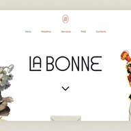
05. La Bonne

La Bonne is an organizer of corporate events, experiential marketing campaigns and social gatherings with a website that matches the team’s “good vibes” approach. Upon entering the site, you’re greeted by a collage on each end of the screen. The collage fades on scroll to reveal additional design elements that explain what the company is all about.
Site is optimized for mobile screens with centered, reasonably sized text.
Contrasting colors and simple top-to-bottom flow improve readability.
Contact button is illustrated as an envelope for an endearing touch.
Design choice sets the tone for the relationship from the start.
Want a site like this? The template behind it is available to customize into your own responsive website.
Template name: Event landing page wireframe responsive template
06. VMV Studio

VMV Studio is a self-described collective of designers, filmmakers and visionaries whose website reflects the studio's innovative approach to visual storytelling. Animations, bold graphis and videos breathe life into the web design, showcasing the studio's creativity and technical prowess. Meanwhile, subtle touches—like the frosted glass footer and text fill on scroll—add extra flair.
All the same assets return on mobile without slowing down load time.
Scroll effects, high-quality videos and full pages are preserved on smaller screens.
Shows that you don’t need to dumb down the mobile view when using Wix Studio.
Portfolio item grid shifts to a single item per row making the site more scroll-friendly.
Want a site like this? The template behind it is available to customize into your own responsive website.
Template name: Design & motion studio responsive template
07. Moon Rabbit Acupuncture

Moon Rabbit Acupuncture's website features high-resolution images, a light color palette, hover effects and a thin typeface to draw attention to the main focus of their website: the benefits of acupuncture and holistic healing. Overlayed menus and product shots invite visitors to explore their various offerings, from booking a service, to shopping their products.
Images scale down seamlessly to fit narrower mobile screens.
Grids of assets adjust so fewer elements appear per row.
Want a site like this? The template behind it is available to customize into your own responsive website.
Template name: Mental health center responsive template
08. Visual Identity Co.

Visual Identity's website showcases a striking animated visual right as you enter the landing page. The animation toggles between a gold or purple color at the click of a button. Below, scroll effects like text fill and resizing elements give the website a sense of flow within the movement. The portfolio highlights a diverse range of projects, demonstrating the agency's ability to create impactful visual identities for clients.
Minimal changes on mobile indicate a highly responsive website.
Animated effects and all elements are preserved from the desktop version.
Includes unique features like a clock showing the current time in India.
Want a site like this? The template behind it is available to customize into your own responsive website.
Template name: VJ portfolio responsive template
09. Scopetheory

Scopetheory keeps their site simple above the fold, using a blank white canvas for a background, a custom typeface and a pared-down navigation menu. As you scroll, things start getting interesting: the brand’s client work is presented in a grid which starts to stack up as you travel further down the website.
On mobile, visuals appear above the fold instead of requiring scroll.
Stacking effect and chat function are preserved on mobile.
"Client impact" section is positioned higher to emphasize key elements and adjust for mobile behavior.
Want a site like this? The template behind it is available to customize into your own responsive website.
Template name: Marketing consultant responsive template
10. Esperia Advocacy

Esperia Advocacy adds subtle design touches that set its site apart from other company sites in the space: architectural imagery, a mix of italicized and serif professional fonts, an eggshell background and an oversized, halfway-cut-off footer.
Mobile site maintains the same appearance as the desktop version.
No assets are removed on mobile, preserving the full content.
Extra space allows assets to breathe, creating a more scrollable experience.
Want a site like this? The template behind it is available to customize into your own responsive website.
Template name: Digital marketing agency responsive template
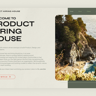
11. Product Hiring House

Product Hiring House's website combines multiple effects for a memorable experience. These effects include a sticky header, items that move on scroll (like the venn diagram that squeezes the two circles closer together), hover effects and sliding image galleries. When paired with a rich paper background, a glassmorphic effect and gorgeous landscape photography, you get a website loaded with texture and engaging functionality.
Mobile version preserves all content while resizing elements.
Grid shifts to a more vertical alignment on smaller screens.
Animation effects are maintained for a seamless responsive experience.
Website feels consistent across all touchpoints.
Want a site like this? The template behind it is available to customize into your own responsive website.
Template name: Travel insurance company responsive template
12. KlikArch

KlikArch's website greets you with a bold sans-serif font that tells you a little about what the brand does. However, it’s only when you scroll below the fold that you see their work in action. Their header disappears into the top of the screen as you scroll down, revealing product images and team headshots that decorate the screen instead.
Mobile view provides more whitespace at first landing.
As you scroll, content gradually occupies more space.
Creates an interesting play on dimensionality when resizing the website.
Want a site like this? The template behind it is available to customize into your own responsive website.
Template name: Interior designer responsive template
13. Strategy Folk

Strategy Folk's website is clean and minimalistic on entry, with a little robot animation that runs across the screen. As you scroll, design assets like text boxes, buttons, cards and more robot animations spring on screen to add movement and excitement. You’ll notice a lot of whitespace on the website, which helps it scale down effectively on mobile, as well as an example of a custom cursor that activates over one specific section.
Elements appear tighter on mobile, signaling scrollable content below the fold.
Everything behaves similarly to the desktop site for a cohesive experience.
Want a site like this? The template behind it is available to customize into your own responsive website.
Template name: Financial coaching responsive template
14. Change the Game Studio

Change the Game Studio's hyper-colorful site is a perfect representation of their ethos: chaotic innovation. Oversized text, unique fonts and maximalist style help the brand go against the grain, and abstract shapes, graphics, patterns and typographies add an extra pop.
Same look and feel is maintained on mobile with a resized, scroll-friendly grid.
Menu is tighter but still displays the full list of options upfront.
Design remains both visual and conceptual for an engaging experience.
Want a site like this? The template behind it is available to customize into your own responsive website.
Template name: Artist responsive template
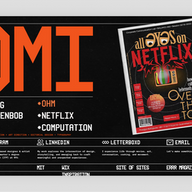
15. Omi Bahuguna

Omi Bahuguna's portfolio website leverages hover display effects against a tv static backdrop to achieve a bold and differentiated aesthetic. Sharp visual and conceptual design lays the groundwork for his portfolio, which merges print, image making and strong use of creative hover interactions. For static homepages like this one, you have to pay meticulous attention to detail and spotlight the work itself.
Mobile view showcases how brilliantly responsive the website is.
Hover displays run automatically with perfect spacing on smaller screens.
Design demonstrates the power of using device interactions to shape web experiences.
Learn more about building a static website.
Want a site like this? The template behind it is available to customize into your own responsive website.
Template name: Coming soon landing rage responsive template
16. Aura Studios

Aura Studios' showcases simple grid layouts that lets the content do the talking: rich photographs of gorgeous travel destinations and epic getaways. It’s a creative agency that wields a strong sense of elegance in simplicity on its homepage. The brand exudes lavishness, from its rich earth-toned color palette, to aspirational imagery and snippets of punchy typography.
Site adapts smoothly to narrower dimensions with an almost identical mobile experience.
Mobile view features tighter shots of the same desktop images.
Text scales to two lines for breathing room while other asset proportions remain the same.
Want a site like this? The template behind it is available to customize into your own responsive website.
Template name: Designer portfolio responsive template
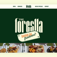
17. The Forestta

The Forestta's features several scroll effects against a leafy green background, including parallax images, side scrolling text and cards that overlay on top of one another. It’s a fun design that showcases some of the delicious food you can expect to find there, with a color palette that perfectly complements the images the brand chose.
Mobile site maintains the same behaviors as desktop.
Grid shrinks to display a single content item per row.
Clear CTAs prioritize usability for booking a table, ordering online and viewing the menu.
Want a site like this? The template behind it is available to customize into your own responsive website.
Template name: Italian restaurant responsive template
18. The Benev

The first thing you’ll notice upon entering The Benev's website is the custom ‘B’ shaped cursor, which appears as the rest of the website loads. From there, slightly washed-out videos and imagery give an ethereal touch to the website’s branding. All the content is laid out in a dynamic, non-modular grid that fills the page in an unexpected way.
On mobile, the grid snaps into a modular shape to reduce visual stimulus.
Responsive design shows how content blocks can scale effectively across screen sizes.
Want a site like this? The template behind it is available to customize into your own responsive website.
Template name: Spa responsive template
19. YNK

Young Na Kim (YNK) combines text and image scroll effects to give a bold landing page some extra dynamism. The focus of the website is clear: to showcase the selected portfolio pieces in a section below the fold, incentivizing people to get in touch.
On mobile, the website behaves the same with added whitespace.
Square images transition into circles as you scroll.
Moving text enhances dimensionality in the mobile experience.
Want a site like this? The template behind it is available to customize into your own responsive website.
Template name: Creative CV responsive template
What is a responsive website page?
A responsive website page is a page that adjusts its layout and content based on the size of a viewport. Learning how to make a website ensures that your web page looks equally good on a small screen of a mobile device and on a large TV screen.
Why should websites use responsive design?
Almost 60% of website traffic in 2024 came from mobile devices, so it's essential to optimize your sites for small mobile screens in addition to standard desktop. Responsive design allows a single website to be optimized for all devices, rather than maintaining separate websites for desktop, tablets and mobile.
Where can I find responsive website templates?
Creating a responsive website from scratch can be challenging because you have to arrange site information for each device it might be viewed on. A website template can thereby be a real time-saver, offering a ready-to-use solution that you can still fine-tune and customize.
Wix Studio offers an excellent collection of responsive website templates that feature unique visual attributes, such as crisp typography and well-crafted animated effects.
Comparing Wix Studio:
So how do you make a great responsive website?

The first thing that you need to do is to learn the principles of good website design, as creating a responsive website differs from building a website that isn't responsive. Those principles are universal and apply to any type of website. After that, you can dive into the specifics of responsive design and explore concepts like what is generative AI to understand how advanced technologies are shaping web design.
Maintaining a flexible website layout is critical for designing responsive websites because it allows you to edit your existing designs instead of recreating them from scratch. Use Wix Studio’s responsive AI as a starting point to shave off hours spent on adjusting your layout and the corresponding elements by hand (you can always set custom breakpoints or make design adjustments afterward).
From there, consider other web design standards to smooth out user experience across all screen sizes. This includes taking a mobile-first approach; designing for thumb, touchpad and mouse interactions; creating websites with a singular call to action to reduce friction; and using fluid layouts by default (including designing with percentages rather than pixels and using SVG images that scale well).
As a generality, a minimalistic design enables your website to scale effectively without running into loading issues or interaction errors.
Learn more:
Best websites for inspiratiopn
What makes a website responsive vs. non-responsive?
Responsive websites scale up and down automatically to respond to the size of your web browser. That means that whether you shrink the browser on your desktop by holding and dragging your mouse, or switching to view a website on a tablet or phone instead, you’ll get a similar experience retro-fitted to the device you’re on.
Responsive websites features
Faster page load speeds
Increase your conversion rates
Provide better user experiences
Strengthen your SEO performance
Keep mobile device users more engaged
Decrease bounce rates because of faster load times
Future-proof your website to stay ahead of the curve
Reduce maintenance costs of having multiple sites with responsive design
Making websites responsive is a best practice in web development if you're learning how to create a professional website to ensure a seamless, unified experience across all breakpoints. If you don’t do this for client sites, your clients’ users will likely need to pinch and zoom to navigate the website because it will display a desktop-friendly design on mobile, or, more realistically, your visitors will bounce.
Best practices for creating a responsive website
Practice mobile-first design: Start your design process with the smallest screen size in mind. It will help you identify and prioritize the most important content for your web page. That’s different of course than when you actually build out your website on Wix Studio (since you should build from desktop screen size down), but the actual design process should start with mobile because most users visit sites online in their phones.
Set media queries: CSS media queries define different screen sizes and make a web page adapt its layout to different screen sizes. Among media queries, a category of breakpoints defines the widths of devices. Commonly used breakpoints are mobile (480px), tablet (481px - 7689px), desktop (779px - 1024px) and TV screens (201px+).
Optimize images: You need to make sure that the images you use are optimized for different devices, so they look great and load quickly no matter where a user comes across them. That’s where image optimization comes in—it’s the process of resizing images for different viewports. This helps to reduce page load time and improve the site's performance (especially on mobile devices). Wix automatically compresses images for performance, for example.
Test your design on multiple devices: You have to test your website on various devices to ensure it looks good and functions properly on different screen sizes and resolutions.
Contextualize the aesthetic to different screen sizes: Your mobile view shouldn’t be a 1:1 clone of your desktop website. Rather, you should adjust the design accordingly.
Responsive website examples FAQ
How can I convert my website to responsive?
To convert your website to responsive, start by making sure that your design adapts to various screen sizes. You can use tools like Wix ADI to create a responsive layout without having to dive into complex coding. If you’re using a more custom approach, incorporate Wix Code to adjust your site’s elements dynamically. Also, make sure your site includes dynamic content that adjusts to the user’s device. With no code low code platforms, you can easily build responsive websites without extensive coding knowledge. This will allow you to maintain a seamless user experience across all devices.
What is a responsive website?
A responsive website is one that automatically adjusts its layout, content and design based on the user’s device or screen size. Whether accessed from a smartphone, tablet or desktop, the website will provide a consistent and optimal user experience. This design approach includes features such as flexible images and text, ensuring the content scales correctly. Websites with dynamic content will adjust and reorganize according to the screen’s size, improving usability.
What are the three basic things required for responsive web design?
The three basic components for responsive web design are flexible grids, flexible images and media queries. First, flexible grids allow content to resize based on the screen’s width. Second, flexible images use CSS to ensure images adjust their size proportionally. Finally, media queries apply different styling rules depending on the device’s characteristics, such as its width. For advanced features, integrating API and intranet options can help enhance functionality. If you want to dive deeper into responsive design using simpler methods, Wix ADI is a great tool for beginners, while exploring what is open source can provide insights into building responsive websites with community-driven solutions.
Why is responsive design important?
Responsive design makes sure a website looks and functions well on all screen sizes (desktop, tablet, mobile). It improves the user experience, increases engagement and potentially conversions by making online navigation easy across devices. It promises a website visitor a seamless experience regardless of the device they're on the website from.
How does responsive design work?
It uses a combination of fluid grids, flexible images and CSS media queries to adjust layout and elements based on the screen size. Instead of creating separate desktop and mobile sites, one design adapts dynamically to different devices.


