- Yoon Jeong Cho

- Nov 19
- 14 min read

In today’s digital landscape, creating a resume website is one of the strongest ways to stand out. CareerBuilder reports that 70% of employers review personal websites during the hiring process. A resume site acts as an online portfolio that highlights your skills, personality and achievements. This blog showcases the best resume website examples to inspire your career growth. These examples will help you understand how to plan a website that goes beyond a traditional CV. If you’re ready to learn how to make a professional website, the right website builder and templates make creating a resume website simple, effective and budget-friendly.

Need inspiration for your website? With Wix, building a standout site is easier than ever. Choose from hundreds of customizable templates and use Wix’s easy drag-and-drop website builder tools to make your vision come to life. Turn your ideas into reality and see just how simple it is to create a unique, professional website.
TL;DR: best resume website examples
Your resume doesn’t have to live in a PDF. A standout resume website can showcase your skills, personality and career story far better than a static document ever could. This guide highlights CV websites that do just that—with smart layouts, personal branding and interactive features that help them stand out in competitive industries.
You'll also get practical takeaways for creating your own, from choosing the right design to writing compelling copy.
How we chose the resume website examples
What we looked for | Why it mattered |
Strong personal branding | Memorable visuals and messaging that reflect the individual |
Clear professional summary | Concise storytelling that highlights expertise and goals |
Design and usability | Clean layouts that are easy to navigate and mobile-friendly |
Work samples or experience | Portfolios, projects or detailed experience sections |
Calls to action | Easy ways to contact or download a traditional resume |
“A strong personal brand can help you stand out in your field, attract professional opportunities and establish credibility.” - Caroline Mignaux, co-founder of Agence Personnelle and host of Marketing Square podcast
15 best resume website examples
Below is our roundup of the best resume website examples built on Wix. From these great CV examples, you can get ideas for your own website design, including ideas for what sort of web pages, content and website features you’ll need to represent your own professional presence online.
01. Christina Sterbenz: Best editor and writer resume website example

With one glance at the top fold of Christina Sterbenz’s resume website, her skill as a bold and talented writer stands out. With a design that’s minimalistic, yet full of personality, Christina combines strong website copy with an engaging user interface to foster a connection with potential clients.
Key takeaways:
As a writer, there’s no better way than look to Chistina’s bold website copy as an example of how to showcase her talent from the get-go.
Christina’s homepage is simple, but engaging. The writer employs a subtle website color scheme and hover animations for an intriguing interaction with visitors.
Christina’s resume page is clean and concise to highlight the most important aspects of her experience. It’s a great example of how to write a resume that will confidently engage future employers.
Be inspired: Resume design ideas
Like what you see? Build your own resume website using this same template.
Template name: Creative CV website template
02. Danielle Gorodenzik: Best curator resume website example

Danielle Gorodenzik has a great resume website example, demonstrating how a clean design and thoughtful content can facilitate an exceptional user experience to contribute to her professional presence. All together, Danielle’s resume site showcases her attention to detail, aesthetic sense and organizational skills—all essential qualities sought after in an art writer and curator.
Key takeaways:
An organized website layout alongside intuitive navigation makes Danielle’s resume website well-organized and user friendly.
Danielle’s resume site opens right up to the About page, providing a strong introduction to the curator’s portfolio and CV.
Danielle includes social media links in her website’s footer, giving visitors the opportunity to follow her pages on LinkedIn, Facebook, Spotify and Instagram—as well as providing easy access to her inbox.
Like what you see? Build your own resume website using this same template.
Template name: Artist website template
03. Matt Lewis: Best creative director resume website examples

He’s kind of a jack-of-all-creative-trades, which is why Matt Lewis’s versatile resume website example perfectly suits his diverse professional background. Matt uses the right combination of visual and written content to draw attention to his diverse talents and personal brand.
Key takeaways:
In this resume website example, a black and white color scheme creates a minimal and calming effect, allowing visitors to read and focus on Matt’s not-so-minimalistic experience and diverse set of skills.
Matt’s About page lists his “Top 10” TV shows and films, adding personal touch to engage with his creative and media-oriented audience.
Each of the projects highlighted on Matt’s homepage has its own landing page. This provides intuitive navigation on his site, and is also useful if he wants to build a landing page to promote each individual project.
A professional headshot, like in Matt’s resume website, is a great chance to make a friendly, professional impression to show off your personality.
Like what you see? Build your own resume website using this same template.
Template name: Interior designer website template
04. Kendall Brandt: Best graphic design resume website

Kendall Brandt has one of the best graphic design resume examples on our list, using her site to hone in on a diverse portfolio of work. On top of her love for illustration and color, visitors to Kendall’s graphic design resume site will have the chance to dive into the professional world of the designer and connect to her passion and skill.
Key takeaways:
Kendall’s website opens right up to her work portfolio, leaving no time before visitors are introduced to her versatile skill set.
Each page of Kendall’s graphic design portfolio describes the research, challenge and objectives of the process. This way, potential employers get a sense of her dedication to approaching graphic design as a way of problem solving.
Every web page also includes high quality photography, providing visual representation of the various stages within each project, from start to finish.
Like what you see? Build your own resume website using this same template.
Template name: Graphic designer website template
05. Tobias Becs: Best athlete resume website example

Tobias Becs is an all-star football player, boasting an impressive resume of awards and world records. Off the field, this sports star and content creator has an even more innovative journey, and is the active founder of Off-Pitch and 4freestyle—two of the biggest sports brands for freestyle and street football.
Not only does Tobias promote his talent and the art of free-style footballing, he’s also showcased his ability to master how to start a business. Let’s see how Tobias fits it all into his resume website example to reach his goals, on and off the field.
Key takeaways:
Tobias immediately shows visitors that he’s an athlete, with a hero image of him juggling a soccer ball. The photograph is full screen and high-quality, presenting an impressive and professional appearance.
Included in his homepage is his Instagram feed, where visitors can click-through to join his following. Social media is a great way to build engagement, grow a more diverse audience, and increase web traffic.
As a business owner, Tobias uses his resume website as a launching pad for interested visitors. He incorporates links to his business website directly in his “About Me” text.
Like what you see? Build your own resume website using this same template.
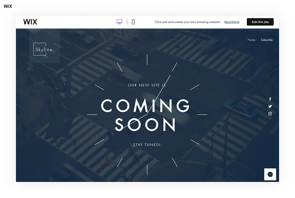
Template name: Coming soon landing page website template
06. Lauryn Higgins: Best journalist resume website example

Lauryn Higgins is no ordinary writer—the two-time Pulitzer Prize winning journalist contributes to some of the biggest names in news, and has covered major events from tracking the Covid-19 pandemic to the Russia Ukraine War. Lauryn’s site combines well-crafted language and clean design elements to get right to the point. The resume website showcases her exceptional experience and reflects the passion she has for her journalistic career.
Key takeaways:
Lauryn’s writing portfolio highlights her impressive experience in a visually appealing way. She uses the logos of publications she’s contributed to, like PBS, The New York Times, Vogue and more, linking these images directly to her author page on each site.
A serif font used in the titles of Lauryn’s resume website reflects her profession as a journalist. Pairing this with a modern sans serif font for longer content enhances user experience and readability.
On her resume, Lauryn uses a custom business email to give her freelance services a more professional quality when future clients want to be in touch.
Like what you see? Build your own resume website using this same template.
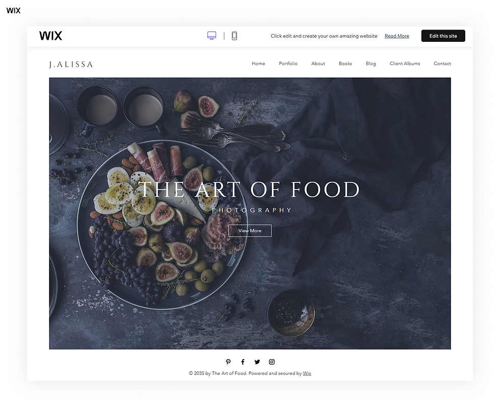
Template name: Food photographer website template
Editor’s note: Don’t worry about the template’s original niche. Wix templates are fully customizable, so choose a design that feels right and adapt it to your brand.
07. Toni Bonini: Best art director resume website example

As an art director, Toni Bonini’s website design already does a great job at showcasing her creative talents before diving into the specifics of her resume. Toni uses her vibrant website design to create an unforgettable impression for first time visitors. Using attention to detail and a perfectly balanced user interface, the colorful resume website puts her portfolio of work at the forefront, relying on vibrant visuals to grab the attention of visitors.
Key takeaways:
By displaying her portfolio on the homepage, and representing each category of work with colorful shapes, Toni invites us to dive into many aspects of her creative work, without overwhelming visitors.
Toni’s blog, Flamingos + Fringe, is a great way for her freelance business to gain a following, and gives potential clients the chance to learn more about her interests, expertise and passions in the creative world. It can also improve her site’s SEO, acting as a strategy to increase organic traffic.
Like what you see? Build your own resume website using this same template.
Template name: Illustrator website template
08. April McCain: Best portfolio resume website

April McCain’s resume website focuses on bringing attention to her graphic design portfolio. With a meticulous color scheme and personalized elements such as photographs, a custom logo and unique animation, this is one of the best examples of how to use your website design to amplify your personal brand.
Key takeaways:
A striking trio of headshots add a professional and personal touch to April’s homepage, immediately highlighting the designer’s distinctive character.
Throughout the site, a black and pink color scheme is used to turn April’s artistic flair into a personal brand. This is implemented in the website background, website text and her professional logo.
Clean typography and modern fonts are used to present the designer’s content, from her website’s favicon, to the clean website copy.
Like what you see? Build your own resume website using this same template.
Template name: Graphic designer website template
09. Anissa Hexton: Best marketing resume website

Anissa Hexton's online CV captures her decade of experience in marketing and branding with a clean friendly design. The homepage instantly introduces her with a professional headshot and a warm welcome while simple buttons lead visitors to her resume, projects and background.
Key takeaways:
A personable introduction makes the site feel professional yet approachable.
Clear call-to-action buttons guide visitors to her work.
Multiple contact options (phone, email, LinkedIn) make networking easy.
Like what you see? Build your own CV website using this same template.
Template name: Business CV website template
10. Jenna Gross: Best home designer resume website example

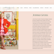
Jenna Gross's website for Colordrunk Designs is a direct reflection of her fearless approach to interiors—bold, colorful and full of personality. The site immediately sets the tone with vibrant imagery and playful design elements that echo her mastery of mixing patterns and hues. Visitors are greeted with an inviting aesthetic that feels both polished and approachable, showing off Jenna's ability to create spaces that are sophisticated yet fun.
Key takeaways:
The portfolio section is the heart of the website, filled with photography that captures Jenna's signature use of color and eclectic combinations. Each project feels dynamic, giving potential clients a clear sense of her creativity.
Her "about" page tells her story in a personal and engaging way, outlining her path from New York fashion to Southern interiors—helping clients connect with both her experience and personality.
Her email is placed in the footer making it simple and straightforward for potential clients to reach out.
Like what you see? Build your own resume website using this same template.
Template name: One page layout website template
11. Akin Yemi: Best musician resume website example

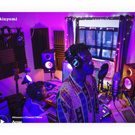
Akin Yemi is a musician who uses his resume website to promote his one-of-a-kind tracks, tours and videos. The colorful site is full of imagery that showcases the artist’s musical talent and presents himself in a trendy, composed and professional light.
Key takeaways
Full screen images of Akin in the studio or performing in front of a live audience uplift the resume website visually, but also give visitors a glimpse at his professional activity and experience.
As a musician, it’s a strategic move to add a musical track to his website, featuring one of his own compositions. He also connects his site to Spotify, SoundCloud and Apple music pages, inviting us to listen to more.
A page dedicated to upcoming tours is a great way to promote Akin’s upcoming shows and sell tickets to his following.
Like what you see? Build your own resume website using this same template.
Template name: Musician website template
12. Elizabeth Bullard: Best illustrator resume website example

Elizabeth Bullard is a digital artist with an extensive portfolio to showcase her work. The artist uses a resume website to exhibit images of her creations, from double exposure photographs and illustrations, to her work in typography and advertising.
Key takeaways:
An abstract video background is a great way to highlight Elizabeth’s creative side, giving her homepage a dynamic effect without distracting too much from the artist’s own creations.
The extensive website menu gives visitors the chance to view a wide range of Elizabeth’s work. Visitors can click on each clearly labeled topic to open a new web page of her portfolio.
Like what you see? Build your own resume website using this same template.
Template name: Illustrator website template
13. Danielle Matthew: Best marketing resume website

Danielle Matthew's website shows how clear positioning, visual polish and smart messaging can make a marketing professional shine. Her site instantly tells you who she is, what she does and what she brings to the table, all wrapped up in a design that's engaging, modern and super easy to navigate.
Key takeaways:
Right from the start, Danielle states her value proposition. It's bold, forward-thinking and designed to grab attention from brands wanting someone who can drive real change.
Calls-to-action are perfectly placed: a "See Full CV" link, a "Get in Touch" button—every section shows visitors exactly how to take the next step (connect, hire or learn more).
Her website also includes a direct messaging feature so visitors can reach out right away without bouncing around to different pages.
Like what you see? Build your own resume website using this same template.
Template name: Creative CV website template
14. Matt B. Atkins: Best digital marketing manager resume website

Matt B. Atkins's resume website positions him as a forward-thinking digital marketing manager with over a decade of experience. His homepage makes a strong first impression with bold typography and a confident introduction backed by a clean modern layout.
Key takeaways:
Matt's website engages visitors with a dynamic graph showing his professional knowledge across important skills.
His portfolio pages present projects through clean visually striking graphics.
Matt's website includes a contact form making it easy for potential clients or employers to reach out directly.
Like what you see? Build your own resume website using this same template.
Template name: UX designer website template
15. Cameron Renfrow: Best interior designer resume website

Cameron Renfrow is an interior designer whose resume website presents Cameron's portfolio in a visually striking and organized way. The site immediately shows off his design aesthetic and professional experience allowing potential clients and collaborators to explore his work with ease. When starting a business of your own, tools like a resume template, business name generator and logo maker are excellent ways to get your online presence off the ground.
Key takeaways:
Cameron shows his projects through high-quality images giving visitors a clear sense of his style and versatility.
The website includes a contact form and links to social media making it easy for potential clients to reach out and start collaborations.
Like what you see? Build your own resume website using this same template.
Template name: Food photographer website template
Editor’s note: Don’t worry about the template’s original niche. Wix templates are fully customizable, so choose a design that feels right and adapt it to your brand.
The best websites featured here were built with Wix and show what’s possible with real, DIY designs. They represent functional, effective and thoughtfully crafted options that help people run their businesses.
Recommended CV website templates
Ready to create a CV website of your own? There’s no better way to start than by using a professional website template. When considering how much a website costs and how long it takes to build a website, starting with a template and customizing it to match your personal brand will save you both—time and money.
The following CV website templates are all built on Wix, and provide examples of how each design will start you off with the right foundations. Below, we’ll point out the stand-out features of each and why they’re a solid tool for making your own resume website.
01. Business CV website template
For business professionals, a minimalistic design is ideal for highlighting your experience. This resume website features a clean, organized layout with pre-made sections for your skills and work history.
Use this business CV website template.
02. Creative CV website template
This creative resume template gives you all the foundations to show off your imaginative personality. Using modern fonts and an asymmetrical website layout, it’s the perfect start to a creative portfolio that help you represent your skills and ideas.
Use this creative CV website template.
03. Academic CV website template
Who says academic CVs have to be dull? This polished scholarly template lets you showcase your achievements with style. From a clean, organized layout to sections for your credentials, publications, and experience, it’s designed to make your academic journey shine. Customize it with your unique qualifications and let your expertise take center stage.
Use this academic CV website template.
Essential components of a resume website

A great resume website is more than just a list of your past jobs; it’s a dynamic space that tells your professional story. Think of it as your personal online headquarters where recruiters and potential clients can see who you are and what you bring to the table. Let's walk through the components that will help you build a resume website that gets you noticed.
Clean design
First impressions matter and a simple, professional design lets your accomplishments shine. A minimalist layout with clear structure helps visitors find what they need without distractions, showcasing your organization and professionalism from the first click.
Contact information
Make it easy for recruiters or clients to reach you. Place your email, phone number or a contact form in a prominent spot like the header or footer. The simpler it is to get in touch the more likely they’ll reach out.
A professional photo
A high-quality headshot adds a personal touch and builds connection. It shows you take your personal brand seriously. Choose an image that reflects your personality and suits your industry.
A portfolio of your work
This is your chance to shine. A portfolio shows rather than tells what you can do. Whether you're a writer, designer, developer or photographer, include your best projects to prove your skills.
Detailed work experience
Clearly outline your professional history with roles, responsibilities and achievements. Use bullet points for easy scanning, making it simple to see the impact you’ve made.
Relevant links
Add professional links like your LinkedIn profile or portfolio. These let visitors explore your work, achievements and expertise in more depth.
Ready to land your dream job? Check out the best resume website builders and make a professional resume that gets noticed.
Best resume website examples FAQ
What is a resume website?
A resume website is a personal site dedicated to your professional experience, skills and portfolio. It’s more interactive than a paper resume, allowing you to share your career story through text, images and project examples.
Why should I create a resume website?
A resume website gives you a space to control your professional narrative. It allows you to present a more complete picture of your abilities than a one-page document ever could. You can include a portfolio, share testimonials and give potential employers a better sense of your personality and work ethic.
How do I start building a resume website?
Getting started is straightforward. You can begin with a website builder that offers customizable templates. From there you can add your personal information, upload your work and adjust the design to match your personal brand.
Can I use templates to create a resume website?
Absolutely. Using a professionally designed template is a great way to build a polished website quickly. You can choose a design that fits your industry and then customize it with your own colors, fonts and content to make it uniquely yours.
How much does it cost to create a resume website?
The cost can vary. Many website builders like Wix offer free plans that provide all the tools you need to create a professional-looking site. If you want more advanced features like a custom domain name there are affordable premium plans available.









Comments