- Feb 18, 2024
- 11 min read
Updated: Feb 2

The website background might seem like an insignificant detail when you’re figuring out how to make a website. After all, it’s not like you can put anything of value behind your content—or can you?
More than just a visual asset, a website background is a powerful tool. You can use it to reinforce your brand’s visual style, set the mood, emphasize certain aspects of your site and indicate a structure in your web design.
Using some of Wix’s website templates as examples, we’re breaking down 10 website background ideas and offering some best practices for deciding which one is best for your website. Naama Oren, one of Wix’s talented designers, will chime in with insights and tips to help you create the best website you can with these backgrounds.
Want access to all these website background ideas and the corresponding templates? Design a website with Wix today.
10 website background ideas you’ll love
01. White website backgrounds
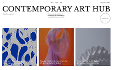
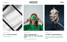
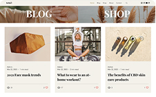
One of the most timeless and versatile choices for website backgrounds is the classic white background. “You can’t go wrong with an all-white background,” says Naama. “Designers love white backgrounds because they always look good and never go out of style.” This clean and minimalistic choice not only makes imagery pop but it also gives you room to play with typography and layouts.
Consider the Branding Portfolio Template as an example. From the header to the footer, the white background creates a sense of calm amidst the chaos of the internet. It serves as a refreshing contrast to the crisp, black text. What's more, the background doesn't vie for attention with the glossy fashion portfolio images below; instead, it provides a breathable context that allows your work to shine.

02. Solid-color website backgrounds
If white bores the heck out of you but you still need a more neutral background than, say, a video website background (we’ll get to that later), a solid-color background could be the ideal compromise. This type of background is useful for immersing visitors in your brand or demonstrating how forward-thinking or up-with-the-trends you are.
Take a look at the hero section in the Fast Food Restaurant Template. The green-grape color is a trendy, bold choice that demonstrates the restaurant’s cool-factor. “I think it creates something very graphic in a way,” says Naama. “The trendy color and the cut-out elements make it look kind of indulgent.” Indeed, the color doesn't just play the role of a background but also brings objects to life, imparting the site with a compelling 3D quality.
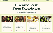
The challenge with color backgrounds is that every element must harmonize with the chosen hue. Therefore, if you’re starting a business that is more image-centric, you should choose colors that are more neutral such as the ecru color in this template’s text-heavy sections. Even if you opt for a bolder color, employing neutral shades strategically can offer viewers a visual respite.
Pro tip: To change the color scheme, simply customize the color theme to match your branding and watch the design transform automatically. If you don't have the hex codes at hand, you can upload your logo to receive a selection of compatible color palettes. You can even manage specific adjustments, like altering background or title colors, in the advanced settings.

03. Split-color website backgrounds
Looking for an even more interesting way to play with color? Consider using a split-color background that divides your canvas in half. While the technique won’t work for every website, it’s a neat one to use when your pages are overflowing with images.
If you want to see this background style in action, check out the Illustrator Website Template. This online portfolio website is covered with graphics that show off the artist’s work. A solid color background might’ve worked here. However, the split between blush pink and black keeps the design visually interesting.
Pro tip: With Wix’s drag-and-drop editor, it’s easy to create layered backgrounds like this one. If you’re looking to go for a split-screen, split-color look, all you need to do is add a container to one side of the template and set it to a different background color.

04. Gradient website backgrounds
Web gradients allow you to have more fun with color. By gradually blending a combination of colors, gradients create an engaging and modern visual experience.
According to Naama, though, you have to be careful when it comes to placing gradients in the background. “It really depends on the concept, the visual language and the industry,” she explains. For instance, in tech and AI, they could look great and work really well with the branding. For more conservative industries, not so much.
There are different ways to use gradients effectively in the background of a website. You could go subtle by blending two similar colors. You could also follow the lead of the Coming Soon Landing Page Template and mix a wide range of colors, play around with the direction of the gradient and use neon colors to call attention to the content in the center. “This gradient pops. It looks fresh and young. A little bit feminine,” says Naama.
If you’re building a brand that needs to stand out among the competition, this striking color competition could be a great fit—but only in small doses. “I don’t know if it would’ve worked on a longer webpage,” says Naama. “You can go crazy with the background when it’s a short page.”
Pro tip: The Wix Editor comes with a tool that allows you to create a totally custom gradient background for any part of your website.

05. Graphic website backgrounds
If you’re thinking about using graphics like illustrations or patterns for the imagery on your site, keep in mind that they can be just as effective in the background as in the foreground. The Gaming Company Website Template is a creative example of how graphics can help you build a world around your brand. Using imagery from the video games the company has created immerses viewers and vividly showcases the company’s capabilities.
This is arguably one of the more challenging website background ideas to execute because graphics add a lot of complexity to a website. Failing to counterbalance the excess with subtle elements may make your website too overwhelming for visitors to enjoy. “While the user scrolls, they need to have a good experience,” says Naama. “If it’s a very purple, illustrative background, I’d use white typography and clean, sleek elements. Nothing too dramatic. It’s a balance.”
Learn more: What is web design? and How to make a Wix website

06. Textured website backgrounds
A textured website background is one that resembles a tactile surface. This is a great way to inject realism into the digital experience. If your brand has a brick-and-mortar component or sells real-world experiences, implementing this website background design idea could be a cool way to bridge that gap.
Visit the Japanese Restaurant Website Template, and you’ll see what we mean. The crinkled fabric background appears on every fold of the homepage, often changing colors to give the page some structure. The texture is subtle enough that it doesn't distract from the content of the website, but it still adds visual interest and depth.
To create a visually engaging and harmonious design, select textures that align with your brand's identity and message. Subtle texture like fabrics, surfaces, tricks of light and shadows often work wonders, adding depth and interest without overshadowing your content.
Pro tip: Search “texture” in the Wix Media Manager to find a textured background that fits your branding. Whereas something like the seed paper image could help you add a peaceful, organic feel to your site, the satin images exude luxury.

07. Photographic website backgrounds
Images are potent tools in the digital world, capable of conveying complex ideas, emotions and the essence of your brand with just a glance. In the context of photographic website backgrounds, their significance becomes even more pronounced. These background images are like the opening scene of a movie, the first impression that visitors get when they land on your website. They set the tone for the entire digital journey, encapsulating the essence of your brand and the message you wish to convey.
The hero of the Plant Store Website Template is the perfect example of how effective this type of website background can be. Rather than a closeup of one of the store’s plants, the backdrop is an atmospheric shot of a trendy, plant-filled room. “It’s more like they’re selling a vibe or an atmosphere,” says Naama. “The photo creates this sense in visitors like, ‘I want this house full of plants.’”
When implemented thoughtfully, photographic backgrounds can set the tone, create engagement and leave a lasting impact on your visitors. Start by selecting images that harmonize with your brand and message, ensuring they convey the right emotions and align with your overall theme. Consider factors such as image composition, color schemes and subject matter to create a cohesive visual narrative. Make sure the background doesn't overwhelm the content or interfere with readability.
Pro tip: In terms of sourcing your photos, you have a couple options. If you’re not taking your own, use free stock photos instead. Wix users, specifically, have access to Wix’s free image library as well as Shutterstock and Unsplash integrations.

08. Video website backgrounds
Unlike static images, video backgrounds introduce movement and the sense of a physical presence to your website. It's like inviting your audience to step inside the story of your brand, where they become active participants. Whether it's the serene waves of an ocean or a bustling cityscape, video backgrounds offer a sense of place, mood and atmosphere that can be both aesthetically pleasing and emotionally evocative.
The Producer Website Template demonstrates that something as simple as a short clip of a person working at their desk can make a big impression. While the fullscreen website background enhances the immersive experience, the dark overlay pattern ensures that the site’s text is the focus. “It lets you in easily,” explains Naama. “You want to stay and stare at it and you don’t understand why.”
Pro tip: In order to avoid overloading your site with heavy files, use brief clips for backgrounds and click “play in a loop” in Wix’s video settings panel. Wix’s Media Manager offers plenty of free videos for you to choose from. Alternatively, you can upload your own or purchase one from the Shuttershock integration.

09. Animated website backgrounds
Animation backgrounds serve as a dynamic tool to capture your visitors' attention and evoke specific emotions. For instance, slow animations can create a sense of calm, making them ideal for wellness-oriented brands. On the other hand, faster and more erratic animations are perfect for energizing fitness brands.
But animation isn't limited to just enlivening your website; it can also enhance flat, single-color backgrounds. Take, for instance, the Graphic Designer Template, where a subtle undulating animation breathes life into what would otherwise be a plain white background. "Because it's so minimalistic, the subtle animation gives it depth," notes Naama. Moreover, the white coloring of the animation complements the keyhole image and bold typography choices seamlessly.

10. Website backgrounds with parallax effects
According to Naama, a parallax scrolling effect—which creates the illusion of three-dimensionality—is a great alternative to video and animation. “If you can’t find an amazing video to use, a parallax background can add depth to your design,” she explains. “The parallax helps it become more alive.”
In the Sport Merchandise Store Website Template, the parallax effect adds drama to the heroic-looking images of athletes. But parallax has different effects depending on the content of the imagery, so this type of website background could be a good fit for just about any website.
Pro tip: Wix has more than a dozen scroll effects to apply to your background. Besides parallax, “reveal” and “fade out” can also make your background more impactful.

Website background design best practices
How do you choose which website background is right for you with so many choices out there? Naama says it starts with a good understanding of what kind of content you’re working with and who you’re building the website for. Here are a handful of additional best practices she recommends for selecting the right website background.
01. Don’t let the background draw too much attention away from content
Think of your background like a backup dancer—it needs to look good and be in-sync with the star, but it should never steal the show. Remember that your primary objective when choosing a background is to create a visually pleasing and user-friendly experience that encourages users to stay and explore your website.
For example, if you decide to go with a color background, avoid using colors that are overly vibrant or jarring. According to research from Top Design Firms, 39% of people surveyed said that website color is more important to them than other elements. However, they’d leave the site if the colors are outlandish or off-putting.
02. Use backgrounds to streamline the flow of content on the page
For long-scrolling websites, backgrounds are useful for dividing content sections. They create a distinctive look for each section, helping users transition from one part to the next.
To create an effective flow and keep it engaging, create a distinctive look for each alternating background. For instance, the hero section could have a video background, the below-the-fold section could use a white background and the next one could have an image or video.
03. Add boundaries between backgrounds as needed
Sometimes, alternating background types alone may not provide a clear distinction between sections. For instance, a sticky header with a white background may distract from content in other white background sections. Use techniques like grid lines, bevels, shadows and transparency to create a definite separation between backgrounds.
04. Ensure readability
Backgrounds with busy imagery, bold colors, or excessive movement can hinder content readability and accessibility. Pairing your background with the right typography is crucial for accomplishing this. Additionally, adjusting the contrast between the color of the background and the text can help you achieve optimal readability.
05. Be on brand
Leverage backgrounds to reinforce your brand identity. Incorporate your brand's color palette into your background and use it as a storytelling canvas. Background elements, whether images, patterns, colors, videos or even interactive features like custom cursors and hover effects, can effectively convey your brand's story and purpose. These dynamic touches not only enhance engagement but also leave a lasting impression that aligns with your brand.
06. Make it mobile-friendly
Because almost 59% of global internet traffic comes from mobile users, you need to consider whether your background is going to look as nice on mobile as it does on desktop. While fullscreen color and gradient backgrounds are the easiest to make responsive, don’t let that stop you from experimenting with other website background ideas.
In the Wix editor, you can toggle back and forth between desktop and mobile when designing your website. So creating a responsive image, video or animated background should be no problem.
07. Pay attention to the quality of your background imagery
Whether it's textures, photos, videos, or animations, pay attention to the quality and resolution of your background files. Start with high-quality, high-resolution files from reliable sources. Ensure file formats and sizes align with your website's design, avoiding issues like pixelation or stretching.
Learn more: What is a pixel
08. Optimize image or video backgrounds for speed
It’s not just undersized files that can cause problems. Excessively large files can cause your pages to load slowly. According to Google, the chances of visitors bouncing off of a page go up by 32% if it takes more than three seconds to load.
Choosing the right file formats will help keep background file sizes reasonable. WebP and SVG are the lightest. JPG is lighter than PNG, but it can come at the cost of resolution and graphic detail. Another thing you can do is use an image resizer to resize and compress your files before you upload them into your website builder. This will help your site maintain speed and functionality.
Website backgrounds FAQ
What is the best background for a website?
The best background for a website depends on its purpose and content. Generally, a clean and subtle background, such as a solid color or a subtle texture, provides a visually appealing backdrop that doesn't distract from the content. Choose colors that complement the overall theme and promote readability. For image backgrounds, prioritize high resolution and relevance to the website's message. Regular testing and consideration of user preferences are key factors in determining the most effective background.


