- Dec 31, 2024
- 7 min read
Updated: Feb 26

Back around its online debut in 2011, the parallax scrolling effect made waves as a new and exciting web design trend. Many internet fads have come and gone in the years since, but parallax scrolling has established itself as a fundamental design asset that’s here to stay.
When you're deciding how to create a website, parallax scrolling is a great way to add depth and movement to the browsing experience. Below you’ll find a full explanation of what parallax scrolling is, complete with a selection inspiring examples of parallax scrolling websites to learn from and a few website templates to get you started.
What is parallax scrolling?
Parallax scrolling is a web design technique in which the website background moves at a slower pace than the foreground. This results in a 3D effect as visitors scroll down the site, adding a sense of depth and creating a more immersive browsing experience.
Parallax is based on optical illusion. Since the human eye perceives objects that are close to us as larger than things farther away, we perceive distant objects as if they were moving more slowly.
The illusion has been long adopted into parallax across different mediums, fostering a realistic effect. Its first use was in traditional animation, dating back to as early as Disney’s Snow White and the Seven Dwarfs, and in video games such as Super Mario.
With advancements in CSS and HTML, parallax effects later evolved into the world of web design as we know it today.
Here are nine outstanding parallax scrolling examples built with Wix, handpicked for your web design and making a website inspiration:
Parallax scrolling examples
01. Mild Design
Emilie De Grosbois, a Montreal-based visual artist and the founder of Mild Design, can show us a thing or two about how to make a portfolio. Her own portfolio website strikes visitors with an impressive welcome: a series of intricate fullscreen images displayed in a long scroll. These are some of the best website images we've seen.
By use of parallax, the transition from one image to the next becomes not only smoother, but it also adds a sense of depth, as if the images gently glide on top of each other.
02. Nolan Omura
Nolan Omura is a Hawaii-based photographer and videographer specializing in underwater photography. His ingenious take on the parallax scrolling effect adds depth and motion to his already captivating homepage design.
By dividing the page into full-width strips, site visitors are met with exhilarating shots of aquatic life each time they scroll down further. The strips float gently above one another, using a mix of both parallax and reveal scrolling effects.
Giving the photographs even more movement are minute animations. While these are barely discernible, the website animations - combined with the use of parallax and video - make this page fully come to life.
03. Chris Covert
Aerospace engineer Chris Covert’s bold resume website is just as professional as it is innovative. The site’s design and interactivity manage to inject much of Chris’ personality into what could have otherwise been a dry list of skills, experience, and education history.
Chris places shots of his printed CV and business card in the center of the screen. Using the reveal scroll effect, the website background images swiftly changes behind them as the visuals stay put, achieving a surprising result.
Paying much attention down to the smallest of details, the website provides a remarkable answer to the question of how to write a resume. It also includes a downloadable PDF document of the CV for potential employers to print out.
04. Ivy Chen
Designer and illustrator Ivy Chen’s use of parallax makes for a unique portfolio website, in which her works gradually reveal themselves as if by scrolling magic.
Ivy’s use of the parallax scrolling effect is not only mesmerizing, but also amplifies and explains the page’s content. As a multidisciplinary designer, she operates at the intersection of illustration and graphic design. The two fields are integrated seamlessly, with her fashion illustrations slowly transforming into real life garments as we scroll.
Jewelry designer Hila Rawet Karni’s website employs parallax scrolling to create an interesting, multifaceted browsing experience. By layering images and text on top of one another and having them move at different speeds, the page seems to be constantly changing and forming new compositions as we scroll. The layered look also helps this small business website keep up with the latest web design trends.
Notice, for example, how the middle photo of a sitting woman stays in place as other elements drift alongside it. That photo eventually rolls out of the screen too, making room for other sections of this website and achieving a dynamic feel.
06. Barco Sorriso
Digital illustrations and a vivid color palette lend a cheerful, welcoming tone to this nonprofit website. The top fold depicts a boat in the ocean, fitting for an organization whose name means ‘The Boat Called Smile’ in Portugese.
As we scroll down this multilingual website, however, the ocean view of the first fold is gradually obscured behind the greenery of the second. This sleek transition, achieved by use of parallax scrolling, brings to mind the layers and depth of animated films or video games.
07. Karlie Kloss
This elegant and clean website is the perfect modeling portfolio for supermodel Karlie Kloss. The website color scheme aims for simplicity in its choices of white, gray and black, and so do the generous amounts of white space.
At the same time, this classy look is combined with small touches that keep the website far from ordinary: the subtle use of pink, the heavy black font, and the sense of motion imparted by parallax scrolling and the use of video.
Explore these modeling portfolio examples and marketing website examples for inspiration.
08. Hana Knizova
London-based Hana Knizova’s photography website features a long scroll of images revealed and obscured using parallax scrolling.
The photos on the homepage are an introduction to Hana’s varied projects and many specialities as a photographer, from editorial to portrait to maternity photoshoots.
Simultaneously, the images also double as the website menu, creating a unique navigation system where each image leads to a different inner page.
09. Frankie Ratford
The personal website of graphic designer, digital nomad and entrepreneur Frankie Ratford is colorful, vibrant and bubbly.
The sunny colored top fold features several layers of parallax. While Frankie herself remains static in a candid and relatable portrait, her name slides upwards from behind the photo, followed by a bio section that glides on top of the same image.
The rest of this graphic design website makes more subtle uses of parallax scrolling in its display of various informative details.
Enabling parallax scrolling on your Wix website
To enable parallax scrolling on your Wix website, use strips that have a color, image, or video background. Combining multiple strips together can enrich the effect.
How to enable parallax scrolling on a strip:
1. In the Editor, click ‘Add’ on the left menu, then choose ‘Strip.’
2. Click ‘Change Strip Background.’ Here you can change the background to a color, image or video of your choice.
3. Click ‘Settings’ on the Strip Background, and under ‘Scroll Effects’ choose the desired effect (Parallax, Reveal, Zoom-In or Fade-In).
4. Check out the effect in action in Preview mode, and revise if needed.
1. In the Editor, click ‘Change Page Background.’
2. Click ‘Settings’ on the background image.
3. Under ‘Scroll Effects,’ select ‘Parallax.’
Website templates with parallax scrolling
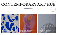
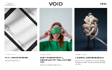
To get started easily, choose one of our many website templates that’s designed with built-in parallax scrolling, then customize it to your needs.
We’ve selected three such templates to help you in creating a website:
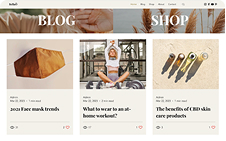
Online Personal Care Store: This template for an eCommerce website features its products on clean, solid backgrounds. At the same time, parallax scrolling is applied to photos of people interacting with the products, setting them apart and making for a more interactive experience.
Bread Shop: This mouthwatering template is made up of several full-screen strips with parallax scrolling. A cinemagraph on the third strip adds an extra sense of motion.
Let’s Play: This multi-layered parallax template achieves a sophisticated look with a color-changing gradient fullscreen background and a static layer of typography. For additional information, check out this detailed template tutorial.
Learn more: What is mouse parallax?
Parallax scrolling FAQ
What is the best use of parallax scrolling?
Parallax scrolling is best used sparingly and strategically. It's most effective when used to create a specific mood or atmosphere, or to highlight a particular element on a page. Parallax scrolling should not be used on every page of a website, and it should not be used in a way that makes it difficult for users to navigate the site.
Why is parallax scrolling avoided?
Parallax scrolling can be avoided for a number of reasons. For example, it can be difficult to implement on mobile devices, and it can also make websites feel less accessible to users with certain disabilities. Additionally, parallax scrolling can be overused, which can make it feel gimmicky and unprofessional.
What does parallax mean in video games?
In video games, parallax is a technique that is used to create a sense of depth. This is done by making the background images move at a different speed than the foreground images, which creates an illusion of movement. Parallax is often used in platform games and racing games to create a more immersive experience.
What size image should be used for parallax scrolling?
The size of the image you use for parallax scrolling will depend on the size of your website and the effect you want to create. In general, you will want to use a large image that is at least the same size as your website's viewport. However, you can also use smaller images and scale them up using CSS.
What is an example of a parallax effect?
An example of a parallax effect is on a website where the background image scrolls more slowly than the text or graphics in the foreground. This creates a sense of depth and movement, making the design feel more dynamic and engaging.
What is a parallax in layman's terms?
Parallax is when things closer to you seem to move faster than things farther away. Imagine looking out a car window—nearby trees zoom by, but distant mountains barely seem to move. Websites use this idea to make scrolling feel more interactive by moving different layers on the page at different speeds.


