- Apr 30
- 10 min read
Updated: 2 days ago
Build your website in minutes, try Wix for free today →

If you’re wondering how to start a service business, one of the most important steps is making it easy for clients to book your offerings online. Whether you run a yoga studio, a photography business or a pet grooming company, you need to know how to build your own website from scratch that's more than great visuals and it needs built-in functionality that supports your day-to-day operations.
That’s where Wix Bookings comes in. This all-in-one website builder feature lets clients seamlessly book services, pay online and even receive automatic reminders. From private appointments to group sessions, Wix Bookings helps turn your website into a fully functioning business hub.
In this post, we’ll spotlight the best service business ideas and sites built with Wix that use Wix Bookings to their advantage. As you explore each example, you’ll discover how different types of businesses, from beauty salons to personal trainers, use design, smart scheduling and other Wix Bookings features to serve their customers. Use these ideas as inspiration when creating a website of your own or plan how to start a business that runs efficiently online.
When choosing a website builder, you want one that’s flexible, powerful and easy-to-use. Wix is the go-to platform for millions of users looking to create a stunning website effortlessly. See what makes Wix stand out from the crowd and why it’s the right fit for you.
TL;DR: Wix bookings websites

If you're learning how to make a booking website, you’ll want to see what success looks like first. That’s why we’ve curated a list of inspiring service websites built with Wix—each one using the Wix Bookings tool to simplify scheduling and drive business.
These examples go beyond looks. We selected them based on design, functionality and how well they use essential tools like a logo maker, clear service pages, custom domain names and free website hosting.
“A great booking website doesn’t just look good—it works hard behind the scenes. It should feel effortless for your clients and powerful for your business.” - Sharon Hafuta, SEO blog editor at Wix
What we look for in the best booking websites:
Seamless use of the Wix Bookings feature
High-quality web design (learn more: What is web design?)
Clean, mobile-friendly design that reflects the brand
Clear calls-to-action and simple website navigation
Integrated business tools like calendars, contact forms or eCommerce
Use of branding, like designing a logo
Clear display of pricing, availability and service details
Feature | Purpose |
Wix Bookings integration | Lets clients book, pay and get reminders automatically |
Mobile optimization | Ensures a smooth experience across all devices |
Logo and branding tools | Helps create a professional look with tools like a logo maker |
Custom domain name | Adds credibility and boosts search visibility |
Clear service pages | Makes booking decisions easier for your website visitors |
We reviewed dozens of service websites created with Wix to surface those that do more than just look good. Each example demonstrates smart use of booking website builders, strong branding and customer-centric design. Whether you're a beginner or growing an existing business, these examples show what’s possible with the right website builder and features.
10 Wix Bookings website examples
Now that you’ve seen what makes a great booking website, it’s time to explore real examples. Whether you’re looking for business ideas, building your first profitable business or simply want to upgrade your existing site, these service-based websites can help spark your next move.
Each one was built with Wix and uses the Wix Bookings feature to simplify online scheduling, boost client engagement and drive revenue. As you browse, consider how these entrepreneurs turned their skills into thriving ventures and how you can apply their strategies to your own path. If you’ve been wondering how to make money as an entrepreneur, starting with a polished, functional booking website is a powerful first step.
“Sometimes all it takes is seeing how someone else did it to realize you can do it too. These booking websites aren’t just beautiful—they’re proof that with the right tools, you can turn your service into a real business.” - Sharon Hafuta, SEO blog editor at Wix
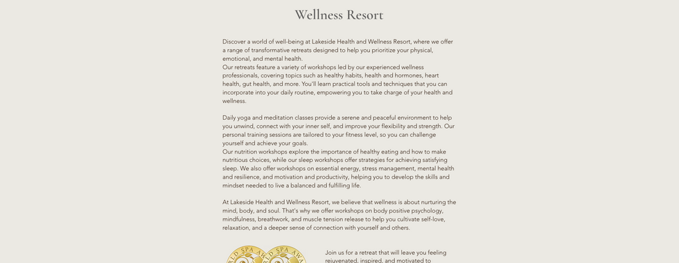
01. Lakeside Health and Wellness Resort

Lakeside Health and Wellness Resort seamlessly blends accommodation, wellness and service appointments into a cohesive booking experience. Their “Book a Chalet” and dedicated service pages use Wix Bookings scheduling forms, guiding users through a clear, step‑by‑step inquiry process. This setup helps anyone studying how to start a hotel business understand how to integrate accommodation and experiences under one brand, making it a prime case for hotel name ideas and service business examples that deliver a full‑scope hospitality model.
Beyond the streamlined booking, Lakeside’s site showcases a strong brand identity—consistent typography, tranquil visuals and intuitive navigation—ideal starting points for aspiring hoteliers. The site’s wellness messaging illustrates a blueprint for how to start a business by offering retreat, spa activity bundles and a dedicated members area under one roof, ultimately inspiring future hotel‑business founders to emulate this polished, customer‑centric online strategy.
Inspired? Here’s the exact website template behind this Wix Bookings website:
Website template name: Hotel website template
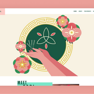
02. Acupuncture with Fabi

Acupuncture with Fabi exemplifies a clean, effective health and wellness website. Service pages are well organized and feature “BOOK NOW” CTAs for offerings like gua-sha and moxibustion. The inclusion of detailed practitioner profiles increases trust, while clear layout and instant booking streamline customer engagement. The site is optimized for patient convenience; integrating testimonials—or patient stories—would elevate its credibility even further.
Another smart addition is the site’s blog, which shares educational content on Eastern medicine and wellness tips. This not only improves SEO, but shows how wellness practitioners can use a blog maker to build authority and drive traffic. If you’re a practitioner exploring how to start a blog alongside your business site, Fabi’s content strategy is a useful example of how blogging can support client trust and grow your audience. The site proves that a strong booking system paired with informative content makes for a powerful digital presence.
Inspired? Here’s the exact website template behind this Wix Bookings website:
Website template name: Pop up shop website template
03. Hireformance Pilates Institute

Hireformance Pilates Institute stands out as a powerful example of a fitness business ideas turned into an online model. The site uses Wix Bookings to let visitors book classes or personal training packages with transparent pricing—ideal for those wondering how to start a fitness business or how to sell fitness programs online. The name itself is a solid example of sports business names and fitness business name ideas, combining clarity with branding punch.
The site guides users from learning about class types to signing up, making the conversion process frictionless. Pricing tiers and scheduling options are clearly presented, providing a practical roadmap for entrepreneurs building fitness businesses—from on-site sessions to e-programs—supported by a professional and engaging front end.
Inspired? Here’s the exact website template behind this Wix Bookings website:
Website template name: Fitness studio website template
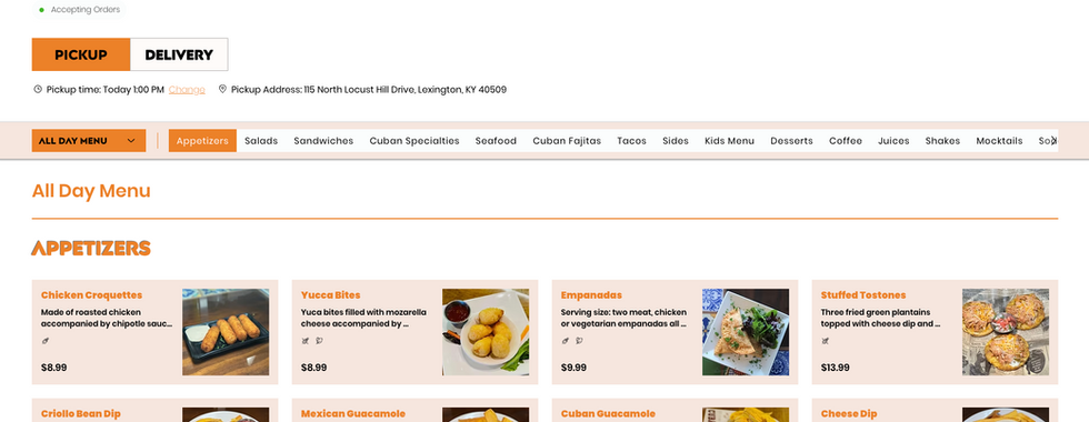
04. Hola Havana

Hola Havana showcases a warm, engaging example of how to start a restaurant business using a booking‑driven website. Their site features a simple “Book a Table” tool and allows online ordering, letting customers reserve seats or place orders in just a few clicks. The clear display of operating hours, contact details and loyalty program upfront conveys strong planning and hospitality strategy—key elements for anyone devising restaurant business ideas or brainstorming compelling restaurant business names.
With vibrant imagery of Cuban favorites like empanadas, plantains and mojitos, Hola Havana leverages brand visuals to convey authenticity—offering insights on how to create a restaurant business plan that includes visual storytelling and signature dishes. The cohesive design and calls-to-action also hint at expert thinking behind how to create a restaurant logo that reflects the brand’s energy. Altogether, it’s a practical, inviting model for restaurateurs aiming to use an online platform to drive reservations, support loyalty programs and plan for long-term growth.
Inspired? Here’s the exact website template behind this Wix Bookings website:
Website template name: Mexican restaurant website template
05. Glo House Sun Spa

Glo House Sun Spa is an engaging example for anyone exploring how to start a beauty business. The site cleanly lists services, memberships and “Book Now” CTAs, offering both drop-in and packaged appointments. With luxe aesthetics and clear structure, it mirrors top-tier beauty business ideas and beauty business name ideas. Entrepreneurs considering beauty dropshipping can also draw inspiration from their clean layout and upselling of services within a branded online platform.
The combination of service descriptions, visual branding and booking options shows how a spa can professionally market itself online. The structure encourages conversion and nurtures brand loyalty—perfect for anyone starting a beauty business or spa-related online service.
Inspired? Here’s the exact website template behind this Wix Bookings website:
Website template name: Minimal layout website template
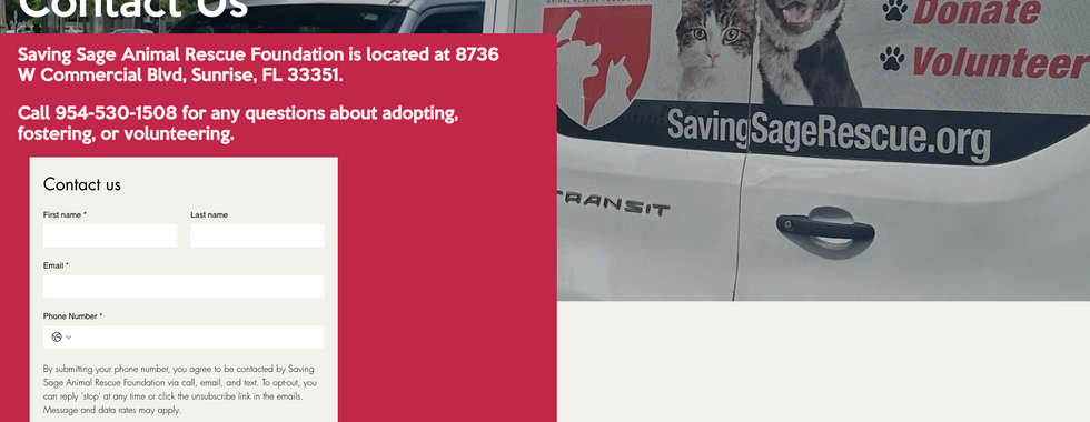
06. Saving Sage Animal Rescue

Saving Sage Animal Rescue is an animal rescue website and is a creative example of a memorable pet business name idea. It even offers insight for pet enthusiasts looking for ideas on pet dropshipping. Although non-profit in nature, the site integrates emotional engagement and practical support. The homepage includes a clear live chat button, enabling instant connection with supporters or potential adopters.
Though it’s a charity, the structure is adaptable for commercial pet businesses: showcasing rescue success stories, live chat support and service listings mirrors eCommerce practices. Business-minded users can adapt its layout for selling pet products or services, with chat-enhanced customer care driving conversions.
Inspired? Here’s the exact website template behind this Wix Bookings website:
Website template name: Pet care provider website template
07. Little Dreamers Playhouse

As a business idea for kids, Little Dreamers Playhouse stands out. Their site targets a precise target market—parents of young children—by highlighting services like playtime, STEM workshops and birthday parties. Bookings are front and center, with multiple CTAs for “Book A Playtime” or “Book A Party.”
The design reflects understanding of the audience, with clear options for different age groups and events. It’s a smart model for anyone building an educational or child-focused service business online, demonstrating how tailored offerings paired with clear booking paths can resonate deeply with parents.
Inspired? Here’s the exact website template behind this Wix Bookings website:
Website template name: Overlapping layout website template
08. Thryve Marketing

Thryve Marketing is a great example of how to start a marketing business, with marketing business ideas and marketing strategies turned into service booking. Their clear “Book a Discovery Call” CTA leads to strong conversion. The site outlines services spanning PPC, branding, web design, SEO features and more—ideal content for those exploring marketing business names or marketing side hustles.
Their succinct yet persuasive copy positions them as experts and client testimonials reinforce credibility. Thryve’s design showcases how service businesses can structure offerings, generate leads and book strategy calls efficiently—all essential for any budding marketing entrepreneur.
Inspired? Here’s the exact website template behind this Wix Bookings website:
Website template name: Marketing agency website template
09. Hearts & Tears Motorcycle Club

Hearts & Tears Motorcycle Club is a tasteful example of travel business names and travel business ideas, with intuitive trip planning and consultation booking features. The site offers user-friendly forms for vacation planning and features support mechanisms like messaging or calendars.
While lighter on immediate booking tools, the layout encourages consultation requests—integral for how to start a travel business. Their visual storytelling and booking approach position them as a strong template for travel entrepreneurs focusing on curated trips and personalized service.
Inspired? Here’s the exact website template behind this Wix Bookings website:
Website template name: Adventure tour company website template
10. 3L Barber Co.

3L Barber Co. presents a polished unique business idea in the barbering space. With an embedded “Book Now” button and an iOS app offering booking & payment, it exemplifies how to create a hair salon business plan featuring integrated, omnichannel booking systems.
Learn more about how to make a barbershop website.
The site highlights services, pricing, team bios and customer reviews to support trust and conversions. The physical location details, clear hours and direct booking form make it a strong case study in professional grooming services. Their app extends functionality, illustrating how online and offline operations can mesh to support client retention and growth.
Perusing this site can also give you inspiration for logo ideas that might be a good fit. Try using a barber logo maker to see for yourself, following this guide on how to make a barber logo.
Inspired? Here’s the exact website template behind this Wix Bookings website:
Website template name: Classic layout website template
Wix bookings websites FAQ
What is Wix Bookings and how does it work?
Wix Bookings is an all-in-one scheduling system built into the Wix platform. It allows service-based businesses to accept online bookings, manage calendars, collect payments and send automated confirmations or reminders. Whether you're offering classes, appointments or consultations, this feature streamlines your workflow while giving clients a seamless booking experience.
How do I make a booking website with Wix?
To make a booking website, start by choosing a template that fits your industry—like fitness, beauty or education. Then add the Wix Bookings app from the Wix App Market. From there, you can list your services, set availability, accept payments and sync calendars. The platform also includes tools like a logo maker, free website hosting and domain name setup to help you build a complete brand.
What types of businesses can use booking websites?
Booking websites are ideal for any service business—from fitness studios and wellness clinics to pet groomers and consulting agencies. You can even use Wix Bookings if you're exploring how to start a hotel business, start a beauty business or build a profitable business offering online classes or coaching sessions.
Can I start a service business without a physical location?
Yes. With Wix, you can launch a fully virtual service business. Use online booking for remote consultations, virtual classes or coaching sessions. If you're researching how to start a service business or how to make money as an entrepreneur, this is a low-cost, scalable option worth considering.
Do I need a blog for my service website?
Adding a blog can boost your site’s visibility and build trust with potential clients. Many of the best booking websites also use a blog maker to share tips, FAQs or behind-the-scenes insights. If you're looking into how to start a blog to complement your booking site, Wix has built-in tools to get started quickly.
What should I include on my booking website?
A successful booking website should include:
A clear services page with descriptions and pricing
An easy-to-use booking calendar
Contact info and location (if applicable)
A custom domain name and branded visuals
Social proof, such as testimonials or reviews
A blog or resources section (optional but helpful)
Search for the perfect domain name using a domain name generator or domain name search tools.
Can I use Wix Bookings for group events or classes?
Absolutely. Wix Bookings supports both 1:1 appointments and group sessions. You can set participant limits, recurring events, pricing tiers and even collect waivers or custom forms during sign-up. It's perfect for yoga studios, workshops, webinars and more.
Is Wix a good website builder for service businesses?
Yes Wix is one of the best website builders for service-based businesses. It combines booking, branding and marketing tools in one place. Whether you’re launching a new idea or scaling a profitable business, Wix gives you everything you need to manage your bookings and grow online. Wix Harmony lets you vibe code a business-ready website from a single prompt and continue shaping it exactly the way you want. Aria, Wix Harmony's built-in AI agent, is contextually aware of your canvas throughout the process, generating pages and sections, refining copy and offering expert guidance on web design and business strategy whenever you need it. Full drag-and-drop editing and radical customization tools including pixel-level control, custom component generation and a brand kit for global site styles mean your creative vision is never limited by how you choose to build. The result is a hybrid creation experience where AI and manual control work in harmony, all backed by Wix's enterprise-grade infrastructure.


