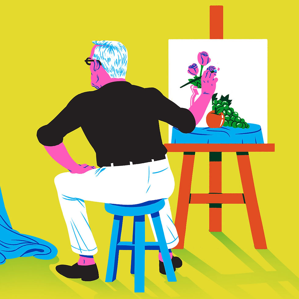
It comes as no surprise that so many people have explored the theme of beauty throughout the years. What draws us to a particular object? What makes something aesthetic? And do aesthetics even have an important role to play in a product’s desirability? This fascination started a long time ago, spanning from before Plato’s early study on beauty, up to Sagmeister and Walsh’s current-day inquiry on the same subject. Whether the research is presented through essays, exhibitions, artworks or new uses of social media, this is clearly a hot topic that will continue to absorb us. Industrial designer Dieter Rams also addressed the theme of beauty, stating that “good design is aesthetic”. However, reaching perfect aesthetics isn’t just about the way something looks, as he goes on to explain in his list of ‘Ten Principles for Good Design’. Here, we’ll explore the theme of aesthetics in relation to web design, asking ourselves what makes for a truly aesthetic website.
Third commandment: “Good design is aesthetic”
This may sound like an obvious statement. After all, faced with the same product in different packaging, we’d probably all be compelled to pick the one we find the most visually attractive. However, Dieter Rams has a more in-depth approach to this subject:
“The aesthetic quality of a product is integral to its usefulness because products we use every day affect our person and our well-being. But only well-executed objects can be beautiful.”

The battle between aesthetics and functionality
Let’s take a moment to ponder over Ketchup. Remember those glass bottles that you used to have to turn upside down and hit furiously to get out a little bit of that delicious red substance? They may have been beautifully designed, with a nostalgic vintage vibe, but the truth is, the new plastic bottle definitely beats them. Not only is the cap at the bottom, letting gravity do its thing, but the soft plastic means you can easily squeeze out a good dollop of Ketchup for your fries. Ideally, a designer will come up with a perfect mix that balances aesthetics and function. But it’s not always that easy.
Think about your favorite bag, for example. Do you like it because of the texture of the fabric, the colors, or the way the individual compartments are arranged inside? Is it just about how it looks, or does the functional aspect also have a part to play? Most probably, your answer involves a bit of both. It’s pretty safe to say that you find this bag visually appealing, but it must have additional qualities that make it desirable and that make you feel good. Whether that be the quality of the zipper, the physical comfort it offers or the adjustable straps, the likelihoods are that something in the design is well-executed. A simply beautiful exterior is not enough. The beauty must be in each and every detail and the product should be fully functional and work perfectly, as Dieter Rams suggests.
If this is the case, why does Don Norman’s collection of teapots include one that is basically useless (the spout and handle are on the same side)? His reasoning: “because I like them”. He explains that each one serves a slightly different function for him. Some are for hosting guests leisurely, while others are useful when he’s in a rush. Although they might not all adhere to the classic idea of a practical teapot, for him, even the “impossible” teapot is functional. Something about having them exhibited on the ledge above the kitchen sink makes him happy. According to Don Norman, the teapots are “sculptural artwork, giving satisfaction in their appearance”. Clearly, these everyday objects affect his well-being, thanks to their usability (or lack thereof), practicality and aesthetics.
In the same way that a design can’t be simply beautiful, it also can’t focus solely on function. There has to be some kind of balance between the two, even if the function is more of an emotional one, perhaps like Don Norman’s impossible teapot. Even influential architect Adolf Loos, who argued that ornamentation in design is a crime (in his essay Ornament and Crime), designed buildings whose interiors weren’t completely void of decoration. His Loos House, for example, is very minimal on the exterior, but the inside is full of different materials, patterns and textures. Was this completely necessary for the building to function properly? Probably not. But, as humans, we have some kind of emotional connection to beauty. We are drawn to it. And after all, a building that no one enjoys being inside cannot be functional.
Aesthetics in Dieter Rams’ designs
With a collection of beautiful designs up his sleeve, Dieter Rams is a master when it comes to aesthetics (as well as pretty much everything else). As already mentioned in the previous article on usefulness in web design, each detail in his designs seems to be placed in the exact right spot, offering a perfect user interface. In his and Hans Gugelot’s 1963 record player, designed for Braun and nicknamed ‘Snow White’s Coffin’, the focus on functionality is what leads to such a fine execution and aesthetic result. The transparent Perspex cover enables you to see the record and buttons while keeping it dust-free. It has just the right amount of presence and a subtle cut-out section that gives space for the vinyl when the cover is lifted. The cover can be propped up, with the help of a very minimal metal strip. The wooden panels on the sides slightly elevate the whole object, giving it space to breathe and some kind of frame. Clean minimalism and a strict focus on functionality are the building blocks that make up this truly aesthetic design.
What makes for an aesthetic website?
This sounds like a simple question. It’s true that everyone has their own taste, and there are certain principles and design portfolios you can check out for inspiration. Taking into account balance, composition, a use of grid, hierarchy and so on are important. But just like in industrial design, architecture, or any other field of design, for a website to be truly aesthetic, the beauty has to be more than skin-deep. It has to function well, or in the wise words of Dieter, be “well-executed”. This means considering minor details, including relevant and interesting content, having spot-on UX design and more.
The design of CHANGES’ website for a music conference in Melbourne (built by Bolster), encapsulates Dieter Rams’ definition of aesthetic design. This beautiful and seemingly minimal page actually contains all the information it needs. And there’s a hefty amount of it. Everything from the ‘about’ section to details on the speakers and artists is done with immense care, along with little surprises. There’s a sense of play, as visitors can click on the different titles and have an impact on the page’s composition – which, of course, remains perfectly balanced no matter what you do, keeping within the framework that the designers have planned. There are subtle hover effects on every word and element, as well as a fun loading animation. This well-executed design, reminiscent of a Piet Mondrian painting, is thorough down to the last detail, with a clear and engaging user interface that balances functionality and aesthetics.
CHANGES music conference website by Bolster.
Designer Ellen Voorheis’ online portfolio is another example of a beautiful website that takes into account the user experience, from start to finish. The moment you enter the website, you’re faced with an intriguing fullscreen video, along with big bold text that clearly indicates the purpose of the site. Not only do we love the millennial pink background, but when you click on the ‘work’ page, the screen fills you with sunshiny Gen Z yellow shades. The navigation is super clear, with a cute animated logo on the top left and a discrete menu bar on the right. The images themselves couldn’t be sharper and their bright color palette lures you in, like a kid in a candy store. This portfolio is filled with the exact content that it should be, both visually and textually, serving its purpose perfectly.
Designer Ellen Voorheis’ design portfolio.
So, where does this mini exploration into beauty bring us? It seems that being beautiful both inside and out doesn’t just apply to humans, or to industrial design. For a design to be truly aesthetic, its creator has to take into account its core, tending to those minor details that together make up a beautiful, well-rounded whole design.
Want to delve further into the world of Dieter Rams? Check out this series’ fourth article on understandability.


