Dune, the eagerly awaited, expansive sci-fi film based on the 1965 Frank Herbert novel by the same name, is by all accounts, epic.
The film, directed by Denis Villeneuve (who has previously directed mega sci-fi films like Blade Runner 2049 and Arrival) is a sweeping story with a mega 165 million dollar budget. It has star-studded cast, including Timothée Chalamet, Zendaya, and Oscar Isaac. But it's also a design feat, and a shining example of how design can be leveraged to tell a story—no matter how big.
We spoke to production designer Patrice Vermette about his creative vision, design influences, and the most challenging moment on set for the movie that was years in the making.
This interview has been edited for length and clarity.

Shaping Design: When did you first sign on to the project, and how long ago did the overall design process begin?
Patrice Vermette: I started working on Dune in February 2018, when Denis [Villeneuve, the film’s director] offered me the amazing opportunity to collaborate with him. It was our fifth movie together—I knew how important the book was to him. I felt it was a huge responsibility and honor at the same time, for him, the fans, and for the book itself. So I went back to reading the book. After that we went into design: exchanging ideas, sketches, and pictures of architecture. Once we did that, I started drawing sketches and I hired my close team of collaborators and concept artists.
After seven months, we had seen like a good 125 or 130 illustrations, and that served as the Bible, the book that we showed the studio and everybody on the team. We wanted to make sure that everybody was on the same boat and that we were going on the same journey together. We had props, all the sets were already modeled, illustrated. I said ‘the Bible’; but it was a bit like the cookbook.
We were a bit shy about the costumes. We had broad brushstrokes. But [costume designers] Jacqueline West and Bob Morgan used the sets and the color palette to make [the costumes] their own. The sets; the cities; what you see beyond the city wall: the skies of Arrakis. The planets were there. The two moons were there. It was fun. It was a great process because it was a small unit. It was Denis and I creating the world.
SD: How do you even begin to design an entire world?
PV: You start by reading the book again and picking out the clues and cues within the book. First of all, you need to understand what the planet is. You have to imagine the planet naked without anybody in it. And that’s quite well expressed in the book.
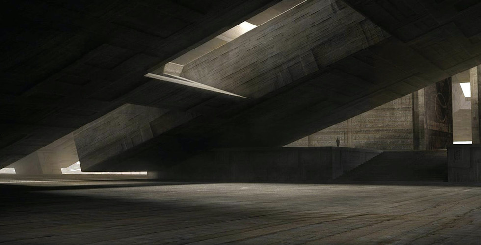
Then you say, ‘Ok, there’s a reality that exists on the planet,’ and you need to bounce from that reality. For instance, on Arakkis, the book says there is wind that goes from 850 km an hour. So architecture and design has to be a response to those elements. When you start making buildings, you’d probably want them to be on an angle, because the wind sweeps over them.
Images courtesy Warner Brothers.
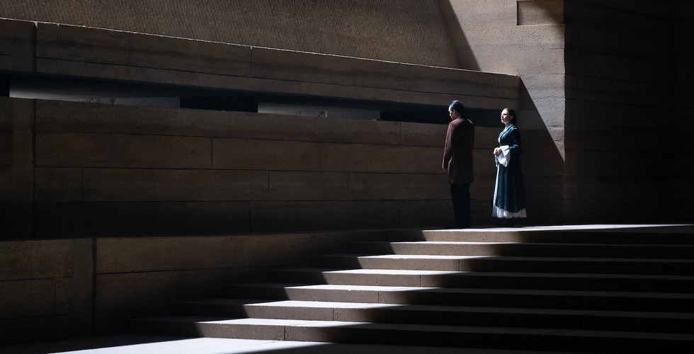
Then you understand that Arrakis is extremely hot, so what do you do? You’d probably make the walls extremely thick, because you want to keep the cool inside, just like in old caves. The natural insulation that the thickness of those walls provide will help people live a more normal life. You never want to have direct light. That’s where the idea of these light wells integrated into the design [came from]. It’s always a response to the environment of the planet.
Caladan was the same. You read the book and you know it’s a planet with islands and waters. The economy is based on fisheries, rice, and wine, so you include that in the design. There’s clues about medieval castles so you include that. You want to understand the past, so in the design, you include wall paneling that explains the history of the family. Same with the tombstones. It’s a very nostalgic moment because Paul [the film’s lead, played by Timothée Chalamet] is leaving a planet. So the atmosphere —what Denis and I relate it to is fall in Canada. It’s not too warm, it’s not too cold. You always need to wear a little jacket. There’s always mist.
Going back to Arrakis, you understand the city was founded after the discovery of spice. It’s a colonial entity that arrives on Arrakis to exploit the natural resource. What does a colonial entity do when it goes to a new country? They want to show their power. That’s where the influence of Brutalist architecture [came in]. The mansion or palace is the biggest palace ever built by human kind. Then you get a sense of scale. Scale also helps Pauls’ visual journey as something more comforting, nostalgic, romantic on Caladan, to the harsh reality of Arrakis. It’s bigger than anything he could’ve imagined. So that’s the process of the design.
Images courtesy Warner Brothers.
SD: Where did you pull visual inspiration from, and where do we see those influences in the movie itself?
PV: There’s Mayan and Aztec architecture in the references. On Caladan, I spoke about the medieval [references], but there's also Japanese architecture and influence. It’s a mix of a lot of things.
For the Brutalist architecture, I went with the lines of Brazilian Brutalist architecture, which have really interesting angular lines. Brazilian Brutalist architecture has the same vibe [as Eastern European Brutalism] but the lines are different. Beyond Oscar Niemeyer—Oscar Niemeyer is probably the most well known, but there are some that are a bit less known that are extremely interesting that I discovered through that process.
SD: How would you describe the overall visual direction of Dune?
PV: The visual direction was trying to get into Denis’ head, because he had a vision of his Dune when he was 13 or 14 years old when he first read the book, and trying to propose and suggest things. Fortunately we have a short hand together and we like the same types of aesthetics, so that was easier for us to collaborate.
The visual design needs to tell the story. It’s not design for design. It needs to reflect reality. The design needs to have a flow that goes well with the story and supports the story. In Dune, everybody notices the design, but the idea of design is always to support the story.
Images courtesy Warner Brothers.
SD: What was your most challenging idea to actually execute and why?
PV: I’ll always remember the first meeting at Legendary and we showed illustrations and one of the producers said, ‘they’re all interesting designs, but how the hell are we going to execute these designs?’ I said, ‘A lot of them I have a good idea, but for some of them we all need to work together, because honestly, I don’t have a clue.’
Some of the sets were bigger than any sound stage could accommodate. The biggest challenge was the Imperial Nexus laboratory main room. To give justice to the concept art, we came together, Paul Lambert, my visual effects supervisor and [cinematographer] Greig Frazier. We had this idea to create a set between sound stage 1, 2, 3, and 4. So we had two walls which created this massive alley which was open on both sides. On one side, we built the entrance of the set 30 feet high, we covered the ground with sand, cladded the sides of the soundstage with fabric, painted the average color of the set to create the right light environment, and between the sound stages we had the riggers pull wires and we created a retractable roof ceiling.
Normally that set would’ve been 150 feet high, but we only had 65 feet. So with computer models and sun orientation we calculated the size our ceiling would need to have with false perspective, so the sun going through it would create the right dimension for the shadow on the floor.
Since the sound stages were in a weird orientation in the sun path, we had a very tight window to shoot that scene. It was between 10:45 and 11:20 in the morning. And because the roof was made out of fabric, we needed a day without wind and we needed a whole week and a half without rain because of the sand. We had agricultural machinery to turn over the sand to make sure it dries. That was crazy enough to work.
SD: Were there any particular scenes that were your favorite as visual compositions? If we were watching the film and hit pause on a still, where would you pause it?
PV: The training room on Caladan. And Paul’s bedroom. My wife, visual artist Martine Bertrand, with Aaron Morrison, my graphic designer, created the fish relief on the wall. They’re relatively intimate.
SD: Anything else you want to mention?
PV: I hope people go see it on IMAX—it was designed with the aspect ratio of IMAX and seeing it on the big screen in mind. It’s an immersive journey.


.jpg)


