As an expert in all-things-digital, you’ve probably noticed a massive shift in how people consume content. Those old-school text-and-image websites are so 2010, whereas bite-sized, engaging videos are what it’s all about today.
That’s because we’re living in the TikTok/YouTube era, where you have seconds to hook people with captivating visuals and intriguing narratives. In fact, a 2024 TikTok report found that ads that used curiosity-inducing storytelling techniques saw a 1.4x increase in watch times.
The same applies to web design. People want to consume engaging content, and scrollytelling is the latest way to tell stories with your website design and optimize your web design process. Let’s check out some tools, strategies and examples of scrollytelling to stay ahead of one of today’s most popular web design trends. And when you're ready to tell your next clients' story, check out Wix Studio's design capabilities to do it creatively.
Learn more: 10 principles of good website design
What is scrollytelling?
Scrollytelling is a visual storytelling technique that uses interactive elements on a webpage to tell a narrative story. As a web designer, you present the information in a way that makes users experience the story as they scroll down the page.
The New York Times started scrollytelling as a form of journalism with Snow Fall: The Avalanche at Tunnel Creek, which went on to win the 2013 Pulitzer Prize.
But this concept of digital storytelling isn’t limited to online journalism since every brand has its own story to share.
How does scrollytelling work?
Scrollytelling is a lot like comics in that a visual story is broken into different sections and scenes. Instead of just text and images, scrollytelling includes web animations, interactive elements and background videos.
As the user scrolls, the webpage reveals new content, advances the story and conveys information in an engaging way.
Learn more: Add custom CSS to level up your website design
The components of scrollytelling
Like crafting a story, the components of scrollytelling depend on your imagination. You can take the readers to a 2D screen with infographics, open the gates to your 3D cinema by adding animations or offer a cinematic experience via interactive charts, immersive audio and theme-specific cursors.
That said, the typical components of scrollytelling include:
Infographics. Use graphics, text and data for data visualization to convey messages and insights effectively.
3D graphics. Add depth and realism to visuals by creating three-dimensional representations of scenes that provide a more immersive and realistic experience.
Interactive scrolls (vertical and horizontal). Enable readers to explore content by scrolling vertically or horizontally to encourage user interaction and provide an intuitive way to consume content.
Parallax scrolling. Create depth and a sense of motion by moving different layers of the webpage at varying speeds to add a dynamic element to your story as the readers scroll.
Text animations. Add text effects to emphasize important information, guide users’ attention and enhance the overall website experience.
Dynamic pages. Personalize the user experience by adding transitions to change the content and layout of the webpages in response to interactions.
Audio elements. Make your brand more memorable and offer an engaging experience by adding audio elements, such as narration, background music or sound effects to accompany text or call-to-action (CTA) buttons.
The benefits of scrollytelling in web design
With scrollytelling, you can create captivating and immersive website experiences that offer several benefits for both clients and site visitors.
Customers remember the brand. While visitors with shorter attention spans often skim through websites due to the overabundance of data surrounding them, if you tell your story in an engaging way, you’ll be able to stay top of mind with customers and get more results from your landing page.
Customers get a personalized experience. By offering interactive elements—such as infographics, graphs and animations—that respond to users’ actions, you customize each visitor’s experience with your website.
Customers stay ‘til the end. With scrollytelling, you offer an inherently captivating experience that compels people to engage until the very end. The website visitors actively explore your website, consume your content and understand what your brand has to offer.
How to use scrollytelling in web content
Create engaging and intriguing interactive experiences with a few best practices:
Brainstorm a compelling story. Start with a narrative that will resonate with your audience.
Plan your structure. Divide your story into sections or scenes the user’s scrolling actions will trigger.
Choose multimedia elements. Select images, videos, animations, infographics or audio clips to add to your responsive template and complement your narrative.
Add interactive features. Incorporate interactivity by adding parallax effects, scroll-triggered animations and other features that respond to user actions. (Also check out website gamification to take interaction to the next level.)
Optimize performance. Your designing efforts will have a bigger impact if the story loads quickly. Ensure the scrollytelling experience is smooth across different devices. For example, resize graphics files to improve the webpage’s loading speed.
6 best scrollytelling examples for inspiration
01. An appeal to emotion
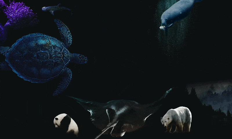
The best stories make you feel something. This scrollytelling story begins with animals appearing sad. As you scroll, you see how humanity is affecting the animals: smoke billowing from chimneys, oceans littered with trash and animal horns symbolizing the threat of hunting.
Afterward, you stroll through the animal kingdom, learning about the symbolism of pandas, distinctive long arms of gibbons and potential consequences of losing honeybees.
Once you forge a connection with these animals, you scroll down to learn about the fate of others: elephants threatened by the ivory trade, polar bears struggling with melting glaciers and turtles navigating oceans polluted with trash.
02. A modern take on a classic
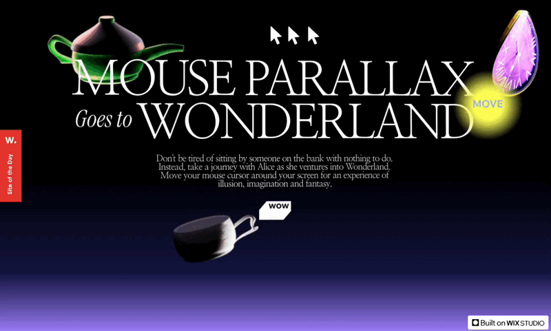
Everyone knows Lewis Carroll's classic book Alice’s Adventures in Wonderland. The web designers of this scrollytelling example modernized it in a way that’s both interactive and surprising.
The whole website is responsive to users’ cursors. You can move the falling pots, chair and even Alice herself by moving the cursor around. As you scroll down, Alice follows until she drops down a hole.
As you move to the next chapters of the long-form story, you can see doors opening and closing, packs of cards dancing and a bunch of flowers swaying in response to mouse movements.
Finally, you meet the Cheshire Cat, with the frightening smile and eyes we all know so well, drawing attention to a large CTA underneath. Aren't you, well, called to act?
03. An engaging portfolio
Maya Lynne Adar, a multidisciplinary graphic designer, shows that you can apply scrollytelling to a portfolio website, too.
Instead of showing a bunch of projects and crowding the screen, Maya has enabled hover-based animations to put individual projects under the spotlight. Similarly, the typography throughout the website changes when you hover over text, showcasing her experience with UI/UX, fonts and various design techniques.
Also note: Maya’s using a one-page website, a standard scrollytelling approach. Site visitors can interact with the projects like they’re right there via a modal window inside the homepage rather than needing to go to another tab.
04. A compelling brand story
BLUXSTUDIO is a great example of how you can apply scrollytelling to a brand’s website. It has scrollytelling elements (such as parallax scrolling, scroll-triggered animations and 3D graphics) on its home, about us and project pages.
On the homepage, BLUXSTUDIO takes you through its brand values, service offerings and past projects via interactive animations. On the project pages, you can navigate through what they've done for other clients.
Lastly, on the about us page, you can travel through the origins of BLUXSTUDIO, the story of how Alvaro Agurto Cea started his own design studio.
05. A hero's journey
When using scrollytelling for a brand website, you don’t need both a hero and a villain. Instead, you can make the brand the sole hero of your own scrollytelling story and tell its autobiography. That’s kind of how The Boathouse implements scrollytelling on its website.
As you scroll, you learn about all the stuff The Boathouse has done, the underlying processes they use and the results you can expect through videos, pictures and animations. The Boathouse concludes its story with a list of brands they've worked with, including Apple, Netflix and Universal Studios.
06. A deep-dive on process
Scrollytelling is a great way to highlight all the progress of your project behind the scenes with digital stories. For instance, in this scrollytelling example by Eliran Vahdi, he illustrates how he thought of combining space and design when setting out to build this webpage.
The story begins with an astronaut vanishing into the clouds. As you scroll, you get to join Eliran on his journey, from his passion for space to the amount of coffee he drank while designing this website.


