- Sharon Hafuta

- Oct 17
- 11 min read

When it comes to creating a spooky atmosphere, few graphic design elements are as effective as a well-chosen font. Scary fonts can evoke a chilling narrative, create suspense or simply add that eerie edge to your designs. Whether you're planning an event, creating content or designing for a client, understanding how and when to use these fonts effectively can make your project stand out.
This article explores what makes a font scary, showcases a selection of fonts to consider and offers practical tips on how to use them in your design projects. Additionally, we'll answer some commonly asked questions about incorporating scary fonts for different purposes.
Get inspired by exploring what is typography and its endless possibilities.

Unleash your creativity with the Wixel editor's extensive library of fonts. Whether you're going for sleek, modern vibes or bold, artistic statements, there’s a font for every idea. Design invitations, social posts or logos with typefaces that help you personalize your project and make it truly your own.
What makes a font scary?
Not all fonts are created equal, especially when it comes to invoking emotion. Scary fonts, along with horror fonts and creepy fonts, typically share characteristics that resonate with fear, suspense or the supernatural. Here's what sets such fonts apart:
Irregular forms and jagged edges
Scary fonts often have uneven letterforms or jagged edges that mimic something hand-carved, scratched or aged. These design elements signal imperfection and evoke a sense of unease, subtle reminders of things unnatural or incomplete.
Dramatic strokes and distortions
Thick, dramatic strokes that seem to blotch or bleed contribute to a horror theme. Rounded areas of letters might be stretched, while straight lines could be skewed, giving the text a warped or unbalanced appearance.
Historic inspiration or gothic influences
Some fonts, including horror fonts, borrow from gothic calligraphy or medieval typefaces, evoking nostalgia for ancient times that people often associate with folklore, myths and the supernatural. You may notice elements like ornate embellishments, sharp serifs or shadow effects in these fonts.
Each of these traits aims to create feelings of discomfort or suspense, which perfectly connects to the theme you're working with. Recognizing these characteristics helps you choose a font that aligns with your spooky goals.
12 scary fonts and when to use them

01. Arbutus
Arbutus is a rugged and quirky slab-serif font that exudes a raw organic charm, perfect for eerie and unsettling designs. Its uneven strokes and subtle handcrafted feel give it a rustic yet ominous personality, making it an excellent choice for projects that require a touch of old-world horror or gothic mystery. Arbutus balances its legibility with a weathered, slightly distorted look, creating an authentic and chilling visual impression that grabs attention without overwhelming the viewer.
Best for: Vintage horror posters, haunted house invitations, eerie book covers, cryptic product packaging and gothic-themed branding.
Use our invitation templates and invitation maker to craft professional and engaging invitations effortlessly.

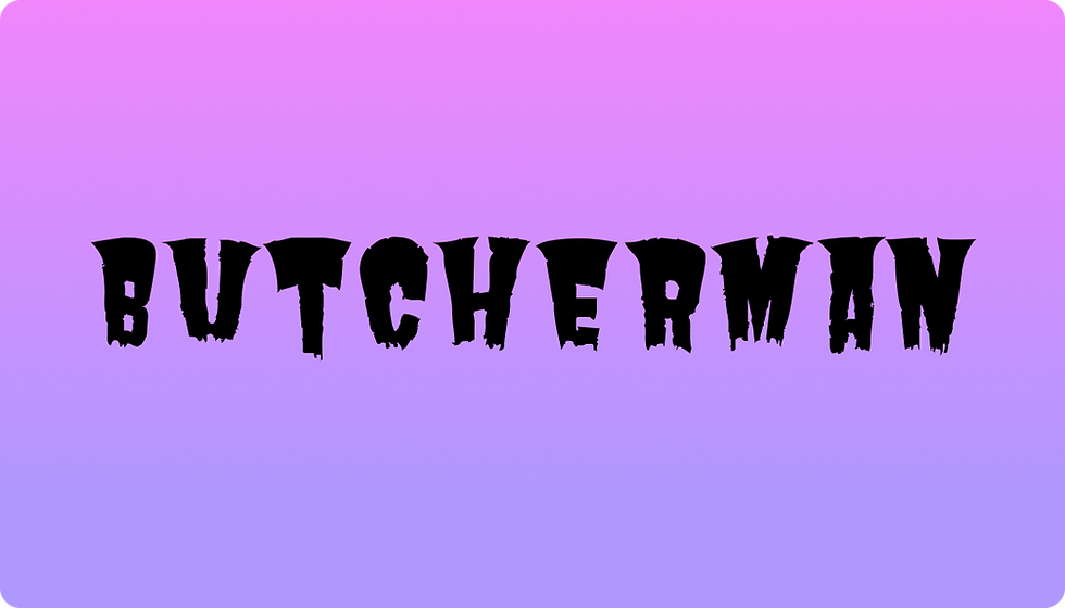
02. Butcherman
Butcherman is a grotesque and thrilling display font that brings the gruesome, spine-chilling character of horror fonts to life. Its jagged edges and uneven letterforms mimic the look of dripping blood or torn flesh, giving it a visceral and spine-chilling character impossible to ignore. This font is packed with drama and personality, making it the go-to choice for designs that need an over-the-top terrifying aesthetic. Butcherman works best in large, bold settings where every gory detail can be appreciated, adding a striking impact to any scary project.
Best for: Horror movie titles, haunted attraction signage, chilling party flyers, macabre event branding and eye-catching Halloween-themed designs.

03. Climate Crisis
Climate Crisis is a bold and impactful display font that captures urgency and unease. Its sharp, jagged edges and distressed letterforms evoke a feeling of chaos and destruction, making it a perfect choice for designs that aim to convey tension or environmental awareness. The font’s raw and gritty aesthetic mirrors the themes of disruption and decay, creating a striking visual presence that demands attention. Climate Crisis is ideal for projects that need to make a bold statement while maintaining a sense of purpose and gravity.
Best for: Environmental campaigns, dystopian posters, protest materials, impactful headlines, and awareness-driven branding.


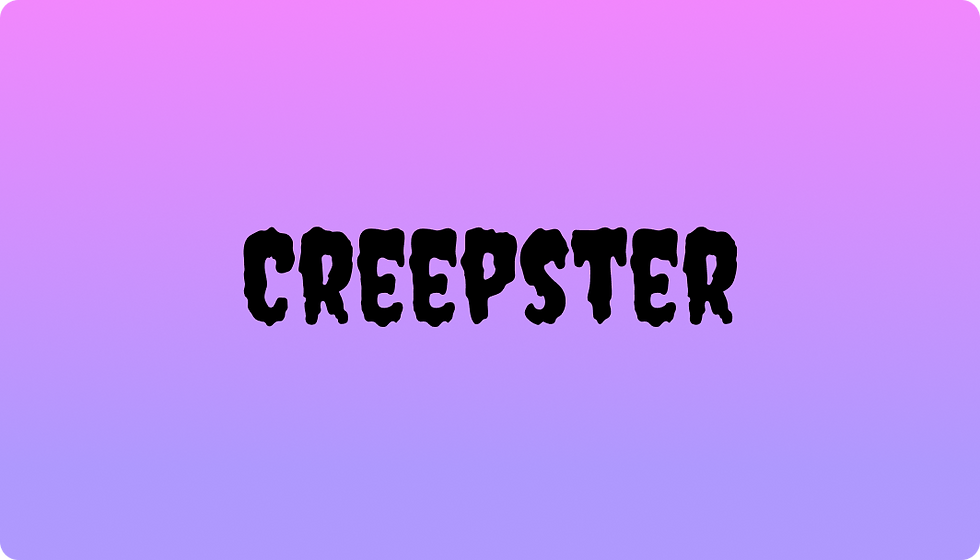
04. Creepster
Creepster is a creepy font that combines a playful display style with a retro horror vibe, as if it jumped straight out of a vintage monster movie. Its jagged edges and exaggerated curves look alive, as if the letters themselves could jump out and haunt you. This bold and spooky typeface is dripping with eerie personality, but remains highly readable, making it a versatile choice for both fright-filled and fun Halloween designs. Creepster delivers a nostalgic yet menacing punch that works wonders in attention-grabbing headlines or themed displays.
Best for: Horror-themed logos, spine-tingling movie posters, haunted escape room promos, festive Halloween décor and spooky children’s book covers.
Learn more: How to design a logo.

05. Eater
Eater is a bold and grotesque horror font that screams horror with every jagged serif and sinister curve. Its irregular letterforms and menacing, almost ravenous appearance evoke feelings of unease while commanding attention. This typeface gives off a chaotic, devouring energy, perfect for creating designs that immerse viewers in a world of terror and suspense. Whether you need to craft a horrifying headline or a spine-chilling backdrop, Eater’s raw and fearsome aesthetic makes an unforgettable impact.
Best for: Gory movie posters, haunted event banners, terrifying videogame titles, horror-themed restaurant menus and immersive thriller book covers.

06. Freckle Face
Freckle Face is a whimsical yet unsettling display font that blends playful charm with an eerie, offbeat character. Its irregular, hand-drawn brushstrokes have a quirky personality that hints at friendly mischief while maintaining a subtle sense of unease. The slightly skewed and imperfect letterforms bring to mind spooky children’s tales or otherworldly adventures, making it an excellent choice for designs that toe the line between delightful and creepy. Freckle Face is versatile in conveying both fun and fright, perfect for creating an atmosphere that's equal parts eerie and enchanting.
Best for: Spooky invitation cards, quirky Halloween event posters, eerie children’s book titles, playful yet spooky branding and festive seasonal merchandise designs.

07. Frijole
Frijole is a quirky and bouncy display typeface that exudes an eerie, vintage charm. Its uneven, hand-drawn letterforms give it an unpredictable and unsettling feel, making it perfect for designs with a playful, yet spooky vibe. The font’s exaggerated curves and unique shapes command attention without being overly polished, which adds to its whimsical yet chilling personality. Frijole feels like the lettering you’d find on an old, haunted carnival sign or mysterious potion label, and it’s this offbeat character that makes it utterly captivating.
Best for: Retro-inspired Halloween posters, creepy event invitations, eerie party decorations, themed children’s books with a spooky twist and quirky horror-themed branding.

08. Jolly Lodger
Jolly Lodger is a peculiar serif font with an unsettling, jagged edge that feels straight out of a chilling ghost tale. Its crooked letterforms and erratic angles lend it an unhinged, eerie aesthetic, as though it were scrawled by a restless spirit or lifted from an old, crumbling tombstone. The font combines vintage horror with a playful twist, making it ideal for designs that need a mix of creepiness and curiosity. Jolly Lodger’s unsettling yet engaging style ensures it leaves a lasting impression, perfect for chilling narratives or mysterious atmospheres.
Best for: Horror movie titles, spooky book covers, eerie social media graphics, Halloween decorations and ghost story poster designs.
Explore our social media templates and make your brand stand out in a crowded digital space.

09. Metal Mania
Metal Mania is a bold and jagged display font that screams with intensity and raw energy. Its sharp, angular letterforms and distressed texture evoke the feeling of cracked metal or fiery chaos, making it ideal for designs that demand a hardcore, eerie vibe. This font captures the essence of heavy metal album covers and underground horror visuals, blending gritty distortion with a dark, rebellious edge. Metal Mania’s dramatic, over-the-top appearance ensures it grabs attention and adds a sense of untamed drama to your designs.
Best for: Horror-themed concert posters, heavy metal band branding, chilling event flyers, haunted house signage and edgy Halloween marketing strategy campaigns.

10. Nosifer
Nosifer drips with unnerving detail, literally. This display typeface features oozing, liquid-like drips trailing from its bold, oversized letterforms, instantly evoking images of blood, slime or even toxic goo. Its haunting and grotesque personality makes it the perfect embodiment of macabre design, adding a visually striking, horror-movie feel to any project. Nosifer doesn’t just settle for creepy—it leans into the grotesque, transforming text into a chilling focal point that oozes personality and makes any message unforgettable.
Best for: Horror movie posters, haunted attraction promotions, eerie Halloween-themed designs, escape room branding and spine-chilling social media graphics.

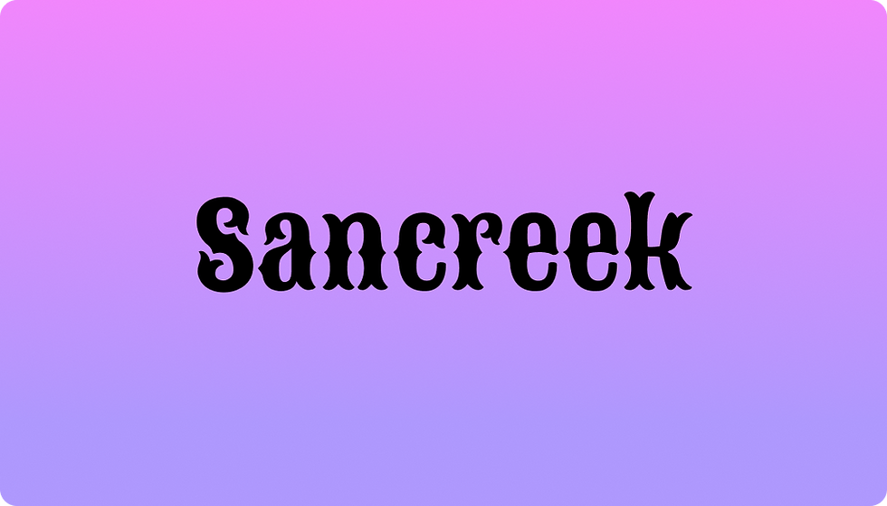
11. Sancreek
Sancreek is a bold and decorative slab-serif font with a playful yet slightly eerie personality. Its exaggerated serifs and quirky letterforms give it a vintage Western vibe, while its uneven strokes and dramatic flair add a touch of mystery. Sancreek’s unique design makes it stand out in projects that require a mix of charm and intrigue, offering a balance between fun and unsettling. This typeface is perfect for designs that aim to feel both nostalgic and edgy, capturing attention with its distinctive style.
Best for: Spooky event posters, Halloween invitations, vintage-themed branding, eerie book covers, and quirky product packaging.


12. Vampiro
Vampiro is a striking gothic typeface that oozes dark elegance and supernatural allure. Its sharp, elongated letterforms evoke the imagery of gothic cathedrals, vampiric fangs and shadowed castles under a blood-red moon. With ornamental details reminiscent of ancient scripts, Vampiro bridges the gap between eerie and refined, making it a standout choice for designs that require a touch of dramatic horror. Its haunting sophistication ensures it brings a mysterious and chilling atmosphere to any text-based design, captivating viewers with its sinister allure.
Best for: Vampire-themed event posters, gothic wedding invitations, dark fantasy book covers, chilling video game graphics and theatrical horror show promotions.

Pro Tip: Most of these fonts are available for free on Google Fonts, so you can explore and experiment without cost.
According to Yaya Aaronsohn, head of Brand Maker at Wix:
"Each combination of design elements has the potential to evoke specific emotions, convey subtle messages and leave a lasting impression on viewers. From the choice of font to the selection of colors and the incorporation of graphic elements, every detail plays a crucial role in shaping the overall identity of a brand."
Tips to using scary fonts effectively
To make the most of scary fonts, you’ll want to ensure that your designs maintain clarity while achieving the desired chilling effect. Here are practical tips to help you use them effectively:
Pair with simple fonts
Not every text element in your design should be scary. Combine your chosen scary font with a clean, neutral font for supporting details, such as dates, locations or other supplementary information. This balance allows your key message to stand out.
Stick to minimal color schemes
Fonts have their own visual weight, and scary fonts often carry high-density visuals. Stick to a minimal color palette to ensure the design doesn’t feel cluttered. Black, red, white and grey tones work beautifully with the scariest fonts.
Adjust font size strategically
Consider the placement and sizing of text when working with scary fonts. A larger font size can showcase a font’s details, but can also make it difficult to read. Use bold, scary fonts primarily for titles or headers, and keep body text simple and concise.
Avoid overuse
Too much of a good thing can overwhelm your audience. Use scary fonts sparingly and purposefully. Highlight only the elements of your design that require immediate attention, such as titles or focal points, while leaving other texts plain for balance.
Test readability
Fonts that are too intricate may lose readability, especially in smaller sizes or when viewed from a distance. Always assess how the audience will see the final design. Testing readability ensures your message doesn’t get lost in the creative elements.
Stay updated on typography trends
Keep an eye on typography trends to bring fresh perspectives to your projects. Integrating trending styles can help you craft visually compelling and modern designs.
Mix scary, horror and creepy fonts strategically
When working with various design styles, blending scary, horror and creepy fonts can amplify emotions and enhance visual storytelling. Imagine bold horror fonts grabbing attention in titles, subtle creepy fonts adding intrigue in taglines and clean sans-serifs ensuring clarity in body text. This layered typography creates a strong visual hierarchy, keeping your message cohesive and impactful.
The spookiest typography in pop culture
01. Psycho, 1960
Alfred Hitchock’s psychological horror-thriller set a new bar for violence and deviant behavior in American films. Tony Palladino designed the fractured, bold, sans-serif typeface, which evokes the mind of the film’s disturbed protagonist Norman Bates, while Saul Bass designed the opening credits with a kinetic sans-serif typography.
02. Halloween, 1978
The slasher franchise that instilled the fear of Michael Myers into public consciousness also brought together a match made in Halloween heaven: the sharp serifs and terminals of the film’s ITC Serif Gothic typeface and its glowing orange color, now pillars of the Halloween aesthetic. The elegant gothic typeface designed by Herb Lubalin and Tony DeSpigna made such an impact that it became one of the most used horror fonts in the '70s and '80s.
03. A Nightmare on Elm Street, 2010
It’s hard to imagine the classical Trajan as a scary font, but since the 90s it has been one of the most overused fonts in horror movies and in cinema in general. Designed by Carol Twombly for Adobe in 1989, Trajan’s grandeur lends pomp and ceremony to a film, a Presidential campaign and to corporate branding and a lot of spookiness when depicted in blood red as in the A Nightmare on Elm Street movie title.
04. Stranger Things, 2016
The supernatural Netflix show about a group of kids dealing with government experiments is set in the 1980s, and its title borrows from the neon-lit aesthetic of the time. For the title sequence on screens, creative studio Imaginary Forces put the iconic ITC Benguiat font in motion, with the letters locking together like puzzle pieces over an eerie synth track. Very mysterious.
05. Suspiria, 2018 and 1977
The dark and dreamlike Suspiria was remade 40 years after its initial release, and the two versions have dramatically different titles. The original 1977 film’s handwritten, stark white lettering implies unease. Designer Dan Perri uses inconsistent weights and colors to infuse emotion and chaos into the jumble of letters of the 2018 version, subverting the harmonious, geometric shapes of the Bauhaus style from which it is inspired.
Explore these fonts for more design inspiration:
Calligraphy fonts for elegant and artistic designs
Cool fonts to add personality to your creations
Cursive fonts for timeless designs
Cute fonts to bring charm to your designs
Free fonts: a curated selection
Fun fonts for playful and lively projects
Futuristic fonts for cutting-edge and modern designs
Graffiti fonts to infuse urban energy into your designs
Handwriting fonts to add a personal, authentic touch
Number fonts for creative numerical typography
Poster fonts to make your designs bold and eye-catching
Pretty fonts to enhance delicate designs
Professional fonts for polished and formal designs
Psychedelic fonts to inspire striking and retro visuals
Resume fonts to help your skills stand out with style
Retro fonts for a nostalgic twist in your visuals
Script fonts for a touch of sophistication
Tattoo fonts to inspire edgy and unique designs
Scary fonts FAQ
Can I use scary fonts for professional settings?
Scary fonts are best reserved for specific contexts, like event branding, seasonal campaigns and entertainment content. For most conventional professional settings, such fonts can appear out of place. However, industries like entertainment or design can sometimes incorporate them to great success.
Are scary fonts free to use?
Many scary fonts are available for free, but there are also premium options with unique designs. Always ensure you’ve read the licensing terms before using a font, especially for commercial projects. Check platforms like Wixel’s library, which offers clear licensing guidelines.
How can I ensure accessibility when using scary fonts?
Accessibility is crucial. When using these fonts, ensure adequate contrast between the text and background. If possible, pair scary fonts with simpler ones for clarity, and provide alternatives for screen readers for digital design usage.
What other design elements pair well with scary fonts?
Design elements like textured backgrounds, shadow effects and eerie color gradients can complement scary fonts. Be mindful of balance—too many elements may overwhelm the design.
How do I choose the right scary font for my project?
Match the font’s characteristics to the theme of your project. A dripping font like Blood Ink might not suit a haunted poetry reading, but would work perfectly for a horror film poster. Consider the tone and audience your project is targeting.
What is a scary font?
A scary font is designed to create a sense of fear, suspense or unease. It typically has jagged edges, irregular shapes, distorted strokes or gothic and distressed styles. Common examples include "Creepster," "Chiller" and "Bloodlust." These fonts are frequently used in horror-themed designs, Halloween promotions or spooky branding to set an eerie mood.


